HOME | DD
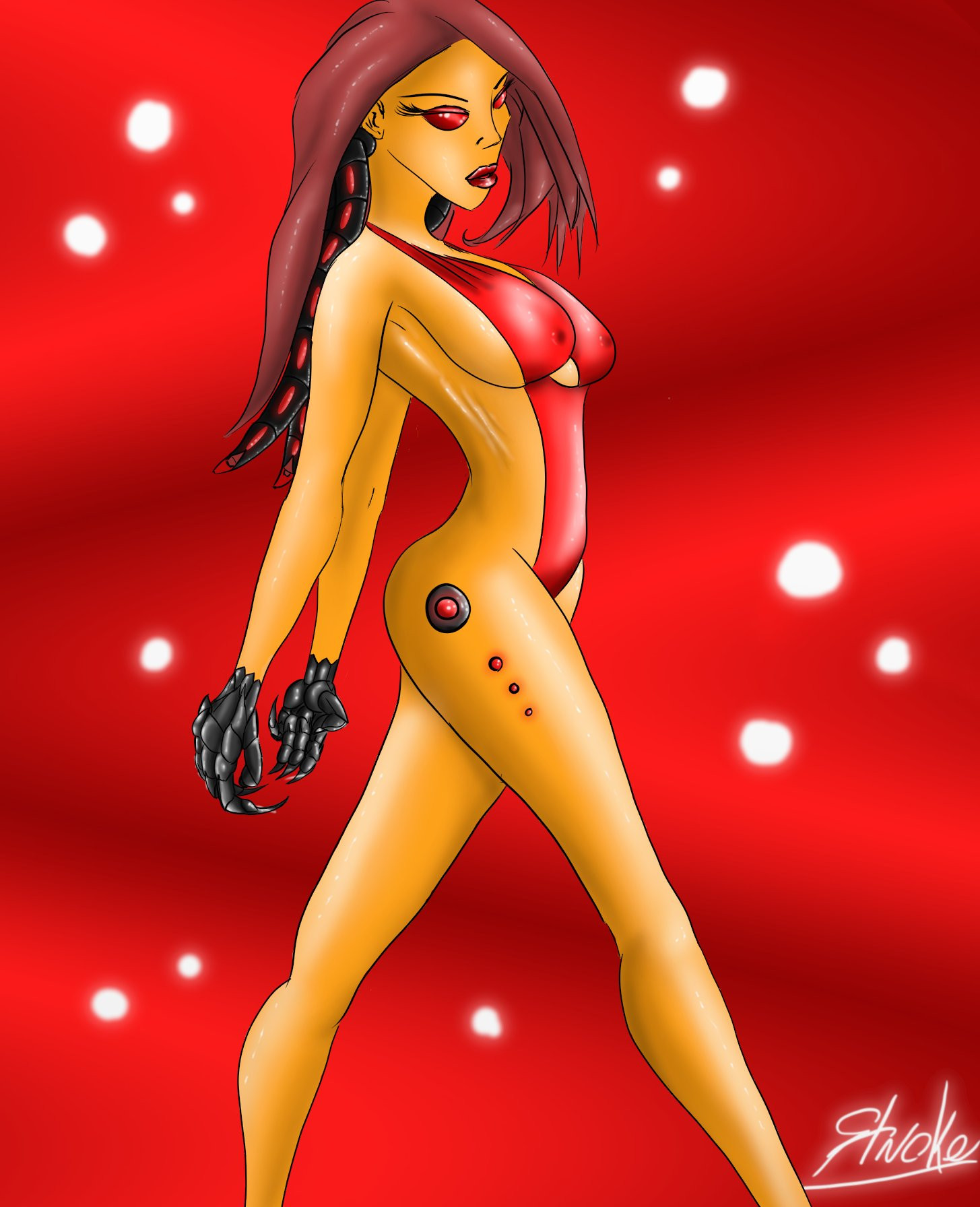
 Snigom — Concubot 3

Published: 2007-01-23 15:45:19 +0000 UTC; Views: 6270; Favourites: 128; Downloads: 170
Redirect to original
Description
Rapidiograph inked, Copic marker colored with Pro White highlights on Crescent Heavy-Weight Hot-Press Illustration board 11 x 7 1/2Disappointment is so...soft a word I have for myself on this peice. I know what your asking: "then why did you upload it?" I just thought I'd upload it to go with the other 2 bots. I worked on this late last night. It started off amazing, then I started coloring. The effects in the leather weren't working, which I think started some frustration. It was uplifting when I started on her shoulder, then it ALL went downhill from there. Try as I might, I couldn't get anything to work. I started getting sloppy and began making stupid mistakes. Something kept me going. Maybe an invisbile imp, whipping me with his spirit stick; I dunno.
This morning I thought to bring her back from the dead. Uh-uh. Nope. I wasted my morning adding highlights. I guess I was too tired..not stimulated enough. THe point is.....it sucks
") The highlights on her Bra and front Legging is just some of the worst highligting ever. Too bacd I can't reall fix it
The highlights on her Bra and front Legging is just some of the worst highligting ever. Too bacd I can't reall fix it Why o why didn't I scan in the Line work before hand

Enjoy

Related content


Comments: 41


I love how the arm's turned out, and the color contrast works for your favor too. It's just as good as the rest, at least I think so! The small details are great.
👍: 0 ⏩: 0

Her anatomy is so muscular this way. The posing and her hair looks really good on her too.
Speaking of the hair, it looks really detailed and so shiny this way. ^^

👍: 0 ⏩: 1

Thanks! I wasn't too happy with how it turned out in the end. But people seem to love her anyway
👍: 0 ⏩: 1
Yeah. Thanks so much for the reply to my comment.
Why weren't you too happy how this drawing turned out though?
👍: 0 ⏩: 1
I made SOOOooo many clumsy mistakes that I had to go back with Pro-White to get rid of. It's difficult to see in the scan...but easy to see in the original. Also the leging in the foreground wasn't rendered correctly. I over-did it with the shiny lines.
👍: 0 ⏩: 1
That was pretty frustrating for you correct the errors in the drawing, wasn't that right?
👍: 0 ⏩: 1
YES! oh yes. I use the PRo-White to do the highlights in the drawing. It;s my favorite step...but it;s tiresome to know I have to go and correct mistakes.
👍: 0 ⏩: 1
Yeah. It will eventually become tiresome enough to a point where your hands will hurt.
👍: 0 ⏩: 1
Ah! Actually not so much. One of the things I teach in my drawing class is how not to hold the pencil or pen so tightly. Partly becuase your hand gets tired quicker...but also it has a tendacy to make drawings very stiff.
👍: 0 ⏩: 1
Yep. If your hands get tired, it would be best to let go of the pencil so that you can continue working on the drawing.
👍: 0 ⏩: 0

I think it looks great ^^ I'd do anything to have your skill, even with this so called bad piece of artwork...
👍: 0 ⏩: 0

mistakes, shmishtakes. thats just your subconcious mind forcing you to continue to improve even after you've done so well. acknowledge and move on.
I dig it. I was hoping to sculpt something very similar but it got too expensive and hard so I put it on hold
👍: 0 ⏩: 1
True enough. I usually keep trying to fix and fix until it reaches some point. Sometimes I wonder if I go too far and I should have stopped earlier and it might hav been better. Oh well, can't all be perfect
A sculpture of this type would be freakin' incredible! I'd like to see her as a scupture. I have some sculpy...but my sculpting skills need work...
 (Wink)")
👍: 0 ⏩: 1
I was trying for life size, with proper joints. Rather like a "Real Doll" except less sex will be had with my robo girl
👍: 0 ⏩: 1
I actually wouldn't mind having a life-size posable doll. Not for sex...but for modeling. THat'd help me out a great deal! My wife won't stand still long enough
👍: 0 ⏩: 0

nice example of your colouring skills again. Cool work!
👍: 0 ⏩: 1
Thanks. I do like the gold...the rest......

👍: 0 ⏩: 0
ok , i can see both sides to this.the actual drawing is killer. the color rocks,what i myself don't like is the fetish leather.not so much the out fit it self but like you said the highlights. i think you may of went over board with them.
an old friend told me once with pro white,its easy to go to far with it (which i do alot of myself) and i think you have done here in certain spots. what seems not to work is the highlights are in the wrong place ? its hard to point out because the illo looks like it could have several light points.
now that i look at it more what i see is that the boots are flat on the outside lines and the high lights show a wrinkled texture.maybe if the outside of the boots were more "uneven" (like her glove) it would look better? idk maybe you got me looking to far into it.
this is good though...dont beat your self up about it.its how we learn.dude i have so many drawings iam not happy with its not even funny.
the illo rocks.
👍: 0 ⏩: 1
You're right. There was 1 light source, and I paid more attention to the robot's armor, and less on the clothes. Like I said, I shouldn't do delicate work so late at noght and then wheel around and try it early the next morning 
I'm trying to beat myself up....but my darn fists keep acting on thier own 

👍: 0 ⏩: 0

Are you kidding?! You need to give yourself more credit. I can't stop starring at this.... What I would give to have even one iota of your talent.....
👍: 0 ⏩: 1
It's amazing. I sat for 45 minutes discussing this phenomenon with my wife. It seems no one really likes the work that *I* like. The work of mine that I hate...everyone loves. It's a (for a lack of better response) 'A bizzare love triangle.'
👍: 0 ⏩: 1
That's interesting! Come to think of it, I get that occasionally too. I'll put my heart and soul into something I love, and then people just kindal look at it and go "meh, whatever"
"A bizzare love triangle." I like that... I'll have to remember that!
👍: 0 ⏩: 1
It's enough to make you wonder "Who am I doing this art for anyway?" Doesn't it?
I don't full credit for 'Bizzare Love Triangle.' It is a song from the 80's by New Order
👍: 0 ⏩: 0

oh.. well... you know, this is my favorite concubot of yours
...really

👍: 0 ⏩: 1
Uh-huh. You guys are just saying that to disagree with me
👍: 0 ⏩: 1
nuu =____= i like her, it's truuue!!!! ><
The face, and the colors... the expression...

👍: 0 ⏩: 1


Hey, don't beat yourself up over it!! I think it came out fine minus a few errors here and there that could always be touched up digitally or otherwise. Until you started pointing things out I was completely satisfied with the overall feel and structure of the piece. I was hoping to mention the care and mechanical form used in the careful construction of the joints and plate areas to make them seem logical for movement and application of this piece. The colors are vintage and make me think of the old 50-60's styled robot wars mixed with a Sorayzma feel after you added the fetish gear and outfits. All round I enjoyed this one and was going to refer tht you makea flash sheet of all the "robo-fems" as I am sure there are some people out there looking for some finely detailed works to have inked in their skin.
👍: 0 ⏩: 1
Just what my wife said: "We would have never known those mistakes were there until you pointed them out!" I don't know...it;s a bad habit I have to break I guess.
I had in mind to do a few flash sheets...but was turned away by some of the Tattoo artists down here. There's a whole 'purist' movement going around where the mentality is: "I won't tattoo someone else's art. If they come to me, I will create art on thier body my way and in my style!" Kinda sucks
👍: 0 ⏩: 1
Tattoo artists draw other people's work for a living. Its a sort of jealousy thing when a non-tattoo artist walks in and says I have tattoo artwork to show you. I was snubbed for a while, then one of the shop owners told me to make some sheets, make outline copies for them and then have the colored sheets laminated. He said I could hit some shows with them and just sit outside. I asked why I should sit outside when all the people are inside. Then he said that is where you make the $$. A spot on the grass is fre to sell your work to people walking in. If I was to sell them indoors I would need to have a table and pay a vendors fee...
👍: 0 ⏩: 1
I might re-consider it. I am certain there must be a shop somewhere that can use flash, I mean they have books of the stuff....
👍: 0 ⏩: 1
Work the system as an ally and you won't come off looking like an enemy. Once you get to hang out and get to know some of them they might even think about letting you do more. Just because the ink the stuff doesn't mean they have time to just sit and make organized reference sheets. I've had my head handed back to me many times when I said the wrong thing like..."Oh, I could draw something like that if you want"....OOOPS!! Remember they are artists, too. If you gain respect from them, they just might ask to see your work...then hesitate a moment and then say,"Ah, sure...why not."
👍: 0 ⏩: 1
I suppose you're right. I don't get along with most people...it's not so much that i'm concieted or an @$$hole (at least...i don't think so
👍: 0 ⏩: 1
")
👍: 0 ⏩: 0

Well if it makes you feel any better I like this one much better than your other two.
👍: 0 ⏩: 1

Too bad. I still like this one much better. Good job on the hair. It goes with the bot.
👍: 0 ⏩: 1
No hearts. Didn't ya notice? No hearts...just for you!
👍: 0 ⏩: 1
I noticed alright. ^__^ Another reason I liked this one better.
👍: 0 ⏩: 0