HOME | DD
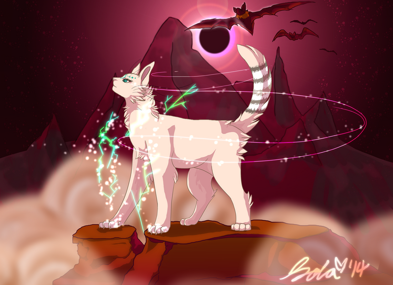
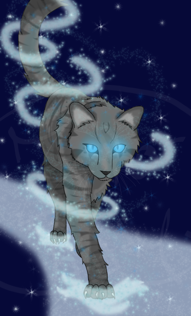
 Solarizing — Night of the Eclipse
Published: 2014-05-30 23:17:46 +0000 UTC; Views: 747; Favourites: 43; Downloads: 0
Redirect to original
Description
An illustration of Sola to kick off the summer! Yes, I went overboard with the light and sparkles here, but shhh, that's all part of artistic liberty, right? I hope you guys enjoy, personally I'm pretty proud of the shading and overall color composition of this piece. I have some really awesome drawings in store for you, I'm just waiting to upload them for a bit as I get a little nervous that my art could be stolen so I like to make sure I don't go posting every single piece of mine online.
-
Original sketch done on lined paper with a normal #2 pencil. Scanned and colored in FireAlpaca. Took roughly two or three days.
Related content


Comments: 7

I spy.. with my little eye....
...some awesome improvement in your art since I viewed it last! Very lovely job with the shading - You're starting to really get the hang of it!
👍: 0 ⏩: 1

Thank you so much, Vet! 
👍: 0 ⏩: 1
That's one thing I like about you. You're always looking for ways to improve. c: That's the sign of a good artist - There's always room to grow! If there's one thing I've learned, while being both an artist and violinist for almost a decade, it is that you can never stop learning. Ever. At the same time, that's the beauty of art! Nobody ever "arrives". It's a constant journey that never grows old!
I'm far from being a "professional" in the art world, but I'm willing to teach you what I know and give you some pointers along the way. c:
--As mentioned before, you're shading is quite lovely. However, I feel that it could look a bit smoother. There are a few shaky edges and dips in the shading that look a bit strange, especially in comparison to your line-art which is very smooth and clean cut. In addition to this, if you're going to add some fantastical lights and sparkles that give off any sort of light, you may want to incorporate some extra highlights of the same color; such as, in this case, on the forelegs and chest. I don't have much of a bone to pick with the highlighting.. it's more of a suggestion than anything else. I don't know what exactly you were going for with the extra sparkles, besides giving the piece more of a fantasy look.
--One of the things that might stand out, more than they should in this piece, would be the mountains in the background. The reason for this is because they have their own lines... which is not specifically a bad thing, but it can be if not done in a proper way. If you had given them distinct cell-shading, as with the rocks upon which the cat is standing, then the mountains would probably be more suiting; but because of the lack of detail, the viewer may be under the impression that they look a bit rushed or sloppy. If you don't want the mountains to have loads of detail then I would suggest you remove the lines from them. Keep the lines, then I suggest you add the detail to match. The primary reason this may be noticed more is because the mountains stand in the middle of two of the key focal points of this painting: the cat and the eclipse. Always keep in mind where your primary focal point(s) are... and try not to distract away from them with additional objects that may not be as important.
--Lastly, I suggest you sit down sometime and do some anatomy studies. No, I'm not talking about looking up various tutorials online (though they can help you sometimes). I'm suggesting that you grab a bunch of cat (or of whatever animal you aspire to draw) photos and focus sketching different points of the cat's anatomy. One day it might be focusing on the anatomy of paws and the different views and positions they can be in. The next day might be a focus on proportions. And the next might be a focus on different breeds of cat. You name it. This exercise is pretty inexhaustible and you might be amazed at how much it may help you in the future. I can tell you from experience that it really helps to take a break from "just for fun" sketching and do some good ol' fashioned work. c; Some people argue that art "just comes to you", but most times it takes more than just inspiration! Art takes practice. And you definitely have the potential. c:
Keep practicing, keep learning, and enjoy the adventure of being an artist!
👍: 0 ⏩: 1
Vet, oh my gosh girl, that really helped, thank you so much for taking the time to type all that!
I definitely agree with the points you brought up. I actually did have those highlights in the original drawing but cut them out because I felt they made the drawing looks a little too busy, but I'll remember to keep them next time. The shading is definitely jagged in a few spots and I'll work on keeping it consistent with the lineart. I really like the point you brought up about the mountain, I hadn't noticed that. And yep, I'll aim to focus more on my anatomy, that's really what I need to put more effort into.
Thanks again!


👍: 0 ⏩: 1
You're most welcome - anytime!
👍: 0 ⏩: 0
