HOME | DD
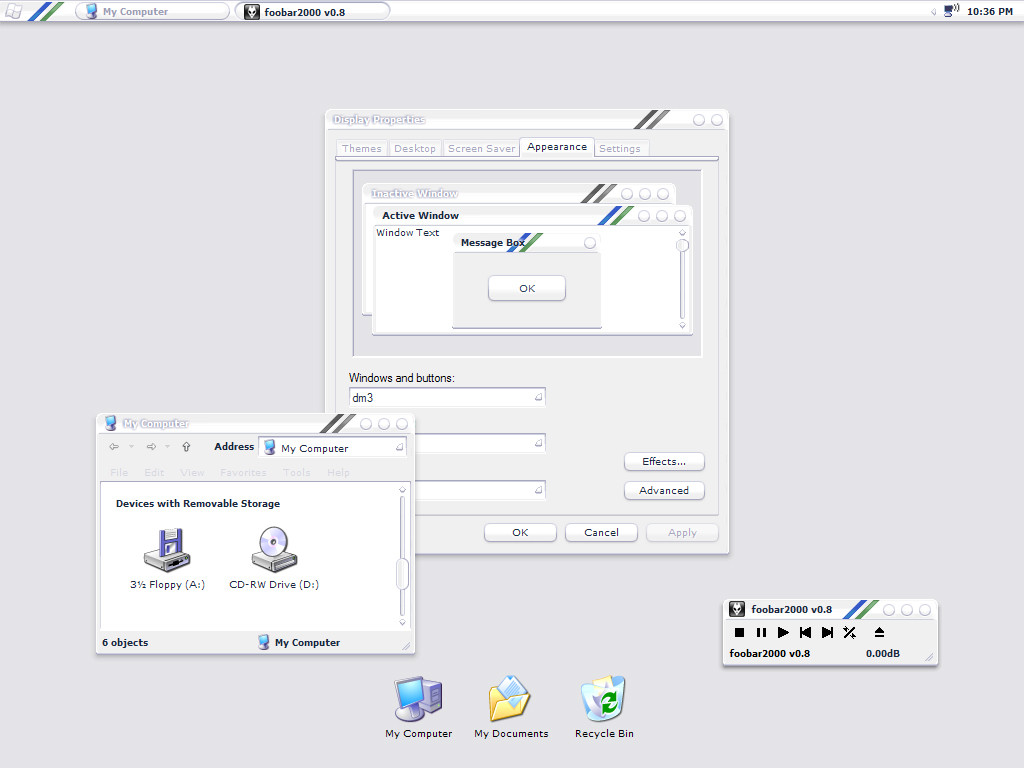
 sonus — dm3
Published: 2004-11-21 06:53:08 +0000 UTC; Views: 32087; Favourites: 37; Downloads: 19629
Redirect to original
Description
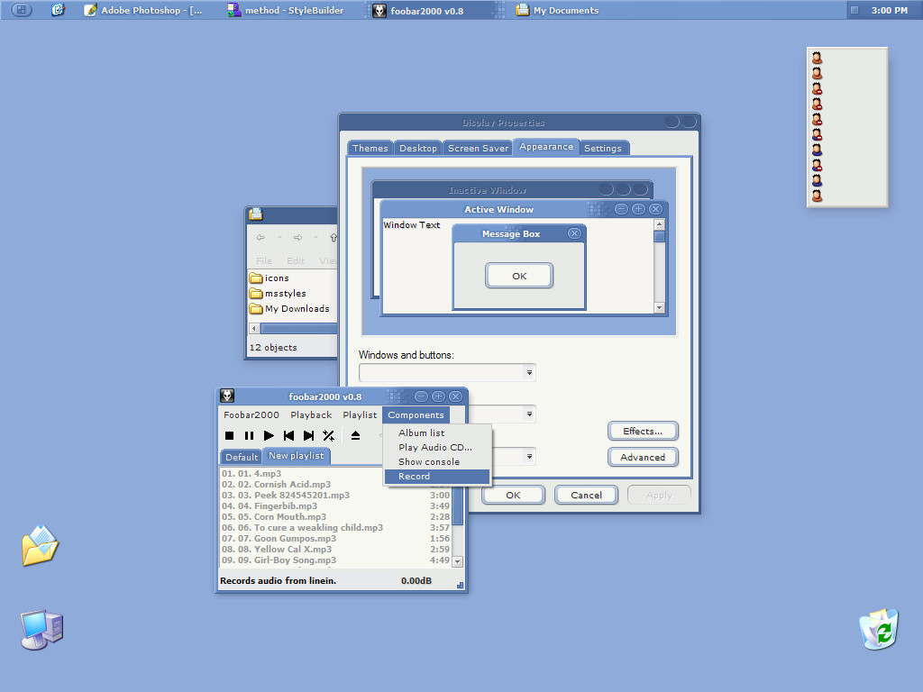
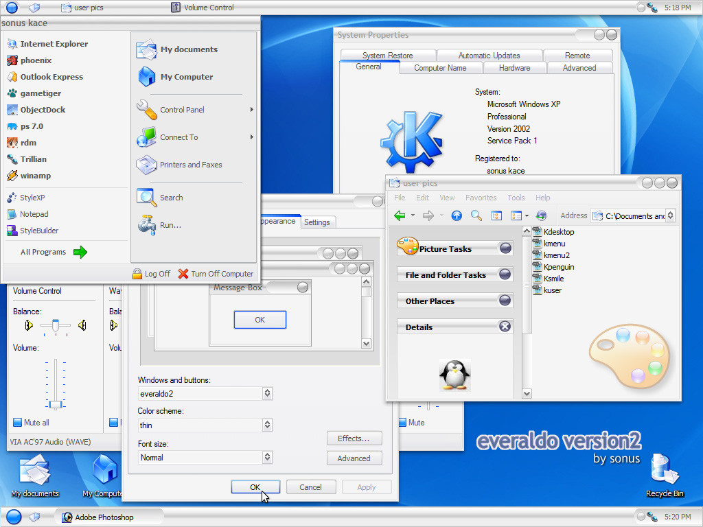
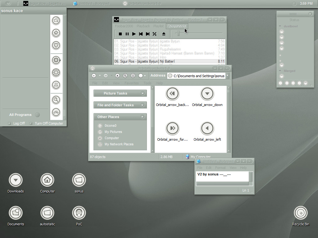
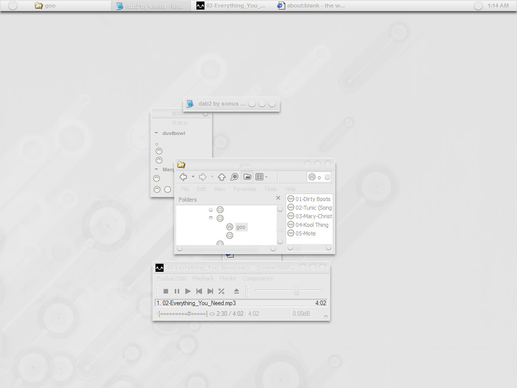
i said something about the last one being aqua influencedi wasnt serious
ive gone off the deep end with this one
i will include a shellstyle later
along with bugfixes and alternate fonts
thanks to armlann for getting the ball rolling
if you have any questions read the txt first
Related content


Comments: 37


really cool but the stripes are too... 1980 sport shirt'ish'
👍: 0 ⏩: 0


")

i'll give it a try. seems to me you've done a good job
👍: 0 ⏩: 0

I'm totally in love with this VS, even if it will make me blind as a bat  (Smile)")
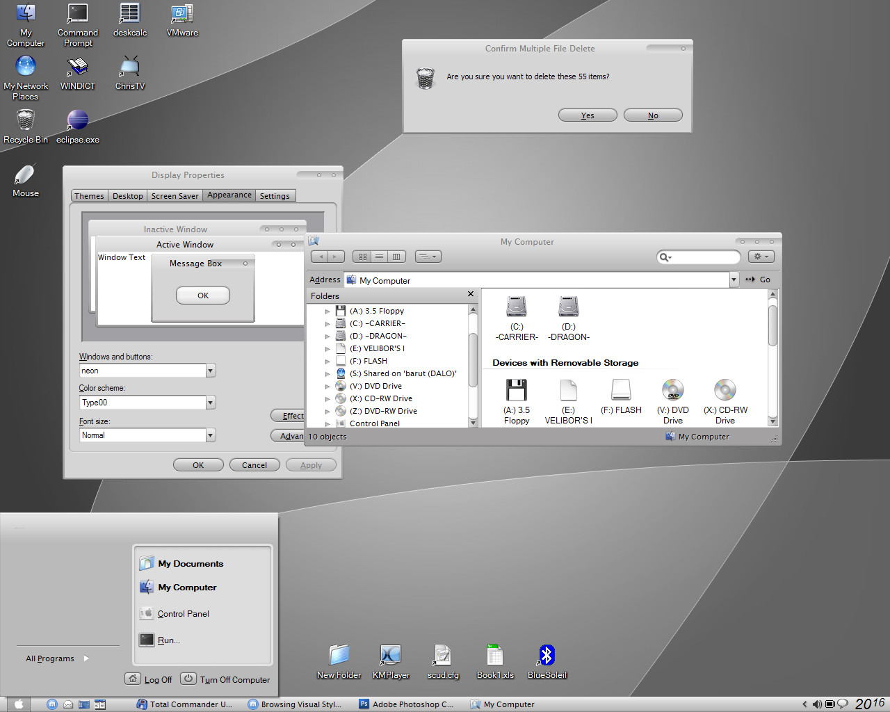
When you're browsing in Windows Explorer with the view of the directory tree at the left and the contents on the right, why is it that the left side uses a different font than the right? Was this intentional?
Anyway, I read you're planning on more font options so I guess I have something to look forward to. Keep up the good work!
👍: 0 ⏩: 0

veeeery slick....the idea is GREAT !
only one complaint....too bright for the eyes, as someone mentioned above...that is the only reason i'm not using it straight away, but i'll keep my eye on you and if u add the shellstyle and some darker color variations (e.g. grey with white/back stripes), it'll be AWESOME !!
keep up the great job there. thumbs up....
👍: 0 ⏩: 1

i adore light visual styles with low contrast
..if i can stare at it for months while making it
there has to be someone out there who is as disturbed as i
but my vision has been getting worse...im not totally positive
that has anything to do with it
stay tuned for my picasso msstyle
")
👍: 0 ⏩: 1
i dunno how to understand this, but i meant no offense....sorry if any has been taken....
👍: 0 ⏩: 1
i didn't get the meaning of the message tho....what did u mean by that? u'll add those darker colors? or were you telling to "piss off"?
 (Wink)")
👍: 0 ⏩: 0


VERY nice skin. My only complaint is that it's not for WindowBlinds, but that was only annoying for the 5 seconds it took for it to autoconvert it. Keep up the good work!
👍: 0 ⏩: 0


This is wonderful.
Any chance of changing those blue stripes to red for Christmas?
👍: 0 ⏩: 0

what toolbar theme are you using, where can i get it? btw, nice theme using it now ^_^
👍: 0 ⏩: 1

his toolbar theme is breeze.. its the best looking simple one out there.

👍: 0 ⏩: 0

EXCELLENT!!!!
why dont you try to use the colour #F9F9F9 (249,249,249) as the systems colour? (i.e menu, menubar etc, etc) this will look badass, man.
👍: 0 ⏩: 1
thanks for the advice
it looks a bit bright as the buttonface
the tabs would have to be reworked...and im too lazy for that
the menus would be perfect as 249,249,249
i might put a left-right gradient on the toolbar
we should work on another project together playboy
its been awhile
👍: 0 ⏩: 1
Yeah? Sure, man. What do you have in mind, guy?
👍: 0 ⏩: 0

This will be interesting to see and use when it's done. This preview release is quite pretty.
👍: 0 ⏩: 0

looks very awesome, been using it for a short period now, but some parts of the themes are just a bit too white with really light outlines making it hard to distinguish, like the scrollbars or the frame of a window.
looks to be a a very promising theme.
👍: 0 ⏩: 0


I think it's really fresh!
I took it apart just to see how you did the tooltip background. Thanks for the tip, it'll be used in the next update of Mint
👍: 0 ⏩: 0

Great looking style. Going to try it out now...
")
👍: 0 ⏩: 0


This is really really nice. I'm loving your recent styles
When I 1st seen you preview this, I was thinking of a white deanach style theme. This is close enough! And does dm3 mean anything by any chance?
👍: 0 ⏩: 0


WOW! this style is very nice, i like the idea very much! ...the only thing i'd request is some other colour-variations too, maybe a little bit darker colours.
thanx alot for your work, very sweet VS! keep it up!
👍: 0 ⏩: 0
