HOME | DD
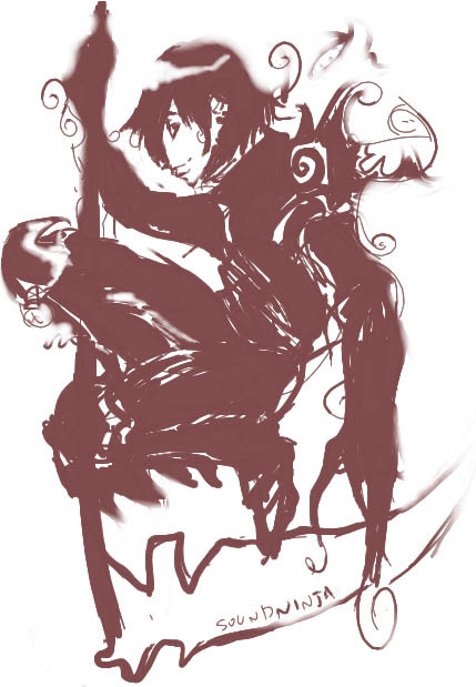
 SoundNinja — Color Practice

Published: 2005-01-11 05:13:04 +0000 UTC; Views: 109; Favourites: 1; Downloads: 15
Redirect to original
Description
hmm... I suppose this could be a scrap, but since it was my first attempt to color something like this, I'll post it as a deviation. I screwed up his hair color... meant it to be a little darker... but oh welll.... also his goggles. They suck too.. god they clash so much it hurts my face....this was also a concept of what I figured the flamethrower guy's face could look like.
done in paintchat
Related content


Comments: 26


kewl :3! paint gets some getting use to (hope that made sense ^ ^). Watercolor is my fav out of the paints.
👍: 0 ⏩: 1

yeah it does...
I don't really know if I like to paint or not...
I really prefer just black and white... pen and stuff
👍: 0 ⏩: 0
Photosprite [2005-01-12 18:03:03 +0000 UTC]
it looks clumpy. well, i guess paint can't be clumpy. um, it looks like it's in daubs or something. big fat ones. make it finer!
👍: 0 ⏩: 1
lol.. you don't know anything about painting do you..
XP
👍: 0 ⏩: 1
Photosprite In reply to SoundNinja [2005-01-13 00:05:18 +0000 UTC]
::snooty chuckle:: you don't know anything about photography do you?
oh wait, you still make comments on that don't you. curious...
👍: 0 ⏩: 1
I don't need to know anything about photography to tell if the picture is a good composition or not. That's the same in both art and photography :3
👍: 0 ⏩: 1
Photosprite In reply to SoundNinja [2005-01-14 22:08:03 +0000 UTC]
::rolls eyes:: I calls em like I sees em. deal with it kid.
👍: 0 ⏩: 1
no but seriously... have been up close to monet or van gogh paintings? the paint is like in inch thick globs in some places.... it all depends on your style.
👍: 0 ⏩: 1
Photosprite In reply to SoundNinja [2005-01-14 22:27:59 +0000 UTC]
oh i know. it's beautiful. yours looks globby in the sense that it looks like it seeped and is messy in a not-on-purpose way. plus yours is 2D so it's harder to see in paint. lol
👍: 0 ⏩: 1
pssh. I can run my FINGER through the paint
I don't know what you're talking about XP
plus, instead of saying globby then, you could say that I need to balance my lights and darks.. like the first person who commented said.
XP
👍: 0 ⏩: 0

that was the tool I used XP
👍: 0 ⏩: 1

Pretty nice!!!The hair looks great!!
That guy reminds me of NarutoXD
👍: 0 ⏩: 1

heh.. except naruto is BLONDE XP
👍: 0 ⏩: 1


The face came out better colored then the rest. But thats just what I think
👍: 0 ⏩: 1
yeah... Same here..
screwed up that hair and goggle... but that was doin it after midnight, and I was just rushing to finish it by then.... face was fun tho ^^
👍: 0 ⏩: 0

Methinks the outline needs a wee more darkening and even out the shadows and the light areas... I guess that's it. ")

👍: 0 ⏩: 1
lol yus stubbles! Yeah the outline was watercolor... it smooths it out alot.. if I had done it solid, it would be all jagged and crap.. pixely... well.. moreso than it is now. Which I can't say I favor... but I could give it a try something I guess..
👍: 0 ⏩: 0