HOME | DD
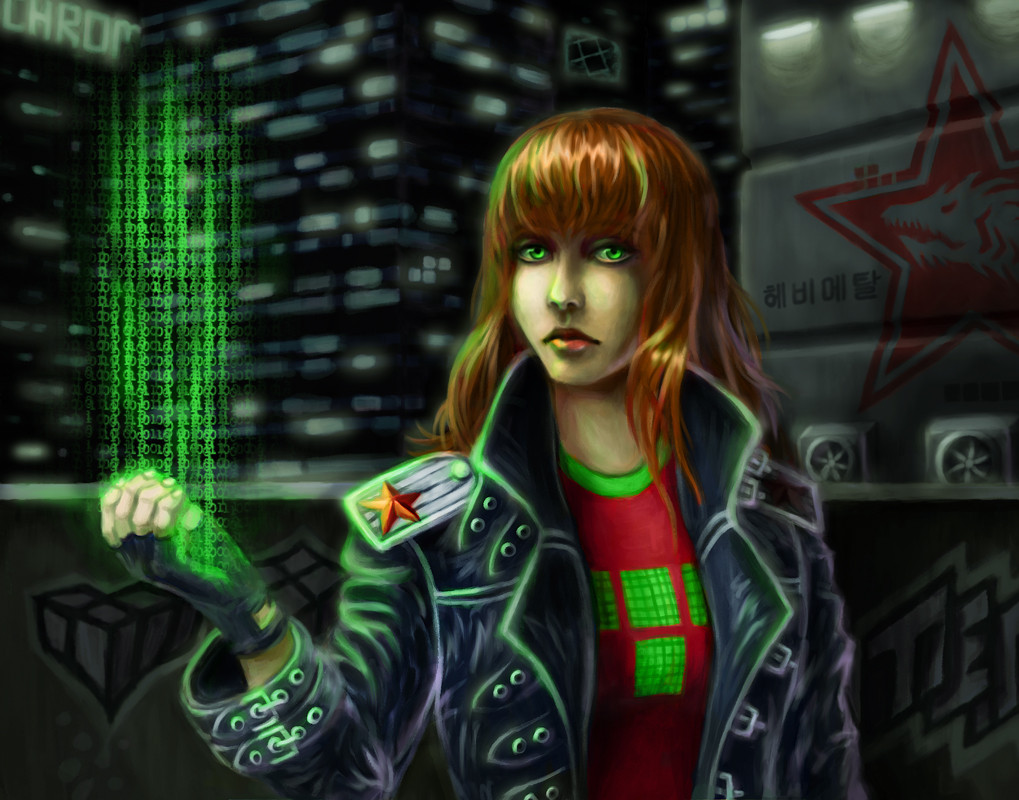
 Spacegryphon — Neon T

#cyberpunk #girl #neon #oc #profile #shadowrun #tetris #woman #technomancer
Published: 2019-01-31 02:32:29 +0000 UTC; Views: 916; Favourites: 56; Downloads: 0
Redirect to original
Description
My Shadowrun OC Tetris. This is basically a practice how to draw head lit from behind.Related content


Comments: 20

Overall

Originality
Technique
Impact
Hi there! Animator-supreme here, with a.deviantart.net/avatars/p/r/p… " alt=" " title="ProjectComment" /> to look over this fine piece of work.
I'm a big fan of cyberpunk stylization in art. Steampunk is cool and all, but cyberpunk has something so cool about it. Anyway, I digress. The lighting is very, very well done here. With the seemingly neon sign behind outlining her with a soft white glow. I especially like how it's all not a solid line since people have peach fuzz that breaks up the line smoothness. I only wish you included some more details in the jacket sleeve, like another wrinkle along the back of her arm, or some stitching. I feel the emblem on her shoulder would look better in a metallic tone, too. One thing I did notice was the button on her shoulder. If its metal, it should be a bit brighter, since polished metals have a tendency to pick up even the smallest amount of ambient lighting.
All in all, I think this is a lovely drawing.
👍: 0 ⏩: 1

Thank you very much! Yes, the clothes could indeed need more details and more work in general

👍: 0 ⏩: 0

Overall
Vision
Originality

Impact
Hello.
At first , the light is very good and the atmosphere is so good too.
The rules of 1/3 is correct, in the center, the head is on a good position. But I feel it's strange that the look is looking on the left ? Is't your chose of course but if you flip your picture there are more impact ! no ? Generaly on the left it's the past, and the right the futur, don't forget a picture reads from top to bottom and from left to right.
The color are very good, I love it, the first light on the face is very good. The rim light is a little too hard for me.
The caracter is very good.
it's a good realization.
Best regard Paladin54
👍: 0 ⏩: 1
Thank you very much. Flipping the picture might be a good idea. Actually, looking to the right and thus to the future would of course support the future-esque idea behind the setting ^_^
👍: 0 ⏩: 1
 (Wink)")

Overall
Originality
Technique
Impact
This piece has nice composition to it. My only gripe in that regard, albeit minor, is that one bit just under the tip of her nose looks a little flat from the tangent that comes from the light in the back. Shifting the lights up to around the nose bridge should fix that and put more attention on the eyes.
The lights themselves look well done too; the textures make it feel like LEDs are being used. However, it feels like there is a bit of a mismatch with how bright the light actually is and the rim lighting on the character. Perhaps some even brighter bits of pink on the lights could make them feel brighter. I'd probably add a bit of fog to accentuate the atmospheric vibe of this piece as well.
Another thing which I find a lot of around DevArt here is that the lighting on the character is quite low contrast for the setting she is in; it makes the piece look a bit muddy. It is a shame because pushing that contrast between light and dark could really make the colours stand out more and really 'pop'.
Other than that, I like the rendering of the hair, especially at where the rim lighting is, it looks quite realistic and soft. The facial anatomy looks real and solid. Her costume looks pretty cool with its cyberpunk aesthetic as well.
👍: 0 ⏩: 1
Thank you very much. There was no grand plan behind the creation process, but I think it's quite okay the way it turned out.
👍: 0 ⏩: 0


I really enjoy the painterly texture the picture has! Maybe it's a bias since I work in a similar style on my less experimental pieces, but I think it gives it a very serious tone and matches the expression on Tetris's face, good job on that!
What I would suggest is shifting the hue when you do the lighting in general, I can see on her sweater there's some hue variation but the lights on her face feel a bit too white for the pink light in the background. Also I suggest making the background light more vibrant and neon-y to fit the universe theme and give some more "pop" to it if you get me.
Otherwise the framing is good but maybe could have benefited from having a longer landscape-orientated background to show more detail. The contrast is well-balanced and it's easy to tell what is what in the piece, the composition is coherent and doesn't have elements that stick out too much or feel out of place.
One last suggestion, which is more nitpicky than anything, is to perhaps blur the background texture a bit more, or variate the textures in it since the texture as it is now gives it slight lack of depth.
Keep up the good work!

👍: 0 ⏩: 1

I like how you used the pink color spectrum for the shadows and lighting. Well done
👍: 0 ⏩: 1


 (Smile)")