HOME | DD
 SpaceHoneys — Never Use Primary Colors
by-sa
SpaceHoneys — Never Use Primary Colors
by-sa
Published: 2008-07-18 08:58:14 +0000 UTC; Views: 7423; Favourites: 30; Downloads: 75
Redirect to original
Description
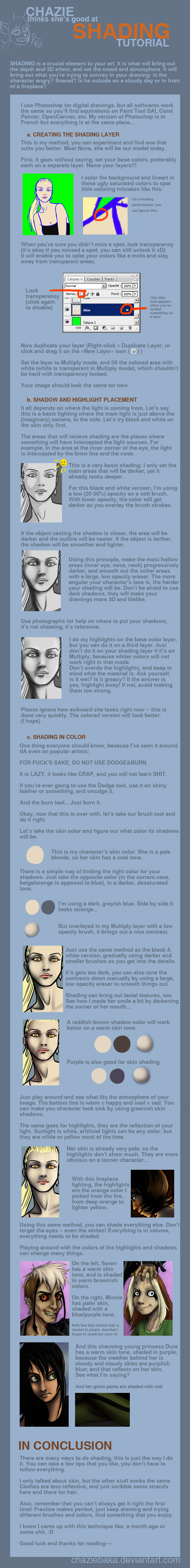
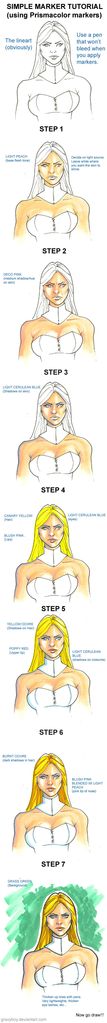
This is a coloring guide I whipped up as we were starting up the Crossoverlord. It was basically designed as a crash course in how to keep comic pages from looking garish.A common beginner thing to do (I was guilty of this myself) is to use the highest possible value for a color, such as the default red (set at 255,0,0). You should never use the sorts of colors that you see in the color tray of applications such as MS Paint. Instead, open up the color picker and soften them by moving them toward gray or even mixing them with other colors.
This is by no means a complete guide to coloring, but if you take this as a foundation as you learn to experiment with colors, you'll begin producing work that looks far more natural.
Related content


Comments: 29

Very helpful
TV Tropes linked me here for some reason.

👍: 0 ⏩: 0

This is a good place to start, but the real problem is the color range available to the artist. Colors this bright should be reserved for things like light itself. Light should be the brightest, boldest thing in your picture - everything else is less than light. So, it goes without saying that things can be bright, but you shouldn't make things like everyday, cotton shirts as bright as a light source.
👍: 0 ⏩: 0

Great advice. I am an utter failure at color, and this helps.
👍: 0 ⏩: 0

Well, I guess I owe them that.
Actually, I love that website. Even if they did sort of misunderstand my point.
👍: 0 ⏩: 1

Yeah, I can spend hours reading Tvtropes.
👍: 0 ⏩: 0
Only when they're cranked up that high. With just a little tweaking, those three colors can be beautiful.
👍: 0 ⏩: 1

[link]
I used your tutorial. :3
👍: 0 ⏩: 0

You got linked on a TV Tropes page!
[link]
👍: 0 ⏩: 1
Hahaha! Whoever did that apparently missed the point that I was trying to make. All of my Crossoverlord pages are very colorful, and I was using my desaturated coloring technique throughout. I have very bright pages as a result.
The whole point is that you can mix colors a lot more easily when you don't crank them up to their highest value. I've never made a brown comic in my life.
I call shenanigans on TV Tropes.
👍: 0 ⏩: 1
Haha, well, you gotta remember that Tropes Aren't Bad. And it is a wiki so you could always go edit in your explanation.
👍: 0 ⏩: 0


As much as I like saturated colours, I figured it out for myself that too much saturation is an eyesore. On the other hand, game developers have the unfortunate habit of setting the saturation too low, resulting in unappealing visuals.
👍: 0 ⏩: 1
I've noticed. If it isn't dull and gray, they'll typically make it brown and unappealing. Part of the appeal of desaturated colors is not just to give your eyes a rest, but to make certain colors pop. It's amazing how much more beautiful a color can be just by shifting it ever so slightly into th gray. A lot of those ugly greens and yellows suddenly become gorgeous.
👍: 0 ⏩: 1
The key phrase being "ever so slightly". A lot of game developers take it waaayyyy too far. Yeah, I can see the point in putting in the odd area with a fair bit of brown or grey (you'd expect a lot in a factory, for example), but doing it everywhere just ruins the visual appeal of the game.
It has been suggested that the overuse of grey in games is a way of hiding the lack of radiosity in the lighting system. Admittedly, it can disguise it, but I'd rather the developers just say "screw realism, we're going to make this look nice!"
👍: 0 ⏩: 1
The only one of their games I've finished was Star Fox Adventures, and that was in an emulator.
👍: 0 ⏩: 1

You'd love their games. They have bright pretty colors EVERYWHERE. ARAAAAAAAAAAAAAAAAAAAAHHH. Honestly, go buy a Gamecube, Buy Starfox Assault, and play it. Tell me that's not colorful enough. Also, first level easter egg: one of the rainbows is painted into the cliff wall, lol.
👍: 0 ⏩: 1
Already partway through it in Dolphin. I think the new developers got lazy with the character models, though.
👍: 0 ⏩: 0


I'm slowly learning the coloring skills. I doubt I'll be making them a regular part of the comic for a while though.
Audio Land was originally drawn as a photocopy print book way back in the 1980s. I hand colored each book and intentionally tried to make the colors as garish as possible to mark how unstylish the characters were. It worked with markers but I agree that the exact same colors on a computer screen are hard to look at.
")
👍: 0 ⏩: 0


 (Smile)")

I use the brightest red EVAR.... but as highlights for blood.
Webcomic colourists scare me A LOT. It's either migraine inducing mspaint block colours or lightly airbrushed random pastels that blot over the lines. Scanning techniques are abysmal, too!
Yay if people pay attention to this!
👍: 0 ⏩: 1
lol... I wouldn't be one to talk about scanning techniques. My technique is to scan extremely rough sketches and then replace virtually ALL art with clean lines. There hasn't been anything seen in Dasien that was actually off the scanner in some time now.
Not to pat myself on the back or anything, though, but I seem to have some vague sort of reverence among some of the lesser comic authors. Maybe I can use my powers to influence the greater good. You know, like a super... hero...
With great power comes... something or other.
👍: 0 ⏩: 0

nice guide. Hope it helps out some of the eye hurting people on drunkduck. That site is like a gathering place for people who can't color...but my comic is in black and white so I can't really talk.
👍: 0 ⏩: 1
Yeah, I was definitely making mean eyes over at some Drunk Duckians when I was penning this up.
👍: 0 ⏩: 0