HOME | DD
 spacesuitcatalyst — ZOMG MY HEAD IS THE EARTH
Published: 2007-12-20 22:17:00 +0000 UTC; Views: 595; Favourites: 2; Downloads: 28
Redirect to original
Description
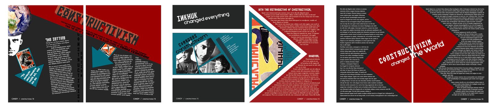
6-page magazine spread for graphics class, based on the Constructivist style.Unless you happen to know latin, don't even try reading it. Most all of it is placeholder text.
This would of been a lot better if I had enough time... I finished the last four pages/two spreads in under 30 minutes...
Plus it's sorta the first magazine layout I've ever done.
So have mercy.
Related content


Comments: 8

Not bad. Good color choices. Aesthetically pleasing.
Something to keep in mind is that when you use solid color as a background, with white or light text, it is more difficult for the eye to pick-out the letters, so it can be harder to read, especially if you are older.
One way around this is to choose a more robust font, sans-serif, or bold it, and then increase the tracking to add a little extra space between the letters.
Remember that the most important element, the primary element in text design, is readability and flow. This is a mistake often made in web design also. A very pretty looking web page, full of action and interest, but hellacious to get around or to find what you need.
Making it look pretty is the part of the design you work around and incorporate in the primary element.
So, easy to read for the target readers (not all readers are 20), carries the reader's eye the way you want it too, from element to element, and page to page, and designing it with innovation, creativity, and aesthetically pleasing to the eye.
If designers keep to the primary elements, they will be the ones with repeat clients who are very pleased, and with readers who appreciate your work. If it is beautiful, but they can't read it well, or keep getting lost, or can't find what they need, they will curse you to hell and back.
So, there are some elements of your design I like a lot, and some I don't. BUT, this is a very good first attempt. BRAVO.
I typed fast so I hope it makes sense.
👍: 0 ⏩: 1

This is pretty old work, and hastily assembled at that, so overall I'm not very proud of it.
I realize that white text on dark backgrounds is heckaharder to read. Just sort of ignored it here >_<. Thanks for the tip on the sans-serif bit though.
I have a couple of page spreads that should be up soon that I just completed, and that I think are many times better than this. Coming from sort of a more poster-based asthetic, I think it took me time to distance myself from that (which is centered on conveying a small amount of information vividly and quickly) to page layout, which is quite different, I believe.
Thanks so much for your critique : ]
👍: 0 ⏩: 1
What software are you using for text layout? Is it Photoshop?
Do you know how to adjust kerning and tracking for your text?
A TYPESETTING LESSON (ignore it if you already know it)
IMPORTANT: Don't forget that any time you enlarge a font size above normal text usage sizes, like for a title, you MUST do individual kerning to make it look good.
For Adobe products: (I think you can do some of this in MS Word too)
With all of the title text selected, choose the size of the text, but also set the TRACKING of the text as you do so. Go to the Text Palette under "A V" (with a double-headed arrow under it). Tracking uniformly increases or decreases the spacing between the letters. You can stretch your title accross the page, or squeeze it shorter.
Next, with all of the text selected, go to Text palette under "A / V" and set the KERNING to either METRIC or OPTICAL. Just try each one and pick the one that looks best (see my blurb on it at the end).
IMPORTANT: Then stand back and look at the spacing between each pair of letters for spacing that "look" to wide or narrow. For example, the space on either side of the letter "o" will typically look too big, others look too small.
Select the pair of letters you want to kern. Go to Text palette under "A / V" and set the KERNING for that pair. Experiment with it until it looks right.
Hope that helps some.
👍: 0 ⏩: 1
This was typeset in indesign. Although I don't know if I would call it typesetting, really. More like a lazy "lets throw this text on a page". Yeahh...
I do know how to kern and track, yuss. But thanks for the lesson.
👍: 0 ⏩: 1
I just posted a Tutorial with you mind. It is about Clipping Groups in Photoshop, if you are not already familiar with it. It is short and simple [link]
You can do amazing things with text in Adobe programs. You can almost custom make your own font. You can skew text (also individual characters(, you can make it taller, you can make it shorter, you can make it thinner, you can make it fatter, you can raise it and lower it, you can increase and decrease the space between lines, you can flip text vertically and horizontally, or both.
Here is info on how to manipulate text (typography): [link]
Here is info on how to text wrap in InDesign (very flexible): [link]
Here is info on text frames, threading text, Glyphs, etc, in InDesign: [link]
------------------------------------
I forgot to put this in my last comment (sorry).
Optical vs. Metric Kerning
Every font has in-built data on kerning pairs between its letters. For most cheap/free fonts, though those kerning pairs are somwhere between awful and non-existent. For a font from a major type foundry, like Trajan, there will be an exstensive set of kerning pairs. That's what you get if you apply metrics. Those kerning pairs were created by an expert font designer, and should get you good results...at the size they were designed for.
Which is generally around body copy sizes. However, kerning for text at display sizes is quite different to that at body sizes, and the metrics at that point are probably way off. That's where the optical setting comes in. There, Indesign tries to guess the correct kerning based on optical weights of the letters. It will usually get you far closer to correct than metrics at display sizes, but under most situations hwere you'd use optical, you should probably expect to need to do at least some manual kerning as well.
---------------------------------------
I hope this of of some assistance.
Best of luck...
👍: 0 ⏩: 1
"You can skew text (also individual characters(, you can make it taller, you can make it shorter, you can make it thinner, you can make it fatter"
When I was going through the typography unit last year, we were told it is generally a rule to never skew text or warp it... although that might just apply to skewing vs. true italics, fattening vs. true bold, etc, I dunno. Clear this up maybe?
In general, I ignored so many rules in the making of this layout. I know (at least have a basic knowledge)of optic vs. metrical kerning, tracking, text wrapping, type rules, etc. In general I seemed to just ignore all of them here >_<.
Honestly, It makes me cringe a tad.
👍: 0 ⏩: 1
In general, "Faux" bolding and italicizing of text is a bad idea. When a type face is designed, alternate faces for bold, semi-bold, italic. bold italic,, etc. are designed separately. This is because the tracking and kerning tables need to be adjusted to accommodate the different shapes and stroke thicknesses. A fonts designer adjusts these value to give the best overall look to his text, at normal text sizes.
So, if you faux bold a font face because there is no bold face available, all of the tracking and kerning will have to be adjusted to keep the original intent of the design (to make it look right).
Using InDeisgn or Photoshop to alter font characters is not inherently wrong in any way as long as it is adjusted for. Typically, the only time you do this king of thing is for "headline" or large character size, logo, and decorative character faces.
If you skew the letter "A" at by 20 degrees, and examine it as 10 points, then blow it up it up to 150 points, you will see no change in the quality of the character because the character is vector drawn, and the skewing is applies to those vectors at any size.
----------------------
As for this pice, please remember that at the time it was a big deal just to plan, design and implement the project, from inception to completion. There is nothing awful about it at all. We always have room for growth of skills.
Typography is something to have fun with.
------------------------
Bye-the-way, did you already how to use "Clipping Groups" in Photoshop?
Later,
👍: 0 ⏩: 0
