HOME | DD
 spacesuitcatalyst — the new hotel
Published: 2008-10-27 22:39:33 +0000 UTC; Views: 503; Favourites: 2; Downloads: 16
Redirect to original
Description
simple page layout,first publication design i've done entirely in indesign.
i used to use almost exclusively sans-serif fonts but..
i'm in a serif-mood lately.
in this layout i used:
Adobe Caslon Semibold Smallcaps and
Adobe Garamond (Light, Book, and Ultra Italic)
and i'm falling in love with Didot and Mrs. Eaves again.
i had another (slightly cooler, i think) one on experimental typography that i did, also
but i forgot to copy one of the pages over to my thumbdrive... sooo >_<
standby for that tommorow though
also the next part of hot tea bad dreams is on it's way
i've got it all worked out i just need to translate it into wordzdzzd.
Related content


Comments: 15

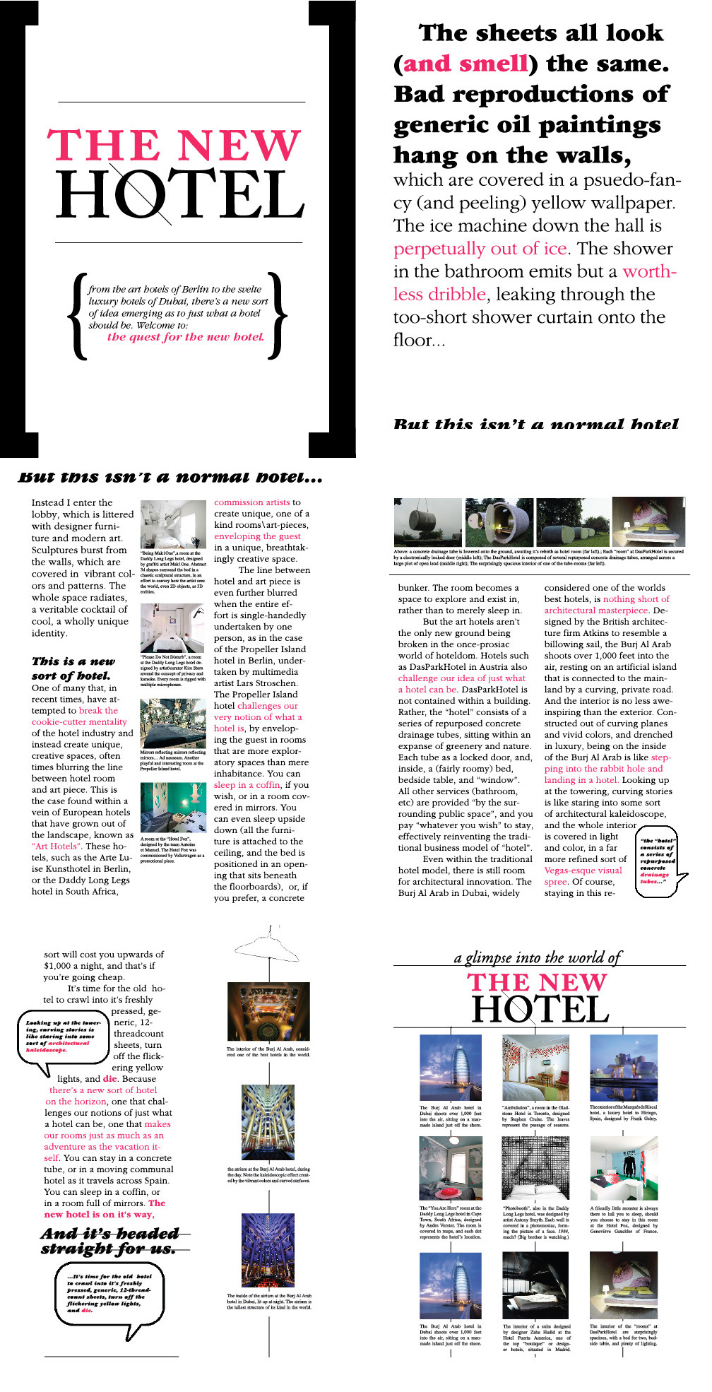
The Burj Al Arab hotel in Dubai is an amazing engineering and architectural feat. It was built to resemble the sail of a dhow, a type of Arabian vessel. Two "wings" spread in a V to form a vast "mast", while the space between them is enclosed in a massive atrium. It was built on a man-made artificial island. The architect is Tom Wright, of the UK.
One of the restaurants has a sea water aquarium holding over one million liters of water.
It is worth Googling it to see some pictures.
👍: 0 ⏩: 0

"The 'hotel' consists of a series of repurposed concrete drainage tubes."
I can't comment on the design. But the little subtle details, they intrigue me.
👍: 0 ⏩: 0

I had to work with it while designing the senior yearbook at my highschool. It had a penchant for crashing every 5 minutes. Maybe it was the version or something, but it was almost impossible to get something done without saving it every 2 seconds (which you should do anyways, but still) and restarting every 5 minutes was soul draining. I guess i just had a bad experience!!
👍: 0 ⏩: 1
It sounds terribly frustrating. It must be like working with Vita now (xd). All of the Adobe software has always been huge RAM hogs. The problems you describe would be typical of trying to run InDesign with way to little memory. If it was on a Mac before OSX, it was a really big problem because you had to know about manually allocating a higher memory partition to InDesign. Photoshop could get away with less because it utilized hard drive space as a "scratch disk" and for virtual memory, but InDesign did not. Once InDesign ran in native code on Mac OS X, there should not have been any problems, other than running slow when installed RAM was too low.
I worked in Adobe PageMaker for years, and did not update to InDesign until most of the big bugs were worked out. By the time InDesign made it to CS, it was a vastly improved program, and offered very real competition to Quark. Adobe push its marketing effort hard into the education sector from day 1, offering deep discount pricing to schools and universities. They figured it was a stealth attack on Quark's market share by getting new designers educated in Adobe software. It worked.
Perhaps it is time to forgive InDesign its many beastly crimes, and grant it mercy. Judge it on the present, not the past. It may help make you a lot of money (hopefully).
I am less forgiving every time Adobe asks for another $600 to upgrade its Suite. I have been skipping an upgrade, since it costs they same if you are upgrading one version, or two versions.
👍: 0 ⏩: 1
Most of the problems stemmed from the imagein function, since that was what we had to use, even if import was an easier way to place the pictures. It would sometimes take imagein 20 minutes to open up, and around 5 minutes to place the pictures, we were on a group server with the whole school. I had a lot of free time working on the yearbook. 8 times out of 10 it would crash while opening.
While imagein was frustrating, i was also in charge of designing the actual pages. This was easier to do, but it was annoying when i would put in a day's work and find that someone else had changed it beyond recognition the next day. People would change my finished pages that were to be sent out to the publisher the same day, and they would always put us behind schedule. We were so behind that we got the yearbooks around may 22nd, the day of the mine, and the other senior's last exam. Every other year the yearbook was finished and delivered by the first of april! It was a mess.
I'm sure if i used it again i wouldn't have such a hard time, but i haven't had the opportunity.
👍: 0 ⏩: 1
Oh, I thought you were using InDesign to do your layouts. What are you currently using for your page layouts?
One good thing about the yearbook mess is that now you know much more about group workflow problems. Whoever was in charge of the entire project was not maintaining control over the workflow.
👍: 0 ⏩: 0

me too it's horrible it's like freebasing arsenic
👍: 0 ⏩: 1
Them's fightin' words. ID's heavyweight champeeen--just may kick yo ass. xd
👍: 0 ⏩: 0
NOTE: For some reason, the subhead "but this isn't a normal hotel" got the bottom cut-off of it in one place, and got the top cut-off of it in another place. This is probably a layer overlap problem that only showed up when you flattened it.
------------
I like the overall design of this a lot, as well as some unique design elements.
I like the slash through the "O" in Hotel. The fonts work very well in this layout. Your use of color for highlighting works really well, and your rule lines to guide the eye through the graphic elements are also well designed.
------------
For a professional polished look, the columns should probably be justified right and left, which I know is a LOT more work. It is a lot of work because some lines may need to be manually adjusted to clear "keep violations" and make it look good if there are too large gaps or too small gaps (fix by adjusting tracking, non-breaking spaces, etc.).
Note: in InDesign, be sure that "Paragraph Composer" is on: Go to the Paragraph Palette and pull-down its menu and check to see if "Paragraph Composer" is checked.
Note: If your Adobe fonts are OpenType fonts, be sure to make sure sure the OpenType feature you want are turned on: Go to the Character Palette and pull-down its menu. Go to the OpenType submenu to select which features you want. This is a powerful tool.
The vertical center white space between the column sets could have been narrowed some to give the other columns a bit wore width. I agree it should have enough width to effectively divide the two halves.
The bottom left text column looks particularly ragged, and could easily have been widened.
When I zoom out to see it in its entirety better, the top right's white space is a bit out of balance, with all of the white space below the main text.
Questions:
Bottom-left where it says "And it's headed straight for us": Are there supposed to be two lines crossing through the text?
In the large bracket area, where it says "Welcome to:" then "the quest for the new hotel", which is in pink: Is the pink text positioned as you intended?
Why did you indent "The sheets all look..." in the top right?
-------------------
I know I made a lot of comments and questions, but please keep in mind that I like this design, and that I am only pointing out minor things for future consideration.
You are making good progress in your page layout skills. You have a definite feel and talent for this kind of work.
As you learn more and more about InDesign's features, it will become much easier to do.
👍: 0 ⏩: 1
The subhead-cutoff was actually a purposeful maneuver, albeit one that no one seemed to get. I guess that's how it works in design - what makes sense to the designer doesn't always to the reader.
I considered justification, and, you're right, it probably would've looked cleaner with it. I guess I just got lazy after spending foreverrr trying to fix all the widows and orphans and et cetera >_<
Thanks for the tip on the Paragraph Composer, etc. didn't know bout that.
The lines on the "and it's headed straight for us" were intended, yes. I was in a strikeout mood and i personally thought it helped set it apart from the rest of the text, as well as playing well with the black rules i have throughout the piece.
The "quest for the new hotel" bit was purposefully positioned that way, yes. Although now I wonder if it'd look better flush left...
as for the indent - i have no idea. probably just a habit left unchecked. nobody's noticed that till noww.
InDesign is definitely more friendly now that i've had some experience with it, yuss.
👍: 0 ⏩: 1
When I woke up this afternoon, laying in bed, I started thinking about your layout (why, I don't know), and the thought popped into my head that the split sentences mat have been intentional. Is that bizarre or what?
Strikeouts will tell most people that the information is wrong.
-------------------
Optical Margin Alignment
One of the secrets to a professional looking text layout is Optical Margin Alignment, not to be confused with Optical Kerning (see number 10 of the InDesign tips below, for more detailed info).
The Optical Margin Alignment option is found in the Story panel (choose Story from the Type menu to display the Story panel).
When you select an InDesign story (with either the Selection or the Type tool) and turn on the Optical Margin Alignment option in the Story panel (choose Story from the Type menu to display the Story panel), the program balances the edges of the columns based on the appearance of all of the characters at the beginning or end of the lines in the column. This adjustment makes the columns appear more even—even though it sometimes means that characters are extending beyond the edges of the column.
The amount that InDesign "hangs" a character outside the text column depends on the setting you enter in the Base Size field of the Story panel (that's the field with the icon that looks like it would make a drop cap). In general, you should enter the point size of your body text in this field.
[ Because the eye doesn't "see" punctuation, it can sometimes appear that the left or right edges of some columns of type (especially justified type) are misaligned. Some other programs compensate for this problem by using a "hanging punctuation" feature, which pushes certain punctuation characters outside the text column. But there's more to making the edges of a column look even than just punctuation. Some characters can create a "ragged" look all by themselves—think of a "W," at the beginning of a line, for example. ]
------------------------
Glyph Scaling: With Glyph Scaling, you give InDesign permission to horizontally scale the characters in the paragraph to make them fit (see 06 below). When you enter anything other than 100% in any of the Glyph Scaling fields, you give InDesign permission to horizontally scale the characters in the paragraph to make them fit. No one can see the difference when you allow InDesign to glyph scale plus or minus one percent (and sometimes even two). The benefit of allowing a small amount of scaling is huge, especially in magazines, newspapers, and any other publication with narrow column widths. Of course, you can also enter larger values to use Glyph Scaling as a wacky design effect, but you'll have to endure the scowls of virtually everyone.
------------------------
Read about Balance Ragged Lines in 06 below.
------------------------
Read about "Keep Violations" [link]
------------------------
InDesign CS3 Help [link]
------------------------
The following Info is is really helpful. I especially suggest you look through 02, 03, 06, & 10.
Tips for Working with Text in InDesign CS3
01 Selecting and Formatting Text [link]
02 Character Formatting [link]
03 OpenType Fonts [link]
04 Find Font [link]
05 Filling and Stroking Characters [link]
06 Paragraph Formatting [link]
07 Bullets and Numbering [link]
08 Styles [link]
09 Copying Styles from Other Publications [link]
10 Optical Margin Alignment [link]
-----------------------
I hope this information is of use to you. InDesign is a very powerful that I am still learning about, after all of these years.
👍: 0 ⏩: 0

*cough*duplicateimagesonpagesix*cough*
No, really though, as many lame "give me your opinion" answers I gave you on this during it's first stages, I really like it.
")
👍: 0 ⏩: 0

