HOME | DD
 Sparkleswords — CDC June 29-(Not a) Happy Camper
#fireperson #summer #fire #cdc #cdchallenge
Published: 2016-06-29 20:29:52 +0000 UTC; Views: 434; Favourites: 17; Downloads: 0
Redirect to original
Description
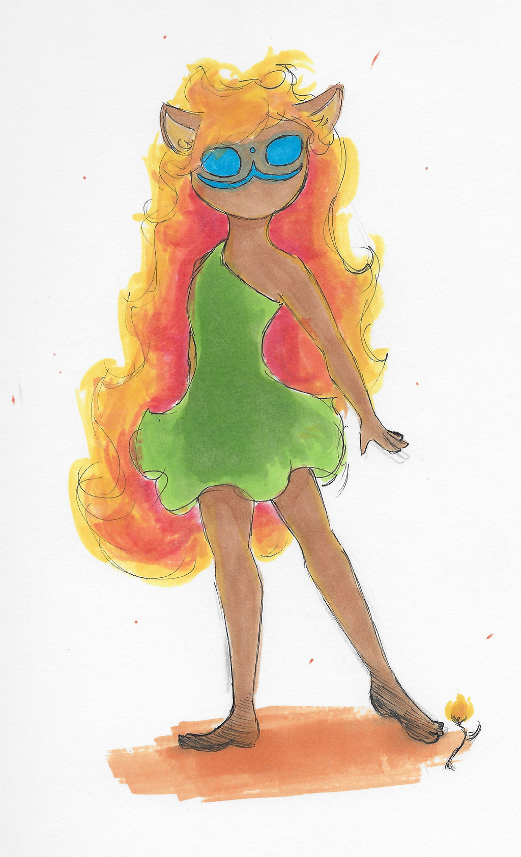
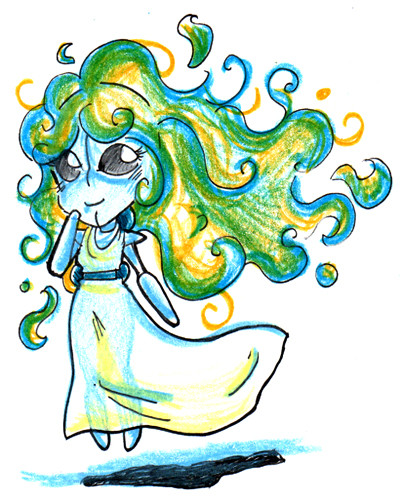
Today is a sort-of redesign of my Summer Spirit character, from the summer camp prompt. To be accurate, this is the Time-to-Set-Everything-on-FIRE side of her personality. The side you want to avoid, very carefully.
Related content


Comments: 15

What I like about this piece: The pose and face are interesting and can easily catch a viewer's eye. The anatomy in the legs and face are well done. The colors oddly compliment one another (even though that isn't a color pallette most people would choose.) The concept is stellar, and makes your piece more beautiful and original.
What I feel needs improvement: The arm, shoulder and hand are a bit off. I wouldn't say it takes away from the piece overall, but it can be a bit distracting if you stare at it too long. The dress doesn't seem right, like I get the whole "flowing" aspect to it, but I feel that cloth is something you should definitely look into. The right foot probably also shouldn't look like that, but that just a nit-pick honestly.
Also, this is just a silly opinion, but I'm not a huge fan of when people add cat ears to their drawings. I can't help but feel it would've been better if you didn't add them, but then again the cat ears may seem appealing to other people. Hope this critique can help you, and have a nice day.
artist-refs.tumblr.com/human
www.youtube.com/channel/UC5dyu…
👍: 0 ⏩: 1

Thank you for your thoughts! I'm glad you think the color scheme works...I wasn't 100% sure about it myself, but I guess it turned out well enough.
I should note though, that those ears ain't cat ears...they're actually slightly-less-diamond-than-they-ought-to-be deer ears! It would probably be easier to tell if the bottom part wasn't covered up, though.
")
👍: 0 ⏩: 0

She's adorable. Really love the color pallet you chose for her, it's very summery and the colors all work together. I really like how you shaded her dress. That really dark shading in the center of it with sort of a halo around it. I love her hair, it gives off this fiery feel, and her ears are precious, like a lion cub's.
I like how the blue details on her face seem to be glowing. I can't quite tell if that's a mask or her face, but it's very interesting. One thing I might suggest to play around with is that 3 line at the bottom of her face looks a little close to her stylized nose and eyes. It's kind of interesting, but you might want to play around putting the features of her face lower in her face.
Also, that sort of cross-hatching you did on the bottoms of her feet are interesting and give your lines some interest. Your lineart in this picture is very sketchy and there isn't a lot of variation. While that may be intentional, you might want to consider playing with that sort of cross-hatching and adding it to her hands or use it to shade.
👍: 0 ⏩: 1
Thank you for your input!
Ha, that comment about the lineart ...I realized just a bit late that I actually forgot the very last detailing step that I usually put in. You caught me! ")
👍: 0 ⏩: 1
Well, I used to have flat line art without much line variation. It's just something that makes the art more interesting
👍: 0 ⏩: 0

I'm here from ProjectComment , and I’m commenting as part of the Give and Get 2 Comments, 5+ Lines project.
Here's the feedback on your work!
Strengths:
- The pose. The pose is speaking for the character - it is very strong.
- The colors. They go really well together, good job!
- The head. I love her facial shape and the ears. Cute ears
Weaknesses:
- Anatomy. It is good, but there are some mistakes: the shoulders can sort of be explained by an asymmetrical dress (the use of such a dress in a drawing is not justified (not worth it, meanwhile you might visually confuse your audience). The left foot should be turned a bit more towards us, cuz it's unnatural and disturbs the harmony of the pose a bit. The right leg is too short (because she's extending it to the side, it should be longer than the left one, which is a bit bent). Still something wrong with the shoulders area. It might be due to this:
- Shadows/volume. Not enough and too even. The shadows can't be of the same intensity everywhere, they need to be a bit more intense in some places, especially shadows on her body to clarify the pose she has (the neck area specifically).
- A similar thing with the hair ^ It would look a lot more visually interesting and effective if you would add more colors to her hair.
Overall great job! Good luck and I hope that this helped!
")
👍: 0 ⏩: 1
Thank you for your thoughts.
 (Smile)")
👍: 0 ⏩: 0


Thank you!
👍: 0 ⏩: 1

That you did, keep up the awesome art work.
👍: 0 ⏩: 0