HOME | DD
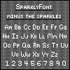
 SparklyDest — Creeper Pixel
Published: 2011-10-12 17:14:42 +0000 UTC; Views: 6481; Favourites: 232; Downloads: 620
Redirect to original
Description
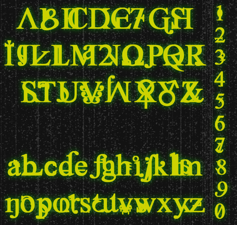
Hopefully this is an acceptable entry for `shelldevil 's Thriller! A Resource Contest . I jammed out to Thriller by Michael Jackson while I worked on this font, so it was heavily inspired by the song.")
I have been itching to do another font. And why not do one inspired by the upcoming holiday. I know what you are thinking. "But Sparkly...all of your fonts are kinda halloween and spooky inspired." I know, I am okay with that. This just gives me a good reason to do another.

~~~~~~~~~~~~~~~~~~~~~~~~~~~~~~~~~~~~~~~~
Some advice when using this:
It is used best at 6 pt (16 pixel).
As a heads up, in some instances you might have to add a random letter to have your word come in crisp. You can then go in and erase the letter manually. (If someone knows of another way to correct that, please share.)
~~~~~~~~~~~~~~~~~~~~~~~~~~~~~~~~~~~~~~~~
Stock Rules
 Credit me with a link in your artwork's description. Comment on the deviation you used, or note me, with a link to your artwork. Chances are, I will love it like a proud mama. Prints and outside use, blah blah, yeah...I don't care. Credit me when you can.
~~~~~~~~~~~~~~~~~~~~~~~~~~~~~~~~~~~~~~~~
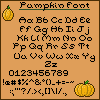
Examples:

Related content


Comments: 39


Heeey can I ask what program did you use to make your font?
👍: 0 ⏩: 1

fontstruct.com/
No program, do it all on this site.
 (Smile)")
👍: 0 ⏩: 1
Ah I see, thx anyway. ^^
👍: 0 ⏩: 0

Hello! I used your font on my icon right here. Hope you don't mind ^^ [link]
👍: 0 ⏩: 1
Not at all! Thanks for letting me know!
👍: 0 ⏩: 0

I love your fonts!~
I shall use them all xDD
👍: 0 ⏩: 1
Thank you! 
👍: 0 ⏩: 0


When I saw they announced the winners, I ran over to check and totally squeed when I saw your there!
👍: 0 ⏩: 1
I have been waiting for the results, almost stayed up last night to see them, but the cold has been making me soo tired. So, when I got up, I opened it up first. I may have done a soft "Yes!" with 

👍: 0 ⏩: 1
Well, it was well deserved.

👍: 0 ⏩: 0

Hi, I used your font as a base for this: [link]
I hope it's okay that I made a few changes
👍: 0 ⏩: 1
👍: 0 ⏩: 1


👍: 0 ⏩: 0


Can I tell you...my heart stop this morning when you uploaded your Vampire Font. Since we talked the other day on your Horror Font, I have been really working on a new font...with Vampires being the way I wanted to go. Lucky for me, I wanted the letters to have a more fangy feel. I looked at your font, and loved it, but refused to look too closely because I didn't want to accidentally be inspired by your awesomeness. 
Thank you for your kind words!
👍: 0 ⏩: 1

You know, I was worried you might do a vampire font, when you mentioned working on one. I thought to name mine something else, but I honestly could not think of what to name mine. LOL! The *only* thing that came to mind was Pixel Apocalypse, but it didn't look like a zombie font at all. So, I struggled and said, "oh well" and hoped for the best. I would have never thought of "creeper."
Honestly, calling it "Creeper" is very appropriate. It has that tall, creepy feeling to it. I wasn't kidding when I fainted. I think this is amazing. I think between the two of us (and throw Bliss in there) we have the horror pixel fonts covered.
Also, don't worry about fonts looking similar. That's a big "problem" with pixel fonts. Because of the small sizing, you'll find many fonts look similar, even if not deliberate. Honestly, that is a problem with traditional fonts, too, especially when getting into the book-type lettering.
Ah well.

👍: 0 ⏩: 1
Well, originally I wanted it to be very vampire....but I knew I wanted to enter this contest with a font, so I started to lean toward something more zombie-ish. This doesn't feel quite like a zombie font, but pretty close, so I was really happy when I thought of the name "Creeper". I was also inspired by the Thriller song and how the dancing almost looks like creeping.
And yes, horror fonts...my fort(e with the hashmark to make it sound "ay"). I am thinking I should branch out now, trying something a little less spooky and predictable.
Yeah, I noticed a few of our letters looked pretty close, but I chalked that up to the size of our canvas. You can only get so creative with a small space and, say, the letter "h".

👍: 0 ⏩: 1