HOME | DD
 splitadam17 — Vector A Gradient Splatter

Published: 2004-11-19 05:37:59 +0000 UTC; Views: 1290; Favourites: 3; Downloads: 232
Redirect to original
Description
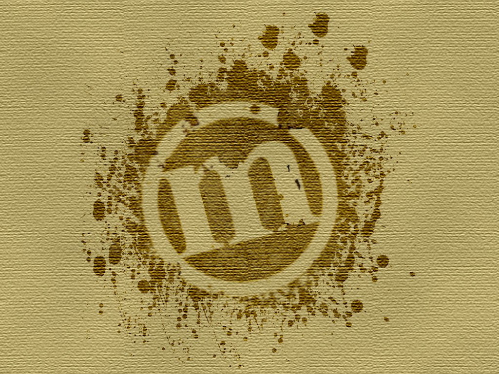
Ok, i'm learning illustrator and mixed a bit of what i did in it with a splatter effect i come quiet good at creating over time... tell me what you think, i know the logo is extremely generic i am really just learning illustrator.... please comment!!! - AdAMPS if anyone wants this with a different style or color background just gimme a holla and ill be glad to help out if i can
Related content


Comments: 8

I made a personal version in blue with a grey background and some trendy line effect.
👍: 0 ⏩: 1

awesome! thanx for commenting! i'd love to see it
👍: 0 ⏩: 1
check your email. I never said mine was good, I just needed a better match to my current theme.
👍: 0 ⏩: 1
i saw, its not bad, you did a good job of altering without signs of it being changed, its a lil lacking of contrast for me but if it matches your theme than so be it, then its perfect.
👍: 0 ⏩: 0

i like it.
looks like someone shot a paintball at a wall then drew in it with their finger
👍: 0 ⏩: 0
i like how it looks like someone shot a paintball then drew in it with their finger O_o lol
👍: 0 ⏩: 0
i like how it looks like someone shot a paintball then drew in it with their finger O_o lol, i like it
👍: 0 ⏩: 1
thanx... i gues it could look like that...... maybe... lol, im not sure if it was intentional but the same comment was submitted from you 3 times.. probably wasnt you, DA has been spazzing a good bit
👍: 0 ⏩: 0