HOME | DD
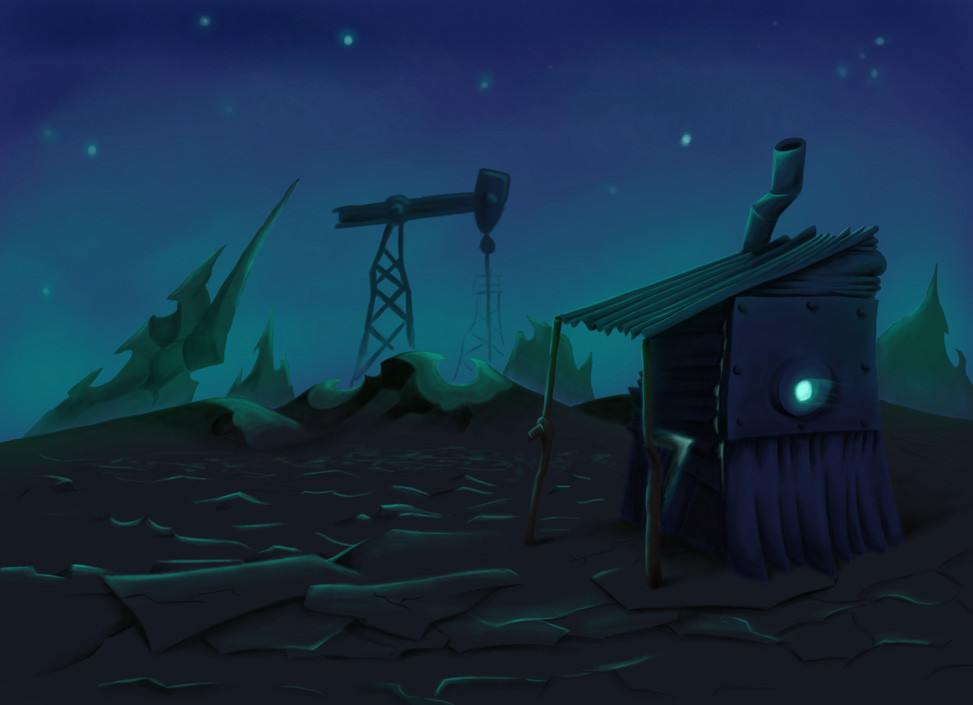
 Springymajig — Bright side of the moon

Published: 2006-03-04 08:57:19 +0000 UTC; Views: 1941; Favourites: 73; Downloads: 111
Redirect to original
Description
Sort of a concept/test for my background design for 3rd year. I was experimenting with how to colour the backgrounds... I'd rather not show linework in the backgrounds cos it would probably end up looking cluttered with characters on it (I did draw the linework by hand for this but painted over it digitally). Unfortunately, this took quite a long time... and I dunno if I can manage to do 20 odd backgrounds of this detail... I'll see how things go (I should be a bit faster if I try it again).I dunno if I pulled it off well or not, it's my first try at that kinda thing (not leaving in the linework that is), any tips would be appreciated
Also, I don't think I understand lighting well at all, so any constructive crit in this area that anyone can give AT ALL would be nice.
One more thing... I tried fiddling with the opactiy to create depth, did it work?
Related content


Comments: 46

The movie entropy was the second to make me start drawing
👍: 0 ⏩: 0

i don't think it should be changed at all i love it the way it is, after seeing all of this art work i wanna watch Entropy again c:
👍: 0 ⏩: 0

i love the video Entropy and i like the art style used for the moon i looks so cool
👍: 0 ⏩: 0

I think everything looks amazing and you don't need to change a thing~

👍: 0 ⏩: 0

I love the surreal-ness of this background!
 (Smile)")
👍: 0 ⏩: 0

Its really awesome...(can't believe I missed this). Just like everybody else said it just needs to have edges cleaned up a bit, otherwise no problems. Totally sweet.
👍: 0 ⏩: 1

can't believe this has '6' favs - it's gorgeous really

👍: 0 ⏩: 1

Thank you! I don't get many page views... but a favourite from someone who's work I admire so much is worth more than like... 100... or something.
👍: 0 ⏩: 0


I really like the colors and perspective. Nicely detailed and stylized.
👍: 0 ⏩: 1

extremem dude O_O man ur guys projects kick ass so early on O_O
👍: 0 ⏩: 1
Thanks... that means alot coming from one of the best 3rd year students from last year
👍: 0 ⏩: 1
haha no way XD i didnt even finish half my assignment D:
but thx

👍: 0 ⏩: 0

this leaves me with much curiousity about the rest of the world and any related project; the hallmarks of a great background
👍: 0 ⏩: 2
are you using Flash to make the film?
👍: 0 ⏩: 0
Thanks for commenting... my short film will have 2 main locations... this is the moon, the other is 'Earth'... both are more surreal kinda interpretations... used to convey a certain feeling and stuff. So Earth will look horrible and nasty, and the moon is meant to look nice and happy.
When I get ound to colouring the 'Earth' concept I'll upload it too but I'm having far more troubel with the moon environment so I've been working on it alot more.
👍: 0 ⏩: 1

That's funny stuff!
Instead of the usual "dark side of the moon", it's the bright side.

👍: 0 ⏩: 1
Hehe... I thought I was so clever back then
👍: 0 ⏩: 1
In all seriousness, I need to work on my background skills
I've been meaning to play around with traditional animation as a hobby. (and also for experience, haha)
For a background, you got the surreal you wanted.

👍: 0 ⏩: 0

I think I'm going to hire you to do my backgrounds, what are your rates?
👍: 0 ⏩: 1
I'll have to check my figures and get back to you.
👍: 0 ⏩: 0

Tsk tsk Dane, this is just way too cool...
Seriously, stop it...
C & C eh?
Ok, firstly the colours you've chosen are AMAZING, they work perfectly. You've created a good sense of brightness on the lightest part of the ground, that golden yellow colour is beautiful.
Suffice to say that everything about the background is totally brawsome, but since you wanted some critiques I'll try that.
You've done the light and shadows really well, but on the craters and curly bits it seems a bit vague. The curly bit in the far background doesn't really seem to fit the contour of the moons surface either, but I guess you could say that's a style thing (just that with such realistic colours it makes it a bit out of place).
I'm not such a fan of the way the closest arch intersects with the curve of the hill behind it, for instance I think it would have looked a little clearer if the bottom part of the left hand side extended up past the hill a bit more.
Not quite sure about the moon-part in the distance... Does the moon have it's own moon? If it does it looks pretty cool, if it's meant to be part of the same moon it looks kinda wrong.
About the softness of the image overall, chuck the final jpeg/bmp into Photoshop and go Filter > Sharpen > Sharpen More. Instantly better like magic!
Hope it doesn't seem like I'm ripping it apart, cos it's seriously wicked. Even if you changed all that stuff I don't know if it would make a difference, considering it's just a background to the onscreen action. If you manage to make all of them look this good your final product will be incredible!
👍: 0 ⏩: 1
Thanks for the in depth comments, most appreciated. I think I do have to work on the idea of the spirally end of the moon... it doesn't look like it's part of it. It doesn't need to be there at all but if I can make it work then I'd love to use the idea cos it'd be a nice touch. I dunno... maybe the tutors can help me with that one.
The curly bits look vague cos I wasn't really sure what to do with them... maybe I should make them look engraved into the ground? I guess that would work. I'm not so sure what you mean about the craters but I'll study the photo's closer and keep practicing them so I get better at it.
And the sharpen filter thingy works brawsomely... thanks!
👍: 0 ⏩: 1
Could have the spirals coming up out of the ground getting higher towards the centre, just a couple light tests real rough but you get the idea - [link]
👍: 0 ⏩: 0

that.... is.... so COOL, great job, this is styley az, i can give any help coz im not an artist, but to me this is so cool! nice one dane
👍: 0 ⏩: 1

Damn thats howt Dane, I mean it really, it looks like something totally pro. If you want crits tho, Ill give em. You seem to have a lightsource comin from the front right, thisd show up a wheeeeee bit more on the clouds, even the mooon, which are fading a bit much into the background. Erm, and yeah, thats it, top stuff bra!
👍: 0 ⏩: 1
Thanks... aaah... forgot to show the shadow on the clouds! The cresent edge of the moon does have shadow but I was silly and blured it heaps... I thought it looked really neat but I wasn't sure if it was a bit excessive so thanks for commenting on that.
👍: 0 ⏩: 1
Holy crap, I just realised the moon has a moon. Thats trippy!
👍: 0 ⏩: 1
Hehe... actually... the idea is... the moon is cresent shaped, so that is the end of itself, seen in the distance. That's why the right side of the ground slopes upwards so sharply.
Either way... trippy is good
👍: 0 ⏩: 0

turned out good dane.. dont doubt yourself. yours is the best stuff i have seen in class so far.. WHAT A SHOW OFF
👍: 0 ⏩: 1
Thanks for the support... jeez you just added practically my entire gallery to your favourites you crazy crazy man!
👍: 0 ⏩: 1

This is what I wish the moon would look like. It's very good, you could maybe clean it up a bit, like the green balls in front right of the pic, but hey... I horrible at cleaning things like that up. lol.
All in all, it's really good though.
Are you in school for graphic design?
👍: 0 ⏩: 1
Thanks, yeah I'm pretty terrible with cleanup with a pencil let alone a tablet (at least I don't have to use a mouse anymore ")
I'm doing classical animation BTW... we have to do a 2 minute animated short for our final year, I'm hoping for my backgrounds to look something like this.
👍: 0 ⏩: 1
I'm horrible with cleanup, too. I hate using mouses (mice?), because I'm left-handed and I can't afford a left-handed mouse. ARGHHH.
Now that you mention it, it probably could be a little sharper, but it's still really good.
Classical animation, that's awsome. Do you use Flash? I've only used it once. I would have liked to use it more, but I couldn't. My school wanted me to pay for an extra optional quarter (my college went by 10 week quarters), but I didn't want to do that-I wanted to get out of there. But my teacher "secretly" taught my 3 friends and I the basics of it. She wasn't supposed to, but we had to promise her we wouldn't tell. lol.
Anyway, have a good day!
👍: 0 ⏩: 1
Cool... nah we don't use flash... just pencils and paper, and supposedly we use Toonboom to colour and Premiere to put it all together.
👍: 0 ⏩: 1
Yeah...that might explain the name "Classical Animation." I'm such a dumbass. Sorry, lol. I've never heard of Toonboom or Premiere. I hope it's fun when you get to use it! So have you thought of any characters for your clip yet?
👍: 0 ⏩: 1
Yeah... I got my characters and story all sorted, once I have final modelsheets for them or at least some cool drawings I'll post them too (mostly just doodles at the moment).
👍: 0 ⏩: 1
Awsome, I can't wait to see them.
👍: 0 ⏩: 0

i like the colours you used.
the shading looks good to me
👍: 0 ⏩: 1