HOME | DD
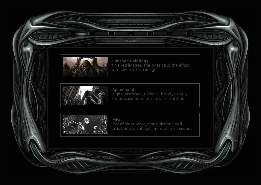
 spyroteknik — spyroteknik v3
Published: 2004-12-17 00:44:15 +0000 UTC; Views: 9388; Favourites: 75; Downloads: 4478
Redirect to original
Description
painted in psCSproposed final design for the 3rd incarnation of spyroteknik, dark and symmetrical, i love symmetry, and darkness
 (Smile)")
dummy content, text looks odd, thumbs are going to be nicer, just a placeholder for when it gets coded, iframe content, gallery on scaleable page (see below for scaleable version of iface) wil have all that php/css/xhtml stuff - courtesy of koobistudio, i hate coding
")
2nd page - [link]
online next year sometime, im really lazy
 (Wink)")
Related content


Comments: 71


Really something in my taste, but still, it needs color.
👍: 0 ⏩: 0


This is one of my favorites. Its really well done, and you're awesome at doing metal & wires n stuff.
Really reminds me of some of HR Geiger's paintings
👍: 0 ⏩: 0


!!!!!!
I want steal absolutelly your skin/menu!! Can i steal it ? eh? eh? eh?
I love simmetry too!
+fav !!
👍: 0 ⏩: 0

(The symetric is nice but i think you should have global light and not just repeat the sides.)
👍: 0 ⏩: 0


nice painting , i love dark paintings
keep up the good work
👍: 0 ⏩: 0


Looks very damn good. And considing you painted it ><
its very desvering of a fave.
👍: 0 ⏩: 0


Awesome work, looks a lot better than the other version!
👍: 0 ⏩: 0


Amazing design mate. Really like it. Any release date?
👍: 0 ⏩: 1

thx man, nope, but it will be reasonably soon, coding is being taken care of at the minute
👍: 0 ⏩: 0

very nice template! love the darkness, as always, and likethe biomechanical theme too.
👍: 0 ⏩: 0

Your work is familiar with H.R. Gigers work, and I love his workas as well as I love yours.
👍: 0 ⏩: 0

Absolutely incredible.
The image is totally symmetrical! (Well atleast to the human eye)...and this fact only adds to the cleanliness of the picture.
What I like most about it is that it looks decorative in many many many ways, yet the image still maintains a great sense of efficiency (if thats the right word that I'm feeling)
It actually reminds me just a tad of the official H.R.Giger site but I don't know if thats a good thing to you.
Bloody great job and I look forward to seeing this up on the Net.
👍: 0 ⏩: 1
thankyou
👍: 0 ⏩: 1
Indeed....your imagination is powerful if it is acknowledged and used.
I think in this day and age, it's very difficult NOT to create something that does'nt look similar to something else that exists. I will agree though that your work is'nt........randy...like Giger's but that only makes me want to see more of it!
Also...I think you deserve alot of praise not only for your amazing artwork, but also your feedback ability. I mean, there are a few of you expert artists on DeviantArt, but they often they fail to reply to any questions and praise. Seeing that you replied to my last comment, with a decent answer too, you deserve many thumbs up.
Keep on going, your art is highly inspirational to no limit.
👍: 0 ⏩: 0


The graphic part is very, very good. HOWEVER! Think about making the headline ("GALLERY") bigger and more legible (stoopid pixel fonts) and the text a bit brighter. Also, you might want to put more emphasis on the title.
It'd be very sad to see this great piece ruined w/ beginner mistakes.
👍: 0 ⏩: 1
thx
agreed, 'dummy content, text looks odd, just a placeholder for when it gets coded', i used to run a webdesign company so i won't be making any beginner mistakes
👍: 0 ⏩: 1


very nice man...
you should make a simple layout for our battle and I can buy a domain and Sam may sponsor it and Bane may code a user interface...what do you say?
👍: 0 ⏩: 0


i understand your love for symmetry
great work btw ")
👍: 0 ⏩: 0

hee hee nice as usual and dark and symetrical...hmm nothing like any of your usual stuff (yes im being sarcastic.!) looks real good.
👍: 0 ⏩: 0

The coding shouldn't be that ahrd for this one bro, even for you ; ). Anyway good work on the whole interface and its looks. I've never been fond of symmetry to be honest, at least in artworks, i'm more a man who likes variation and differences. Still, i'm pleased with the result. It suits you and the detail is of a pretty high caliber so imo you've succeeded with this portofolio. Now its time to get it up ok ; )
👍: 0 ⏩: 0


excellent design and realization. looks influenced by HR Giger.
👍: 0 ⏩: 0


Wow, I'm gonna keep an eye on this, since I'm trying to make my own websites less poop. ^^
👍: 0 ⏩: 0


Good on you for all the complex coding stuff. What I'm planning for my website, which I hope will get done by the end of the month, is tables and the really basic stuff.
👍: 0 ⏩: 0

it incredebal work, if it maket only in shop...
Respect!
👍: 0 ⏩: 0


This is impressive indeed. And my mom tells me "If it is not symmetrical, it is not right". Of course she was refering to my organization skills - hehe..
Just a comment about the font. The color is nice, but it just blends with the frame (I didn't know there was text there). You might want to just lighten the shade a little bit.
👍: 0 ⏩: 1
yep, will do, text was added in ps, resized etc so it's pretty illegible, coded will be clearer
👍: 0 ⏩: 0
| Next =>