HOME | DD
 spyroteknik — spyroteknik v3

Published: 2004-12-17 00:44:15 +0000 UTC; Views: 9388; Favourites: 75; Downloads: 4478
Redirect to original
Description
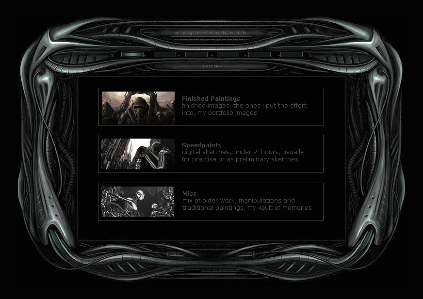
painted in psCSproposed final design for the 3rd incarnation of spyroteknik, dark and symmetrical, i love symmetry, and darkness


dummy content, text looks odd, thumbs are going to be nicer, just a placeholder for when it gets coded, iframe content, gallery on scaleable page (see below for scaleable version of iface) wil have all that php/css/xhtml stuff - courtesy of koobistudio, i hate coding


2nd page - [link]
online next year sometime, im really lazy


Related content
Comments: 71

pseudo-gigeresque design (thankfully without directly aping his works like many other people i and giger himself have seen).......compelling layout.......well done
👍: 0 ⏩: 0

Lovely 

👍: 0 ⏩: 1

nooooo lol, last one took weeks, doubtful i'll do that again 
👍: 0 ⏩: 0

stunning work 
👍: 0 ⏩: 0

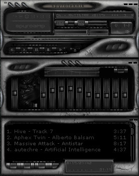
Awesome! Reminds me of the breedart winamp skins!
👍: 0 ⏩: 0

awesome design man xD
really nice monochromatic design, think colours might ruin this piece (aside from maybe lights, but then they aren't really needed).
Nice dark design, now to code it
👍: 0 ⏩: 0

The feeling of the material is really good, and your dead right about symmetry. I would recommend you make the saturated green areas that are supposed to be refraction a little less sharp; in nature you will fine sharp streaks but not sharp blobs. If you seperate the blobs or connect them with like streaks along the surface of the material you will find it to have a much more accurate look. What you have now is inaccurately produced by curves utility in photoshop which I only recommend one uses when they understand the math involved.
I hope you do not take this offensively I really like the interface.
👍: 0 ⏩: 1

thx man, i lightened it up slightly at the end(brightness/contrast), think the stem of it comes from the unsharp mask i ran over this jpg, bit too crispy (almost sure i already ran it once, so the second killed even more pixels hehe), the coded version will be smoother (only ran it slightly over that version, just enough to bring out a few details, not enough to kill the contrast as much as this), would never take offence at crits, much appreciated 
👍: 0 ⏩: 0

that looks great , im sure it'll be a great portfolio !
👍: 0 ⏩: 0

haha, i know, only just twigged that it's been offline for 7 months
👍: 0 ⏩: 0

incredible!
i love the symmetry too!
love the way you can create such a convincing metalic look!
👍: 0 ⏩: 0


