HOME | DD
 Squiddosnazz — Bee Contraption

#abstract #bee #collage #contraption #digital #doodle #drawing #gears #illustration #mechanical #mixedmedia #multimedia #patterns #pen #photographs #steampunk #washer #art
Published: 2018-01-08 01:15:20 +0000 UTC; Views: 700; Favourites: 45; Downloads: 0
Redirect to original
Description
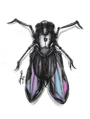
First time experimenting with multimedia collages.This was created with 0.1 and 0.3 Micron pens, collaged photos and digital manipulation.
Please leave critique! Also a disclaimer - The bee's anatomy was modified in favour of good composition, so the curved wings are not intended to look like actual bee wings.
If you'd like an artwork similar to this, commissions for small pen drawings are currently open for only $10 AUD apiece. Message me or comment if you'd like one!
Related content
Comments: 22

Hello, here providing a comment from
I have to say, this is a well put together collage. The bees and circles (sorry, i don't know what those are called ;_; ) are clearly photos, but they're so well pasted into the image that they look like they are a part of it. The bee you DID draw is so finely detailed, it has so many itty-bitty textures and all that cross-hatching must've taken alot of patience and work. The abstract background has a very interesting design, and i think it does well to create that surrealism that collages are generally associated with. The lines do look a bit shaking and messy though, and some of the squares and honeycombs are uneven, so perhaps use a ruler next time to get those clean, straight lines (tedious i know but, art is a pain sometimes haha) And i know you used a different shade of yellow, but maybe it would've been better to use a different color, like light orange (or maybe even used that as a third color) so it would've been more noticeable and collaborated better with the real bees.
And a couple more suggestions; The first is that there's some pencil lines here and there, so always make sure to go over with an eraser (or kneading gum if you don't wanna risk smearing the ink) to make your image look clean. Second thing, is that the left bee looks a bit blurry, but perhaps that couldn't be helped, especially if it came from a photo and it already looks like that.
And that's all the advice that i have but, this came out really well. Another thing i want to point out is that despite this being a collage, the use of photos was quite minimal and yet, they still make such an impact in the pic. That is really impressive and i wish you the best of luck on future projects, and hope this comments helps a bit
👍: 0 ⏩: 1

Thank you very much! 
Also the circle things are washers, they go behind knuts in machinery to protect the metal beneath it, I've had a few people ask me about them
👍: 0 ⏩: 0

An exquisite use of line and patterns in this piece. The intricate patterns and textures on the bees draw the eye towards this and almost hypnotizes. I am thoroughly impressed by the sheer quality of this piece for a first time multimedia collage it is quite good. The overall composition of this piece is brilliant but i almost want to see this as a png or have a transparent bg instead of the white bg if it were to be displayed-but even as is i adore it. I like that the way you incorporated the real photos of bees adds a bit of quirkiness to the piece and doesnt look horrifying(as someone who is afraid of bees would normally). I also like how flat the image is although there are 3d elements to it. It overall looks like something that could be a sticker which i personally love. The colours used also rightly balance the image. Overall good job!
👍: 0 ⏩: 1

Well done!
I really like the added photographic bees in this piece~!
👍: 0 ⏩: 1

Very detailed, love the texturing and design of the mechanical bee. The colors and lines match so seamlessly its quite marvelous to see.
👍: 0 ⏩: 1

Oh wow this is amazing! I love all the different media, it all fits in so well! Brilliant work!
👍: 0 ⏩: 1

Lovely composition! The honeycomb-ing in the dark stripes is a nice touch. Something about the bee photos, though, seems a bit off? I can't put my finger on what; the placement and angles are fine. Maybe it's the inconsistencies in the way they look - like they're different breeds?? Or you know what, I have a feeling it's that the light sources in the original photos came from different spots.
Anyway, you asked for critique. Overall I think it's great!
👍: 0 ⏩: 1

Hmm, I know what you mean and I'm not sure either. I like the smaller bee but the larger one doesn't fit as well.
👍: 0 ⏩: 1

I agree, the larger seems slightly out of place. It could just be that its outline is too harsh. Bees are furry, and the little one captures that well in the way the colours lighten and blur at its edges. The other looks a whole lot smoother, especially around the head. (Again, I think it has something to do with the angle of lighting in the photos they were taken from.)
Sorry for the long response, I just hope it's helpful.
👍: 0 ⏩: 1

No don't be sorry! I like reading other people's feedback especially seeing as I haven't tried this before.
👍: 0 ⏩: 1

