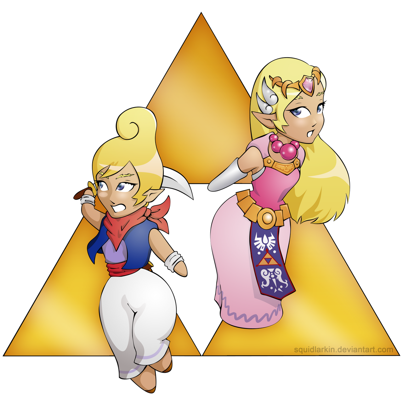
HOME | DD
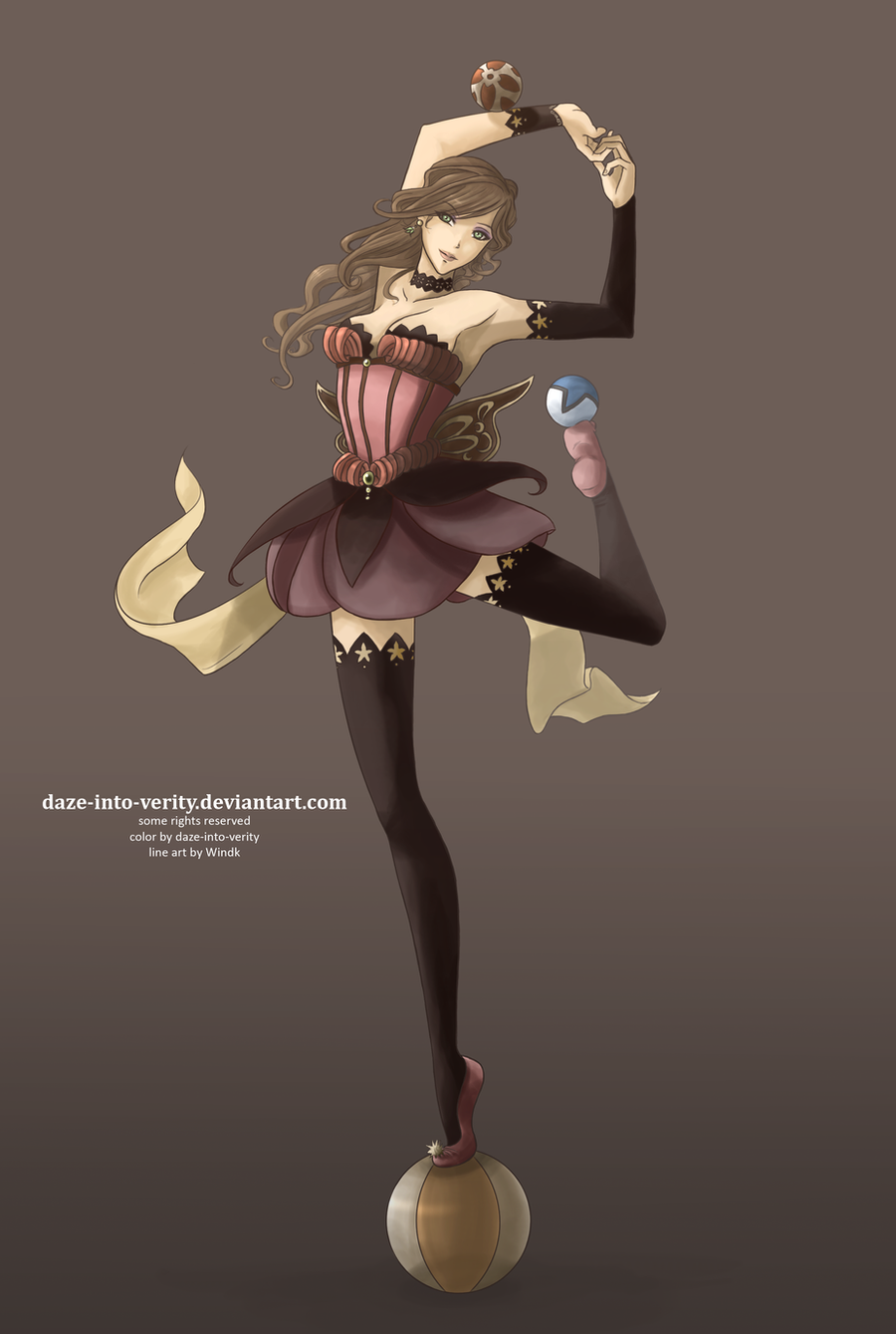
 squidlarkin — Juggler

Published: 2009-10-24 04:02:33 +0000 UTC; Views: 1733; Favourites: 34; Downloads: 0
Redirect to original
Description
Original lines by ~Windk :For *color-me-club 's coloring contest: [link]
To see the super awesome winners, go here! [link]
I seem to be permanently stuck as #3 in honorable mentions in every contest I enter. >___<
10/22
So what do you guys think? I'm still working on it, but most of what's left is detail. I've been experimenting with a lot of stuff I've never done before... mainly with light. Did it turn out ok?
Edit 10/24
Sorry to spam all your inboxes with this one again, but I think she's done and I'm super excited.
 I did some strange things with the lines that I've never done before... and I think it worked.
 ")
Edit 10/26
Didn't change all that much... just played with the lighting behind her arm, redid her hair, and smoothed a little of the shading.
Any last suggestions, anyone?
Thank you all for the helpful feedback from earlier~!

Related content


Comments: 46


You made her look remarkably special!
Love it tonnes!

👍: 0 ⏩: 1

i love the colors, they make her so much more alive and beautiful
 (Smile)")
👍: 0 ⏩: 1

This turned out really pretty, great job! I love how you did all the lighting!
👍: 0 ⏩: 1

Sparkly effects as well as the white outline definetly makes this piece looks magical! You've got wonderful coloring skills ^_^
👍: 0 ⏩: 1

Aw, thank you~! 
")
👍: 0 ⏩: 1
You welcome ^_^ I checked the other entries, I hope you win because yours was my fav out of all of them
👍: 0 ⏩: 1
Really? 

👍: 0 ⏩: 0

I love it :hearts:
It looks absolutely stunning :3
The lights are so amazing and when I saw your colouring I was at loss of words because of how pretty it is :3
👍: 0 ⏩: 1
It makes me so happy to hear it!
👍: 0 ⏩: 1
No problem :3
It's me who's happy- because I got to enjoy such an amazing work :3
👍: 0 ⏩: 0

The lighting is what MADE this piece for me. Good job with it.

👍: 0 ⏩: 1

This is so beautiful. The lighting looks really interesting and different, and the color scheme is perfect. It all works very well with the character and scene too.

👍: 0 ⏩: 1
Aw, thank you so much~!
👍: 0 ⏩: 0

HOLY FUCK
the colors in the shading add so much depth. mad props on the lighting. i'm a huge fan of all the lights in the background. this is excellent. you use all sorts of light and dark hues really masterfully in this. i'm a fan.
👍: 0 ⏩: 1
It's my first time using any kind of secondary lighting, so I'm really glad to hear that! Thank you so much~!
👍: 0 ⏩: 0

Love the colored highlights! I wish her arm didn't disappear so much in the light, though.
The colors remind me of opals

👍: 0 ⏩: 1
I love opals!
Thank you~!
👍: 0 ⏩: 0

Holy Crap this is pro...
I really like the lights, this picture is very bright, matches the mood of the lines quite well.
Texture on the clothing looks so soft
👍: 0 ⏩: 1

yay! it's pretty!!
my only suggestion is when you color use a bigger brush size. that way the shading comes out a little smoother.
👍: 0 ⏩: 1
Haha yeah... Probably a good idea. 
But thanks~!
👍: 0 ⏩: 1
the skirt and skin have the most problems
no problem
👍: 0 ⏩: 0

This really caught the eye,really pretty.
I was just a little sad after I clicked the thumbnail and saw that the line art wasn't yours.
I think you should color more of your work like this also.
I like the elimination of the lines in places, really helps give it a glow.
~Sky
👍: 0 ⏩: 1
Yeah, sometimes I think I color too much of other peoples stuff. Hopefully it's just a phase. >____> It's because by the time I'm done with the lines for one of my pieces, I'm already bored with it. 
But thank you~!
👍: 0 ⏩: 0

Hi,
Nice colour scheme here. They all seem to work well together.
I think the bloom lighting around her left arm is a little too strong. It seems to overpower the figure a little. Perhaps tone it down a bit so you can see the outline of her arm a little better.
I noticed that you kept some of the dark outlines around everything except for her skin. I suggest softening up the line colour a bit with a darker shade of the base colour. I think this will make the piece seem a bit more cohesive. You've established some nice values on the skin without using strong outlines, I would do the same for the details.
👍: 0 ⏩: 1
Thanks so much! I'll definitely play around with some of the things you've said here.
👍: 0 ⏩: 0

Now THAT is a pretty picture. I think that tops my idea a hundredfold!
👍: 0 ⏩: 1
Aw, don't say that! But thanks!
👍: 0 ⏩: 0

Yeah, that looks super-great. Everything else has already been said.
👍: 0 ⏩: 1

I really love the backlighting. Even in thumbnail form it really made an impression! Getting rid of those black lines on the outside really takes the coloring to another level. I also love the sparkle detail on the confetti and all the colors in her hair, as well as the rest of her.
The one suggestion I would give,
👍: 0 ⏩: 1
You know, that's a good idea! I'll definitely try darkening the balls, see how it looks.
Thank you sooo~ much!
👍: 0 ⏩: 0

What blood88 said. I'm not going ot use the critique system, because I don't think my criticism is formal enough.. but the highlights on her leg is a bit confusing.. looks like there's another light source outside of the picture to her right.
But that's it. Everything else looks good!
👍: 0 ⏩: 1
I tried to have the main light source from behind, with a yellow light source from the right and orange from above/left. It's good to know it's a bit confusing... I should play around with it more.
Thanks so much for the feedback though!
👍: 0 ⏩: 1

awww so pretty
you did real good on the lighting
👍: 0 ⏩: 1
Thanks so much! I'm really glad to hear you think so.
👍: 0 ⏩: 1