HOME | DD
 ssandshrew — Ties that Bind Cover Iterations
Published: 2019-07-18 04:53:35 +0000 UTC; Views: 729; Favourites: 42; Downloads: 4
Redirect to original
Description
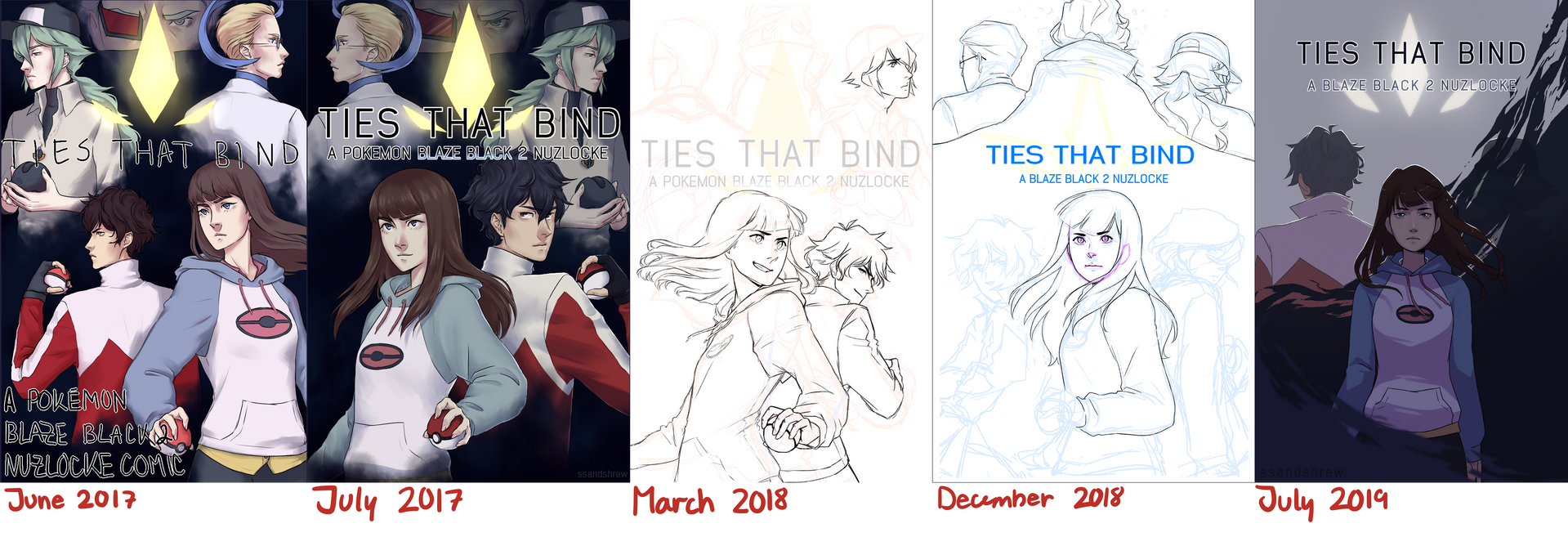
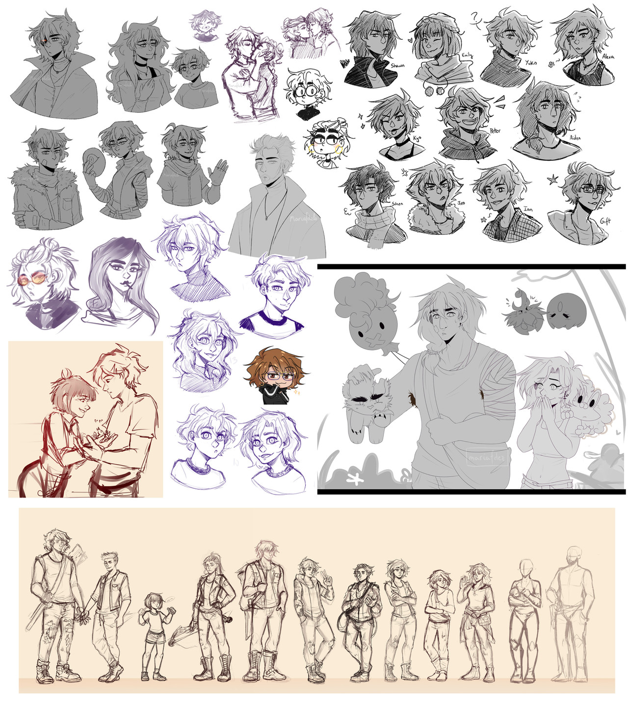
I'll toss this into scraps/extras later, I just threw this together tonight after going through some files and rediscovering how many times I tried to remake TTB's cover.I always find peoples' design process interesting, and even though I'm not a professional or anything I think it's still interesting to look back and see how much my abilities have changed since starting the comic. Iteration and reiteration is something I that is super important in my creative process so the fact I've only "remade" the cover 5 times in the last 2 years is surprising to me LMAO
(also if you were wondering why the colress in the old cover was backwards it's because I was lazy and just mirrored the top half of my first draft as u can now see. i've exposed my secrets)
I guess you can pick and choose which is your favourite, but I feel like this is a good lesson in learning when to drop a concept/layout. In trying to recreate my initial idea over and over I let the whole cover design get cluttered and it wasn't really conveying what I wanted it to anymore.
The takeaway from this i guess is that being lazy and doing the bare minimum is sometimes good in designing something lmao. The newest cover isn't perfect but in my opinion its leagues better than my first 4 attempts. Here's hoping that if I do make a new cover, I can improve again! ;w;
And hey, if you've been sitting on the same cover for a year or so, maybe give a redesign a try! It never hurts to practice^^
Related content


Comments: 8

AAAAA I love them all so much
But oof the last one makes me clutch my heart
👍: 0 ⏩: 0

god the latest version is so foreboding
I guess now I'll just sit here and worry!
👍: 0 ⏩: 1

It's a nuzlocke... what could possibly go wrong? ¬.¬;;
👍: 0 ⏩: 0

ooooo those dynamic poses for hugh and ava look dope in the march one! ahhh you've improved beautifully, keep it up!
👍: 0 ⏩: 0

in the past i tried, for fun, to create a cover (of my own story) kinda traditionell. the three main chars the boring way you show them, the world they live in was way smaller, they were placed behind it (looked interesting) and the cute character hold a spaceship (which, in story, gets destroyed in the world) like a toy.
what i want to say, sometimes it can be freeing to draw (even just scribble) something that looks motherfcking mainstream, too. and for designing itself, yes, there is the minimum the best way, because you concentrate more on the arranging
anyway, i love how you tried it over the years again and again, and your latest is beautiful with the colors, drawing style, typography and its position.
great increase!
hope you understand what i mean, lul..my english lvl is "non native"
👍: 0 ⏩: 0


hey what can i say i have to be at least a little faithful to the canon bw2 plot
👍: 0 ⏩: 0
