HOME | DD
 statichavoc — dav4 unofficial WP
Published: 2004-08-07 08:30:22 +0000 UTC; Views: 1936; Favourites: 10; Downloads: 789
Redirect to original
Description
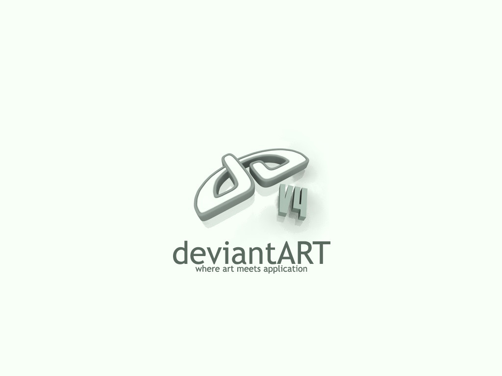
Well I created this a few days ago... and here it is for your viewing pleasure. Created in cinema4d. Using a similar color scheme to dav4.Sizes included in zip:
DOWNLOAD to get the right resolution for your monitor
800x600
1024x768
1280x1024
1600x1200
Enjoy
Related content


Comments: 38

Wonderful  (Smile)")
👍: 0 ⏩: 0


Looks very cool
-Tom
👍: 0 ⏩: 0

brilliant, i love your choice of background colour
👍: 0 ⏩: 0


I saw this before you posted it and loved it then I completely miss that you posted it.
The simplicity, as stated before me by others, makes this piece a must have.
Soothing and soft.
The logo looks great and the layout is mint.
Thank you for a new desktop for the rotation.
Oh.. and it comes in my size.


👍: 0 ⏩: 0

I think you've made a very good minimal wp here...and I like what you've done with the da logo. Something makes me wish there were a few more "curves" in the piece...it feels like it's really really minimal. But as an wallpaper, it's very functional, gives one a lot of room for desktop and icon placement, and looks very shway...
`Rob

👍: 0 ⏩: 0

great minimalist 3D desktop.
v4 is teh shizz w00t!
great colors of course similar to dA
very great job on this
mP
")
👍: 0 ⏩: 0


")

Love the simple design, and the matching dA colours. Very nice man.
👍: 0 ⏩: 0

The wallpaper goes great with Olive Green XP skin
👍: 0 ⏩: 0


thank you kind sir, i'm using it as well
👍: 0 ⏩: 0

Neato! But the placement of the motto could have been slightly better aligned.
👍: 0 ⏩: 1
it's centered to the da logo
👍: 0 ⏩: 1
Personally I would've tried to align it to match the edge of a character in "deviantart" but what you've got is perfect as it is. Plus being centered it keeps everything nice and uniform!
I just defeated myself, oh well.
👍: 0 ⏩: 1
twas a valiant effort :-P
👍: 0 ⏩: 0


I like this, although near-white can be a bit bright at times
👍: 0 ⏩: 1
Actually, the weird rough textured shadow bit (?) looks a bit off to me, but its good nonetheless
👍: 0 ⏩: 0

Awesome! I love the smoothness of the da logo itself, looks really awesome
Thanks for adding the other sizes too, I was about to ask about it
This will be my current wallpaper
👍: 0 ⏩: 0

nice I like the logo but I think the V4 is a little too plain.
But maybe it's because of this minimalistic skin i've been staring to for so long I dislike everything 3D
👍: 0 ⏩: 1
Hehe minimalistic skins are good but i wanted the da logo to be the center of attention, if the v4 had the same sort of detail it'd take away from the logo
👍: 0 ⏩: 1
yeah I hear ya, it's still a good wp especially if you don't want your desktop to be too cluttered
👍: 0 ⏩: 0


