HOME | DD
 Steelo23 — Building a Complete

Published: 2007-01-13 09:29:26 +0000 UTC; Views: 2243; Favourites: 15; Downloads: 0
Redirect to original
Description
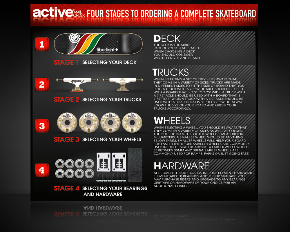
A layout design for Active Mailorder's [link] Spring 2007 Catalog.Related content
Comments: 11

how new is that design? I think I've seen it before, or something similiar..
👍: 0 ⏩: 1

The deck is just a placeholder. It is from last year. I'm still waiting on the actual deck from Alien Workshop. It's going to be a Rob & Big deck.
👍: 0 ⏩: 1

Oh wow how cool, Rob is one of my favourite skaters.
I love that show, Meaty is so cute :]
👍: 0 ⏩: 0

I can only recommend using lowercase for paragraph copy. Using all UCs in a whole paragraph makes things difficult to read and hard on the eyes. While it might look cool, it reduces the actual purpose of the copy (copy is meant to be read).
I'm also not a fan of Avant Garde.
👍: 0 ⏩: 1

I totally agree with you Ryan. My Art Director is stuck on using UC letters for our catalog. I'm trying to convince him to let me use lowercase. Thanks for the constructive criticism!
👍: 0 ⏩: 1

Also, how is Fonce Sans Bold coming?
👍: 0 ⏩: 0


