HOME | DD
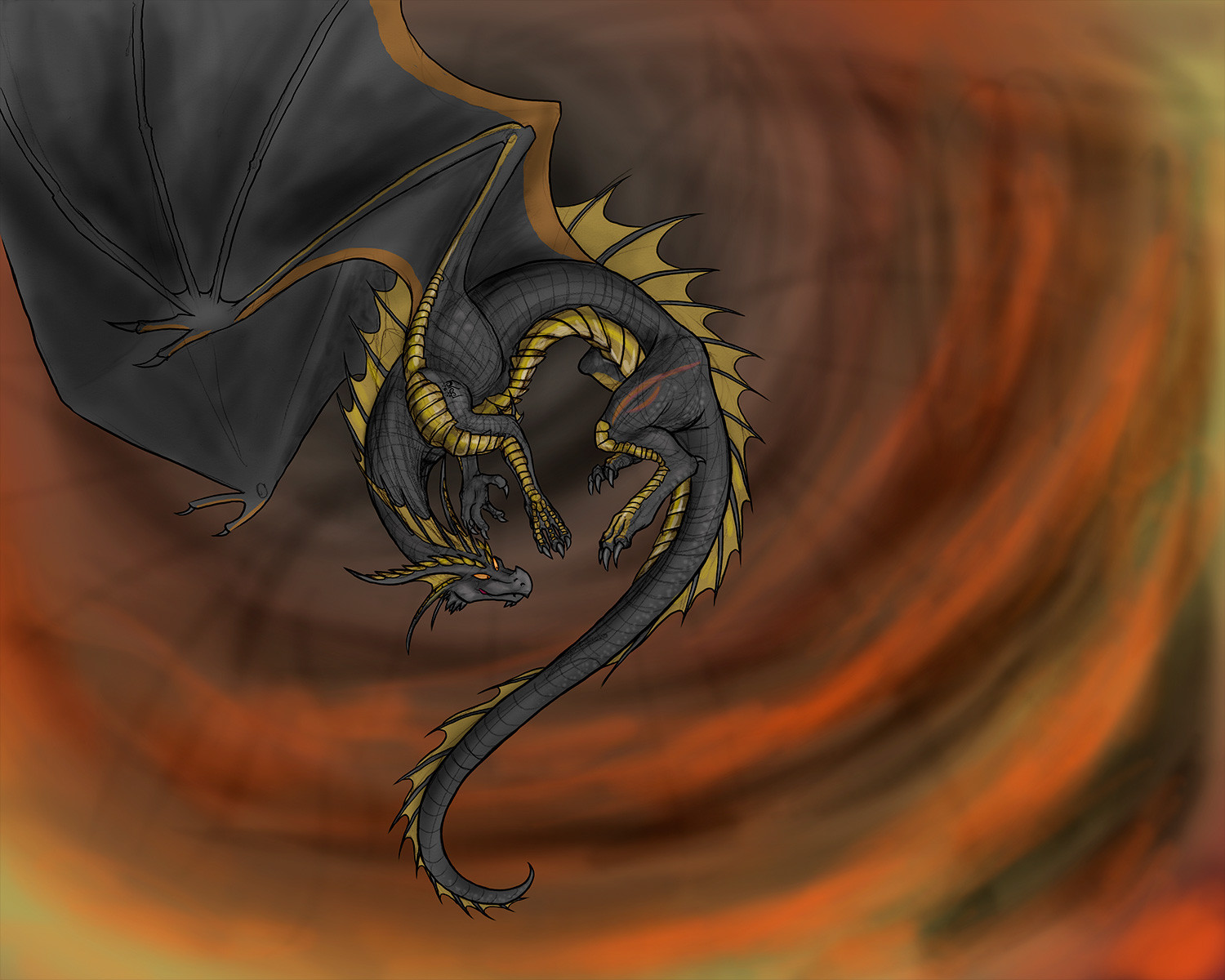
 Stepharuka — WIP- Harmony's spell

Published: 2008-08-31 02:28:07 +0000 UTC; Views: 485; Favourites: 9; Downloads: 17
Redirect to original
Description
I NEED CRITIQUES ON THIS.I wanted to practice coloring on my new pad of bristol board before jumping into art I owe other people (I have an art trade sketched out, and I want to get used to the medium before coloring it). So I sketched out Harmony (why Harmony? I figured that she needed some more love), inked my sketch, and broke out my Prisma pencils...
...and then I noticed a mistake. I figured that I could hide the mistake by shading it correctly, given an appropriate lighting scheme.
So I did a digital speed-paint.
It would help me a GREAT deal if any of you could point out any mistakes I'm making with the lighting/colorscheme here, because I'm using this as my basis for the coloring I'll do on the original, on paper.
Related content


Comments: 21

Color the eyes?
Also, I think the offturned side of the dragon could have been darker, though the shadows on the wings are okai.
Hm, I cant think of sth. else at the moment, but maybe think of the horn throwing a shadow...
👍: 0 ⏩: 1

Yeah, that's a really good point. I've been told that the best way to show form is through shadow... this is probably the best advice I've gotten so far on this
As far as the actual piece goes, well... I kinda started on it, and then didn't get very far with it. Yay distraction. I don't know whether I'll ever finish it.
 (Smile)")
👍: 0 ⏩: 0


my critique is that you should remove the outline, and improve the shading to compensate.
other than that, a well done piece!
👍: 0 ⏩: 1
That would work if I were going to finish it digitally. However, the "real" piece consists of inked black lines on white paper, and this was a digital study so that I could figure out what to do with those lines.
Thanks for the comment, though!
")
👍: 0 ⏩: 1


There are no glaring mistakes, but I would personally make the highlights from the glow a little brighter, but just on the outline of the dragon. Otherwise, wonderful job with the coloring and the pose! I love the tail and wings.

👍: 0 ⏩: 1
Yeah, I definitely see what you mean, and I definitely could improve it by making the lighting more intense in certain places. Thank you very much!
👍: 0 ⏩: 0

I don't have enough people yet to do another set, still D:
👍: 0 ⏩: 1

but what about the set including my dragon character?
👍: 0 ⏩: 1
That's what I was talking about. I do them in sets of four, and right now there are only two people signed up currently...
👍: 0 ⏩: 1
acually, i can ask you to turn my pokemon into dragons for your +10 dragon project XD
👍: 0 ⏩: 1
Um... no, actually, since the point of the project is to get as many different characters from different people as possible, I've limited it to one character per person.
I have another set 1/2-done that's my own characters only, which I'll be posting soon in the attempt to rekindle interest. I think I may have to get people to advertise this for me in their journals or whatever.
👍: 0 ⏩: 1