HOME | DD
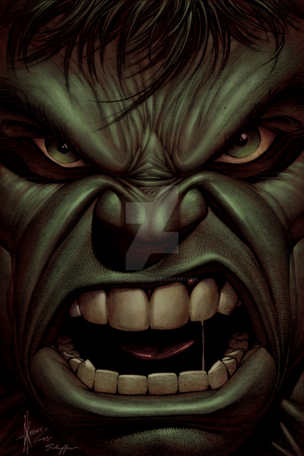
 StephenSchaffer — Hulk vs. X-Men by EDEX

Published: 2008-04-27 14:31:23 +0000 UTC; Views: 9532; Favourites: 123; Downloads: 579
Redirect to original
Description
I'm kinda indifferent about this piece, rather my coloring of the piece, the pencils and inks are perfect... What do y'all think?Pencils -
Inks -
Colors -
Characters © Marvel
Original image: [link]
*Edit: darkened background
Related content


Comments: 37

"Bah! You are even bigger freaks than Hulk! Hulk smash you all!!"
"Not if we wear you down first, da?"
👍: 0 ⏩: 1
I think in the poor guy who´s gonna clean that mess
👍: 0 ⏩: 1
Really, it´s not fair
👍: 0 ⏩: 0


Yeah, like I said in my other response, I like the way that this isn't too glossy, it looks more like an incredibly hand colored piece than a computer piece. I like it a lot!
How's your schedule looking for commissions now?
👍: 0 ⏩: 1

Thank you. It's looking pretty open, so whenever you're ready just send the pieces along!
👍: 0 ⏩: 0

This I think, in my eyes, is the best you've done!
👍: 0 ⏩: 1

I think it looks like Wolverine got owned.  (Smile)")
👍: 0 ⏩: 1
It's about time someone kicked the shit out of that furball ")
👍: 0 ⏩: 1

Its bright!
But some parts arent bright enough, like storm's attack.
Thats all i'd change.
👍: 0 ⏩: 1


To me, the colours seem dull yet bright at the same time! Weird analysis but thats how I see it!
👍: 0 ⏩: 2
I think I understand what you mean. It's vibrant in the color, but it doesn't have the glossed look of computer coloring, it looks more like it was done by hand with markers.
👍: 0 ⏩: 1
Um... okay? I guess I'll just leave it at that
👍: 0 ⏩: 1
Thanks! Dex is an awesome inker!
👍: 0 ⏩: 1

Haha, I agree.
👍: 0 ⏩: 1


Wow. This is quite the piece. Man, I love how Hulk's just powering through all the attacks. It's great. Man, you're

👍: 0 ⏩: 1

wow that is really cool, did you use painter for this? if so what brushes do you use? and i think if you really wanted to improve on it you could try changing the background to make it slightly darker, but i dunno just a suggestion
 (Wink)")
👍: 0 ⏩: 1
Thanks. I started out in Photoshop and blended everything (the colors) in Painter. I can't remember the tool I used, but Ill post another tut soon with my brush presets and everything, because a lot of people ask me how I do what I do.
👍: 0 ⏩: 0

Hulk is going like " That tickles hulk!" lol!
Personally I think you might need some more layers or filters to contrast out the background light.
👍: 0 ⏩: 1
Yeah... something about it wasn't sitting right with me. I liked it for the most part, but, I don't know... I probably should let it rest for a day or two then look at it again with fresh eyes. Thanks.
👍: 0 ⏩: 0