HOME | DD
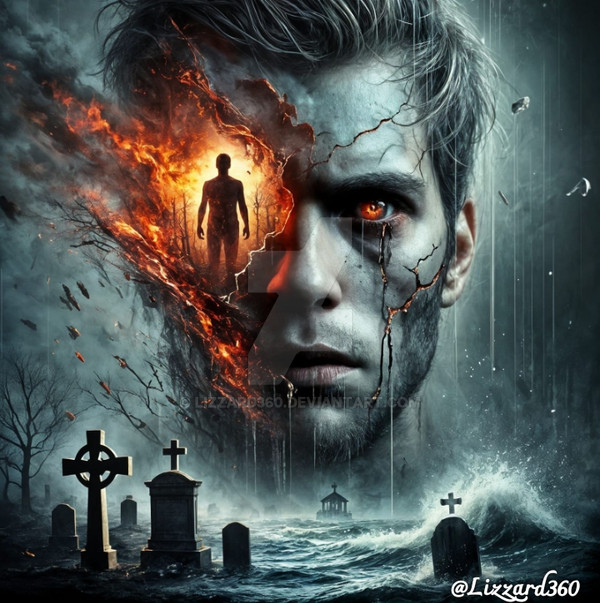
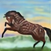
 StephOBrien — Falling Down

#undertale #undertalefrisk #undertalefanart
Published: 2018-02-28 03:14:53 +0000 UTC; Views: 623; Favourites: 28; Downloads: 5
Redirect to original
Description
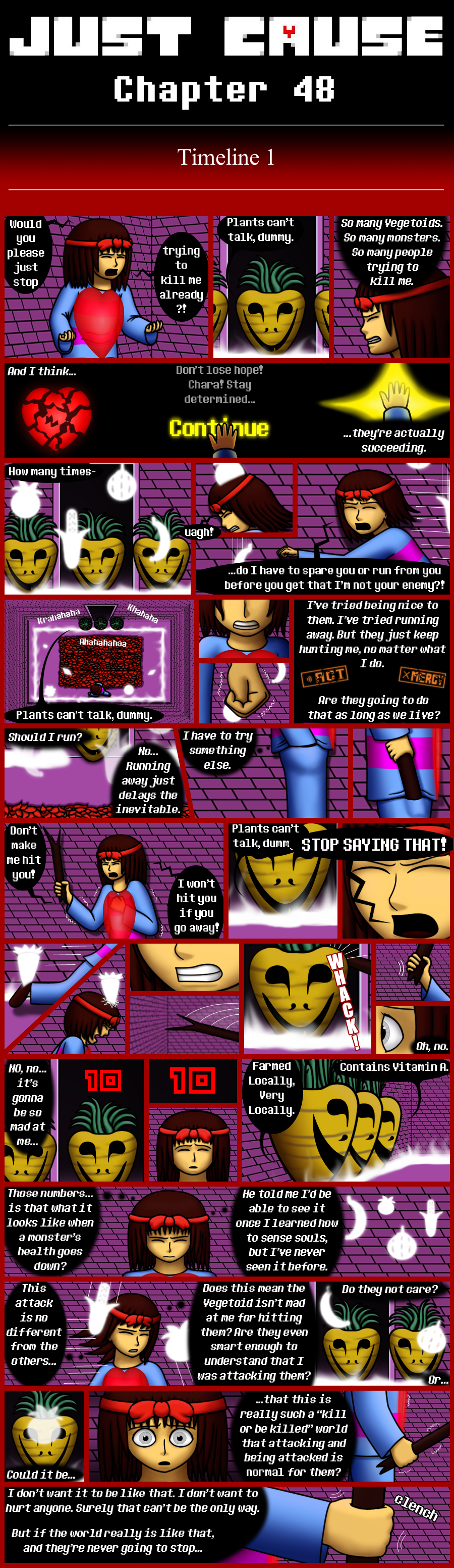
You know that thing I do where I make higher-resolution versions of some Just Cause panels before putting the shrunk-down version in the comic? I did that with this panel, too. And then ended up making so much other stuff so fast that this piece got pushed back in my publication schedule in favor of new and shiny things. >_<
But now it's here. I hope you like it!
If you want to read the comic from the beginning, here's the first page: stephobrien.deviantart.com/art…
Commissions Society6 RedBubble Ko-fi My Patreon
Related content


Comments: 17
")

Hi! I'm from
First, I like that you can tell it is Undertale right away! The hands look good, and the pose looks accurate (nice foreshortening! This is a hard thing to do for many artists but for the most part you got it accurate). However, I feel there's a lot that needs work.
First, I have no idea what the background is. I know it's Mt. Ebbott, but is it the bottom? If so, why is it so oddly shaped, and where is the flowerbed? The passage to the Ruins? It is also way too detailed compared to Frisk, and the textures look out of place, this also applies to the textures in the hair. It's a bit unclear that Frisk is falling at first glance, too. The hair doesn't look like it's going up, same thing with the clothing. More of Frisk's hair should be affected by gravity, not just the bangs. A more clear angle, such as Frisk falling with their back to the bottom of the cave, since if they tripped down Ebbott they wouldn't be falling feet first. Or a more pulled back perspective where you can see the opening of Mt. Ebbott as well. The shading is also very odd. The direction of the light is unclear, and the colors of the shadows are very dull. Hue shifting shadows and highlights is something that really makes your drawings look more interesting. The mountain also looks like it's going inward, getting smaller as it goes down like an ice cream cone, particularly because of how small the bottom looks. Expanding the bottom and making it look like the place Frisk ends up in when they wake up would really help the clarity of the drawing if you don't want to change the angle.
I know I have a lot of critisims about this drawing, but it's good overall. The pose and anatomy / proportions are good, and the message gets across. There's a lot to improve, but hopefully, my advice will help!
👍: 0 ⏩: 1

Thank you for the advice! The colors are supposed to be a bit dull; in this scenario, they're falling down very early in the morning, so the light is in that greyish predawn stage.
They are fairly close to the bottom of their fall; the dark passage behind them is supposed to be the tunnel leading away from the flowerbed, but I guess that didn't come across very clearly. A pulled back perspective, with at least the tips of the flowers visible, would probably have been a good idea. Thanks for the suggestion.
I agree that the rock is a lot more detailed than Frisk; I'm not quite sure how to give something a rocky texture while making it less detailed. Maybe I need to look up some tutorials.
All of Frisk's hair was affected by gravity, and the hair on the sides isn't their bangs, but maybe I should have added more layers of long hair behind that front layer to make that clearer. Do you think that would have helped?
Thanks again for the well-thought-out advice!
👍: 0 ⏩: 0
I'm here as part of ProjectComment to give you feedback on your work.
The good:
You can feel the character is falling.
You have good shading.
I love the details of the background.
You have a good set of hands on the character.
Great foreshortening with the body and legs.
What needs work:
The clothing underneath should be pressed up against the body, there shouldn't be any slack under the hand on the right. It would also be recommended to add some folds so that the clothing looks less rubbery.
Look at the lengths of the hair, it should be longer in the middle and shorter at the sides.
It's hard to tell where the character is falling from, it looks like there is half a tree there, and I would think the tree would be falling if that much of the tree was exposed. Also, if this is a tree, think about the roots almost like spaghetti, they go out everywhere, and they gradually get smaller but also have small pieces coming out everywhere while it also splits smaller and smaler
Overall:
I think you did a great job with this piece and I hope you keep moving forward with your art. I hope I've been able to help
👍: 0 ⏩: 1
Thanks for the feedback! It was very organized and easy to follow, and you clearly have a keen eye for art.
You make a great point about how the clothing should be pressed against the body - I'll keep an eye out for that in the future. I'll admit I tend to skimp on the clothing folds for the sake of time efficiency, since this is part of a long-running webcomic; I'm still working on finding a balance between "enough folds to make it look good" and "too many to get pages out at a decent pace".
The hair is shorter in the middle because the middle parts are bangs, while the hair on the sides is longer, but I guess that's hard to tell from this angle.
The character is falling into a cave, but from the feedback I'm getting, it sounds like that wasn't very apparent to anyone who hasn't played the game this is based on. Oops!
I appreciate the compliments and suggestions - the one about clothes was particularly helpful. Thanks!
👍: 0 ⏩: 1
No problem, I'm glad that I could help.
Well, just remember, that a little bit of shadow placed real quick can create a nice fold effect, Just keep working on it. The more you practice the faster and more accurate you'll get. If you have to slow down to make something look good you should because that means you will get more practice doing it the way you want it to look.
I used to have a short fringe like that, and I would jump onto my bed backwards (like the way the character is falling) my longer hair in the back would fall over my face while I jumped back and end up in my eyes. It doesn't always happen, but that's what I remembered from being a kid.
Sometimes that happens. It's like inside jokes, sometimes you have to be there to get it.
Anyway, like I said I'm glad I could help, keep up the good work!
👍: 0 ⏩: 1
Sorry for the late reply; the last couple weeks really blew up on me schedule-wise.
*Glances at the text version of this webcomic, which is now over 200 words long* I'll try putting in some folds here and there, but I'll probably stay fairly minimalistic for the most part. Though, this next page will have a few panels where a character is hunched over, so that will be a good opportunity to practice clothing folds.
Good point about the hair. Thanks.  (Smile)")
👍: 0 ⏩: 0
Hello! Coming to you from ProjectComment
I know next to nothing about Undertale, but would like to give feedback on this picture. I'll go into detail in a moment, but first off, great pose from an interesting angle!
Overall image: My first impression when I saw this was "What is going on here?" Then I read the title and it all made sense. The way she's reaching out and how her hair is falling upward should have clued me in right away, but I think the background threw me off.
Background: This is simple, but that is okay because this is one panel in a larger comic. In fact, the textures you've added to the stalactites and cave walls are a nice touch. As I said above, I think the background is what confused my first impression of this picture. From the title, I know she is falling, but the background does not show me from where. I don't see a ledge or a hole she tripped into, so I have no idea where her fall started. This makes the scene feel static instead giving me a real sense she is falling.
Somewhere off-scene, however, light is falling from above, so I assume there is a hole up there somewhere. I'm left with a few questions, which I'm sure are answered in earlier panels, but the biggest is how far has she fallen? (see Composition for a thought on this). And how did she fall backwards? And (gulp) where is the ground?
Shading: Very nice. You have a strong, clearly defined light source from above. The intensity of the light suggests that it is day above the cave/hole.
Foreground: I like the character's pose, and the foreshortening looks good. This pose could be even better by adding a hint of desperation, having her fingers spread out as she reaches upward. Fingers speak, and hers are way too resigned. Your hands are good; I would just challenge you to experiment a bit more. (This coming from someone who can barely draw hands, ha ha.)
Hair is the other detail you can use to give this picture more movement. Right now, all her hair is sticking straight up as though she used too much styling gel. To get the sense of movement you're going for, it should flow. Let the strands bend toward her nose, since her head is a sphere and they will follow the curve of her head.
Composition: What you have is working. It could be interesting to experiment with where you put your character in the frame. What would happen if you put her even farther down, maybe partially off canvas? This would create more empty space for her to have fallen through. Might be a cool experiment.
In closing, I have to say you have a nice comic style. I hope you can use some of this feedback in future art work
👍: 0 ⏩: 1
Thank you very much for the detailed compliments and advice! Your confusion about the background probably comes from not having played the game - people who have seen the opening cutscene will probably be able to recognize the scenario and know the shape of the cavern right away - but it's good to know how the picture is perceived by people who don't have that context.
You make some good points about the hair and the fingers' pose. I'm still in that in-between stage where I can draw hands reasonably well, but I'm so focused on getting the anatomy right that the pose sometimes suffers in the process, so it's good to know which areas I need to improve in. I appreciate you giving a specific suggestion; so many people just say "this looks wrong" without saying what it should look like instead.
Your suggestions for experiments with the composition sound like something I should try in future panels.
Thanks again for all the thought you put into this - it was very helpful!
👍: 0 ⏩: 1

