HOME | DD
 StephOBrien — Symmetric Pattern: Crystal Aurora

#aurora #pattern #snow #snowflake #symmetrical #patternart #auroraborealis #northernlights #printsforsale #printsavailable #symmetricalpattern
Published: 2019-04-27 07:24:52 +0000 UTC; Views: 498; Favourites: 25; Downloads: 1
Redirect to original
Description
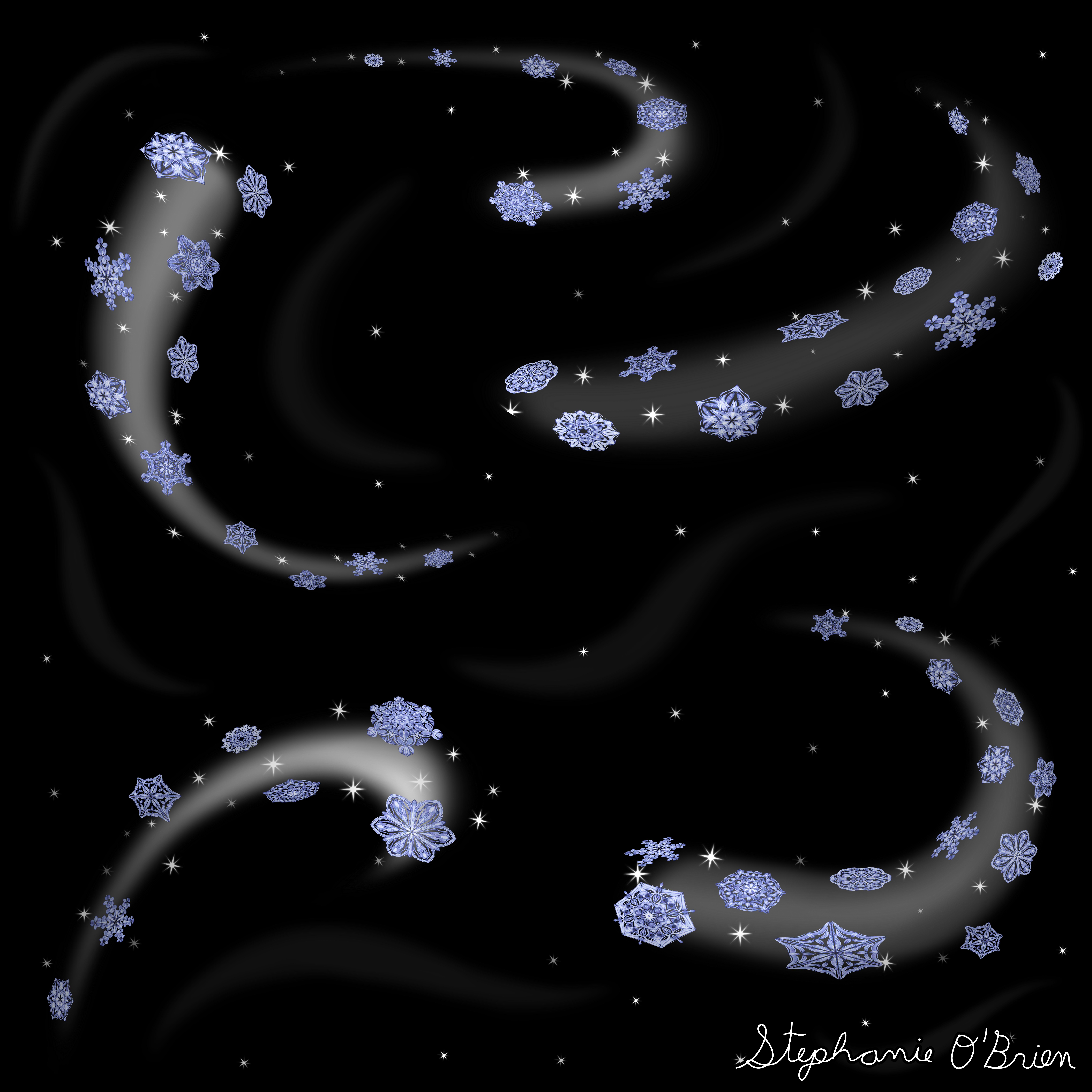
I was watching Frozen, and it made me want to draw a snowflake. A few hours and several repetitions of various versions of Let It Go later, the snowflake is drawn, and I LOVE it; it's probably the most polished-looking pattern I've created so far.I knew I wanted to have some smaller, blurrier snowflakes in the background, but for the frame, I was torn between snow clouds and an aurora.
I'd recently seen another artist's drawing of a night-themed horse whose mane resembled a midnight snowfall with clouds, and it was mesmerizing, so that was a big temptation. But auroras were a repeating event in Frozen, and I liked the way my experiments with them looked, so I decided to stay on-theme.
This pattern was a departure from my previous ones, in that I decided to try letting the spokes overlap a bit. In my other patterns, I kept the spokes much more separate, so I wanted to try something different this time, and I love the way it turned out.
This pattern is available on coffee mugs, blankets, backpacks and more in my Society6 store and my RedBubble store . You can see some examples of the available products here: www.deviantart.com/stephobrien…
If you want to learn how to draw patterns like this, check out my tutorial here .
If you want to help me make art faster, get early access to completed art, and get exclusive access to works in progress, please consider supporting me on Patreon . If you want to help me without the monthly commitment, you can also support me with a one-time donation on Ko-fi.
Related content
Comments: 23

Hello, commenting on behave of ProjectComment ´s Big comment contest.
It looks really beautiful! I like the calming colours combination - the blue looks very peaceful, especially with stars-like background. I know that the description says that it´s snow in the background, but I personally prefer imagining that it´s stars covered sky. Anyway, it´s nice background that compliments the snowflake well, without stealing attention from it.
The snowflake itself is gorgeous. I like the crystal-like structure of it, I think that it looks elegant and that it´s fitting to theme of Frozen, because Elsa´s snowflakes also used to have this sharp, crystal-like shapes.
Also, I think that having the picture in square shape looks good. If it was a rectangle, some of the symmetry would be lost, which would be a shame. But this square helps to keep everything nicely centered and symmetrical.
The only tip for improvement I have is that aurora usually doesn´t have so sharp boundary. It fades into the sky, like the outer boundary of your aurora. But the inner boundary of aurora in the picture seems quite sharpy cut. I think that it would look more natural if it was blended more into the sky.
👍: 0 ⏩: 1

Thank you very much for the compliments and advice! The aurora was by far the most challenging part of this picture for me, and I appreciate you sharing tips on how to improve it.
The part of the aurora on the inside of the circle is meant to reflect the lower part of an aurora, which tends to be a bit more sharply cut than the more gradually fading upper parts. But I totally agree that the upper edge of an aurora should fade slowly into the sky.
👍: 0 ⏩: 1

You´re welcome. I wish you good luck with your drawing.
👍: 0 ⏩: 0

LET IT GO....LET IT GOOO. Can't hold my words back anymooooore.
Hello. I found your work through and couldn't hold back commenting after the Frozen reference.
First of all, the pattern is absolutely mesmerizing, and the light effects are beautiful. The snowflake is amazingly intricate without too many details that could overload one's eyes. I especially like how the center starts with a rather simple flower-like pattern, lies over a more dull color (meant positively here) (reminding me of looking down to the floor of Elsa's palace through an open ceiling, and then connects to the more reflective and intricate oval patterns. I think it is beautiful how you kept the longer oval shapes a bit darker, especially as they have more connection with the dark background, creating harmony. I also like how you added texture to the flatter parts of the object, creating a very interesting subpattern. Overall in every pattern, there is an intense three-dimensional look letting me wonder how this flake would look like a real 3D object.
For the background. It merely looks dull behind the beauty of the main pattern creating the illusion that pattern, Aurora and stars belong to different images pieced together. Especially on the duvet cover, it creates the look that the pattern was put atop the background raising the 3D effect to a maximum. The stars and aurora themselves for me miss some details and look slightly too much blurred out which may not be a problem on a coffee mug but could probably look weird on pillows or the duvet cover as the details are much more visible at that zoom level.
This is the only point I can critique, and the only advice I can give is to get some high-resolution photos of the night sky and an aurora if you wish to add more detail to these elements.
A beautiful piece with a recognizable Frozen flair. Bet Elsa would love to have some of these pillows in her palace.
👍: 0 ⏩: 1

Thank you so much for the detailed and deeply-thought-out comments and critique! I really appreciate all the time you put into this.
The white shapes in the background are meant to be distant, blurry snowflakes, so I'm not worried about them being blurry. The aurora, on the other hand, didn't turn out quite as well as I'd hoped; I'm still not sure how to create a convincing aurora effect. So in this case, it wasn't so much that I thought an aurora should be this blurry, as that this was the closest I could get with my current skill and knowledge of Krita's tools. If you know any tips or brushes for creating a realistic aurora, I'd love to hear about them.
Thanks again!
👍: 0 ⏩: 1

As I do not know the program Krita, I do not have specific advice for you. I would use a watercolor brush at average density for the base and then add details on a screen/glow layer. For the structure, I would use either hair or finger smudge tools.
A Sai Speedpaint
www.youtube.com/watch?v=y0Sd9g… Speedpaint- Northern Lights | Digital art | Paint Tool SAI
A more detailed tutorial
www.youtube.com/watch?v=qEd2gz… Abstrakts "Northern Lights" Photoshop Tutorial
The only tutorial for Krita I found
www.youtube.com/watch?v=pNgGnZ… Fairy lights - Krita Speedpaint
Hope that helps you.
👍: 0 ⏩: 1

It is good that you didn't choose tthe snow clouds, I guess that would have distracted the viewer's eye from the crystal. Having these more greenish aurora around the crystal have a nice contrast. Have you ever seen a real aurora? Because the colours are matching a real one very well.
👍: 0 ⏩: 1

Thank you very much for the feedback and compliment! I based this aurora on photos of auroras.
👍: 0 ⏩: 1

You're welcome. I once saw one when I was in Abisko, Sweden. It was like raining light. So magical
👍: 0 ⏩: 0

Wow, I really appreciate that!
👍: 0 ⏩: 0

Thanks! <3 I do, too.
👍: 0 ⏩: 1
Hello i'm from project comment and you art is very intrested so here is my comment
for me the design is very beauty. It look like a Snowflake but better and more nice for a eyes, The background is so simple that it is not distracting of a main part of art. I very like the color of this. It's one color in a lot of variants but how you used it is pure amazing. What is more this green Aurora working like a frame allowing me to focus more on the central point and its shine just saying to me" look at this look at this and be surprised. Last thing is fact that it's so good that i can't found any mistake. Keep it
👍: 0 ⏩: 1

Thank you so much for the detailed compliments! I appreciate you taking the time to share your thoughts.
👍: 0 ⏩: 1

Love the crystallized shape you have in this one!!! The aurora about it is it awesome!!
👍: 0 ⏩: 1

Thanks! 
👍: 0 ⏩: 0


