HOME | DD
 steve-o-mac — No One

Published: 2004-05-25 02:19:28 +0000 UTC; Views: 1078; Favourites: 15; Downloads: 839
Redirect to original
Description
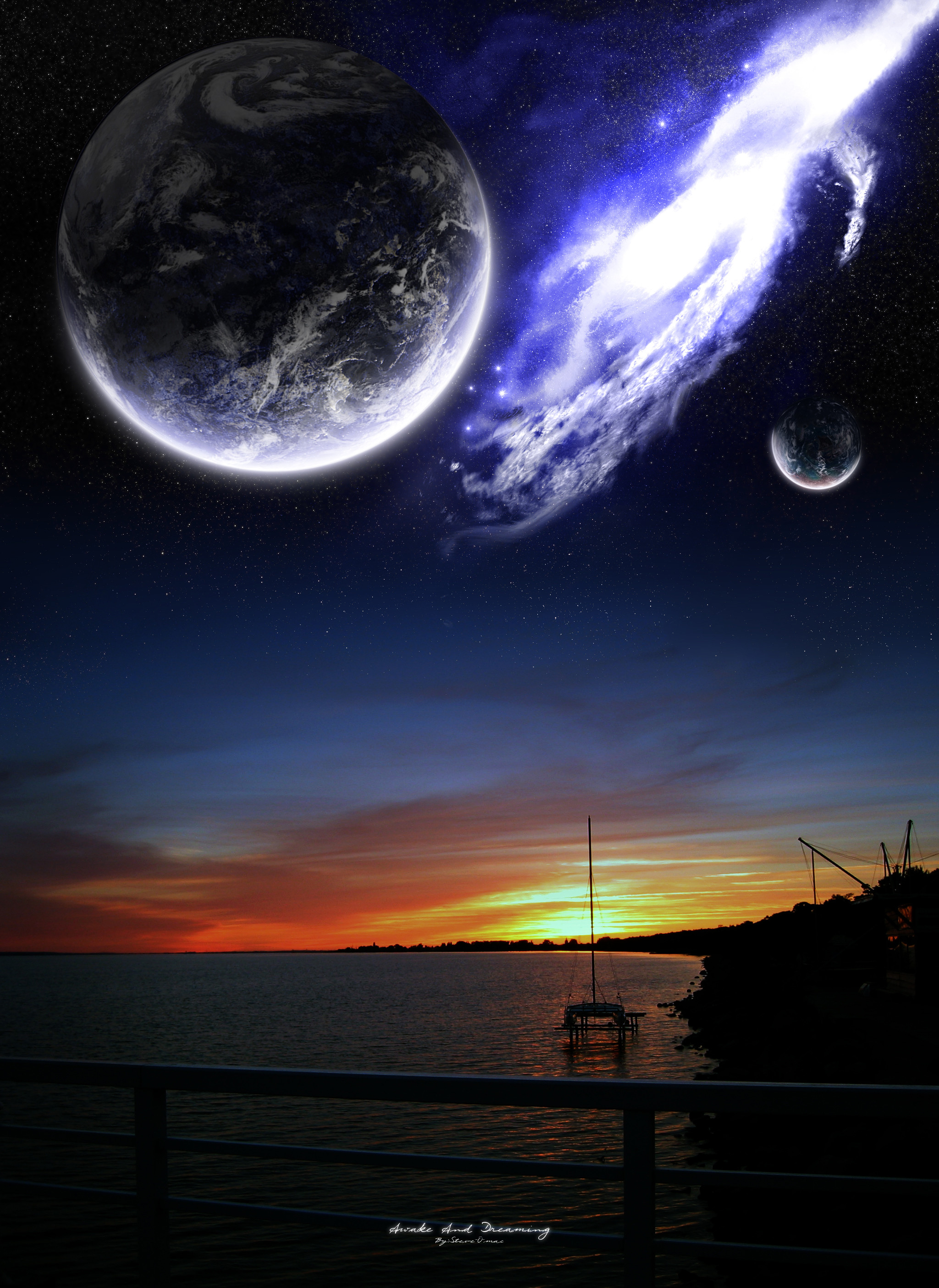
Just something I put togeather today.I think it looks good, stock photo used for the base of the picture.
I don't really know why I put the clouds type effect in the air, I just think it looks really cool so I kept it.
I'm just trying to get back into making planetscapes again.
Enjoy
 (Smile)")
Related content


Comments: 33

Really nice work
is that a landrover disco siloeted
")
👍: 0 ⏩: 0


I don't like the fact that both planets are basically the same, but this is very well put together. The stock photo choice is wonderful and really compliments the whole piece.
👍: 0 ⏩: 1

the planet is different its just the cloud map that is the same, I didn't realize that they were identical.
Thanks
👍: 0 ⏩: 0

very nice. i like the cloud effect. mystifying. keep te good stuff a comin.
👍: 0 ⏩: 0

This is GREAT!
There is nothing awkward or wrong about any of it.
I like the concept, the cloud effect, the vehicle, the blending.... everything.
👍: 0 ⏩: 0


OOOoooOOOO I love all the orange squishyness , looks great man, keep up the good work!
👍: 0 ⏩: 0

nicely done, i like the conpect to, colours are good, and i like the cloud/mist. Planets are just a little blurry but
👍: 0 ⏩: 0

how do you make the planets or what program do you use
just askin
neospace
👍: 0 ⏩: 1

Hmm, both elements to this pice are really nice. but they jsut dont seem to match each other. I dont think the planets are blended into the scene well enough. Your other photo-manip shatters this one.
Though, the planet designs are awesome, lighting looks near perfect on them. So great work on that part.
👍: 0 ⏩: 0

I just found my first spacescape wallpaper, great job!
👍: 0 ⏩: 0


hehe, cool a space safari?.... i like it....maybe you should take an other colour for your planets....the difference between red and blue doesnt fit together ... in my eyes...
👍: 0 ⏩: 0

Gr8 pic.. m8.. I dont really like the big planet.. but yeah.. the pic itself is gr8.. keep it up
 (Wink)")
👍: 0 ⏩: 0

the bottom part with the car is a great addition
👍: 0 ⏩: 0


nice man nice...
only thing i dont really like is that the smaller planet is an obvious duplicate of the bigger one ")

bravo!
👍: 0 ⏩: 1
actually it isn't a duplicate of the big one, I did use the same cloud map for it, I'll change it around to make it looks different next time.
👍: 0 ⏩: 1
o ok
again...great job

👍: 0 ⏩: 0

very nice!! sup steve o!! remember meee!!! hehe i see you improved alot
👍: 0 ⏩: 0


nice, although the bumping on large planet a lil wierd, still, good job
👍: 0 ⏩: 0

I really like that ring on the smaller planet, how did you make that?
👍: 0 ⏩: 0

Nice planets...complete ownage-ness. Looks a lot like earth. The blending is bad though, I would like to see them solid.
👍: 0 ⏩: 0

