HOME | DD
 StrangeComet — Mistortle
#misty #pokemon #tf #transformation #wartortle #waterpokemon #pokemontf #wartortletf
Published: 2011-01-25 02:38:35 +0000 UTC; Views: 7377; Favourites: 75; Downloads: 0
Redirect to original
Description
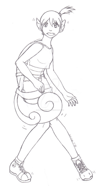
Wortortle's are my fav. out of the Blastoise line.That's all I really have to say about this, other than it's ancient.
art = mine
Misty/Kasumi + Wartortle
Related content


Comments: 12

I think this is very good
but you should do one of Misty into a Psyduck because she hates it
It would make it very ironic
👍: 0 ⏩: 1

I'm pretty sure it's been done numerous times, specifically for that reason - which is why I didn't do it. I like to break norms.
 (Smile)")
👍: 0 ⏩: 1
Well, that's better than 'This Sucks!'.

👍: 0 ⏩: 1

Well maybe. if it sucked then you would at least know something was wrong. this to me was just ok. Not bad or good, just kind of in the middle.
👍: 0 ⏩: 1
What is it that puts it only in the 'ok' category? If I find out what makes images 'good', I can try to push my craft further forward.
👍: 0 ⏩: 1
IDk. maybe the lack of color I think.
👍: 0 ⏩: 1
Most things in my gallery lack colour. So it's not just 'this' image that's ok, it's all of them? (I'm just trying to understand, I apologize if it seems like I'm being pushy or aggressive.)
👍: 0 ⏩: 1
it is ok. But really i just don't seem to like this one. IDk. can't put my fingure on it.
👍: 0 ⏩: 1
If it comes to you, lemme know ok?
👍: 0 ⏩: 1