HOME | DD
 Strife-Ignition — AD Layout Final
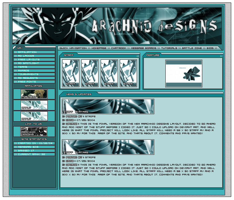
Published: 2004-07-29 10:22:47 +0000 UTC; Views: 9114; Favourites: 22; Downloads: 4665
Redirect to original
Description
Ok This is the Final well i hope final, version of the new AD layout, hopefully the members will like this one. umm +Favs really Liked as to help get more people to see it.Related content


Comments: 145

thanks  (Smile)")
👍: 0 ⏩: 0

lawl.. just read through all the comments on this.. o_o..... so many people were hatin on ya! >_>
👍: 0 ⏩: 0

")
thanks, even though it is really old
👍: 0 ⏩: 0

I'm jealous. I wish I could make layouts such as this one.
👍: 0 ⏩: 1
lol, takes alot of practice, i made this one a long time ago, over a year
👍: 0 ⏩: 0

its nice but the colors burn your eyes like hell >.<
👍: 0 ⏩: 0

cool maybe too turqoise? then again mines maybe too purple [link]
pretty much like everything about this, empty space bottom left though
")
👍: 0 ⏩: 0

holy crap....thats like....the best layout ever....(i say that alot o_O) but yeah thats awsome! its like...."woaah! thats awsome!" (i say that alot too ")
👍: 0 ⏩: 1
Thanks, hey if you like this one you should check out my others
👍: 0 ⏩: 0

what the fuck i dun remember writting that...i dun like that layout..jjus looks the same as the rest o his layouts
👍: 0 ⏩: 1
well arnt you nice. if you dont like it go away, you dont have to be a ass about it
👍: 0 ⏩: 0
Hey its rossco, Never thought of AD to be like green lol....
That is by far one of the best layouts i have sen on groups...uve out done yerself this time..well done dude *2 thumbs up*
👍: 0 ⏩: 2

eh, its just a real simple layout, just the way i like them
👍: 0 ⏩: 0

i really don't see anything special about this layout... i mean it is a step up from a basic layout, but it doesn't deserve to be at the top of the designs and interfaces gallery for a week (or however long this was up there).
👍: 0 ⏩: 1
i dont see why not, its a nicely laid out layout. Simple yes but i always say simple is better, and obviously im not the only one who thinks so as it has been the top for about a week
👍: 0 ⏩: 1
yes, it is laid out well, and you made it simple yet nice... but ive seen many other layouts submitted to deviantart that are just as good, or better, that are the same style as this that only get 40 or 50 views, and maybe if they're lucky a comment or two... and very very rarely a fav...
then there is your layout that is of the same quality that gets over 2500 views, over 125 comments, and 20 favs... i dunno, but it kinda seems like AD members may have just +faved the layout without truly feeling that it was that spectacular.
👍: 0 ⏩: 1
actually not even half the favs came from members
👍: 0 ⏩: 0


ordinary, seems this layout is default nowadays for mose sites. Colors are conflicting with each other wherever you look.
👍: 0 ⏩: 1
i happen to like the colors
👍: 0 ⏩: 1
That's great that you like the colors but what about the people looking at your site which is the whole purpose... No one will consider you professionally if you continually decide to make decisions on what you like, rather than what the client likes.
👍: 0 ⏩: 1
eh its just a hobby not that big of a deal
👍: 0 ⏩: 0

Im Loving This Layout Strife Cant Wait To See Coded!
👍: 0 ⏩: 1
yeah, already started slicing it, just ahve a few offline things todo before i can really sit down in one session and do it
👍: 0 ⏩: 0

Pretty good Strife. Good to hear AD is still rollin
👍: 0 ⏩: 1

Looks great, I love it. Very organized, and to the point. Perfect.
👍: 0 ⏩: 1
thanks a bunch, the simpler the better i always say
👍: 0 ⏩: 0

sweet layout. text kinda hurts my eyes after a bit of reading, but i think i'll get over that. u might want to try a layout that doesn't involve DBZ sometime [lol] just a suggestion. Killer layout bro.
👍: 0 ⏩: 1
lol, ive done non dbz layouts
👍: 0 ⏩: 0

i would have to agree that the colour is a bit too saturated, it's just too strong.
the white text on the blue background on the left panel doesn't read very well, not enough contrast between the two colours.
👍: 0 ⏩: 1

sorry but i don'T like it you should make more effects
👍: 0 ⏩: 1
thats ok, not eveyone hasthe same taste
👍: 0 ⏩: 0

lol, just a fan of layouts of that sort
👍: 0 ⏩: 0


Yes... It is... Not sure how this got to todays favourites, As of, It hurts my eyes, Its got dbz which was like a fad that died out a few years ago... I wouldnt trust any tutorials from this site. o.o
👍: 0 ⏩: 0

I'm sick of seeing DB:Z crap all over the place. If you're going to rip something off at least pick something decent.
👍: 0 ⏩: 2
not really ripping anything off, only thing not mine is a vegeta pic, you cant seriouslt think im th eonly on ethat does that... so many sites and so many layouts here as well
👍: 0 ⏩: 0

lol i must agree but never the less its a good concept.... with out the pics hey. congrats on the front page spot tho.
👍: 0 ⏩: 0

Sry, but, I dont like it at all.... this werid anime-kind page design style, that quite alot of people use is imho totally ugly...
It doesnt look professionel at all (a design page with vegeta in the header????) and the colors are not that nice...
Try to do something more professionel looking, that would get alot more favs imho!!!
👍: 0 ⏩: 1

great layout, seems as if it is an interesting site.. if you could let me know more about it..

👍: 0 ⏩: 1
| Next =>