HOME | DD
 Strife-Ignition — AD Layout Final
Published: 2004-07-29 10:22:47 +0000 UTC; Views: 9115; Favourites: 22; Downloads: 4665
Redirect to original
Description
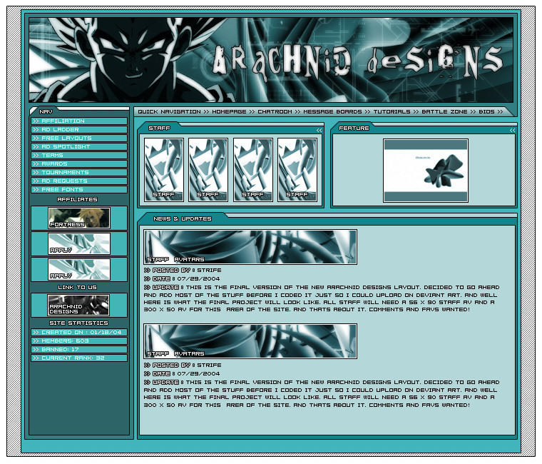
Ok This is the Final well i hope final, version of the new AD layout, hopefully the members will like this one. umm +Favs really Liked as to help get more people to see it.Related content


Comments: 145

there will of course be a disclaimer this is just a uncoded version with text put on in Photoshop to fill space
👍: 0 ⏩: 1

But you realize that it is still violates copyright laws....disclaimer or not. Unless you have consent from the owner of the images.
👍: 0 ⏩: 0

")

full view doesnt work for some reason..so i dunno what to say..
well from what i see i like the overall feeling
sorry
👍: 0 ⏩: 1
huh works for me, must be a bug im sure it will work eventually
👍: 0 ⏩: 0

wow, very nicely done! It's crisp and clean and I like the color scheme.
👍: 0 ⏩: 1

Very slick and pro looking..nice color balance and design...
the type with the black outline looks good, but the non outlined white type is very hard to focus on, with the light blue-green background...
Other than that it looks terrific!

👍: 0 ⏩: 1

Just beautiful ^_^! buuuuuut.... the color doesn't appeal to me, red could be nice!
👍: 0 ⏩: 1
lol i dont like red, im a Blue-Green Fan
👍: 0 ⏩: 0

It looks nice, clean, and professional 

👍: 0 ⏩: 1
lol thanks, vegeta btw, but he is dark so hard to tell
👍: 0 ⏩: 1
*looks again* aah, you're right, it's Vegeta
")
👍: 0 ⏩: 1

nice i like it the clour is eye cacthing
👍: 0 ⏩: 1
thanks, yeah the color is a main part of its appeal
👍: 0 ⏩: 1
Yep, Hopeing to get a Todays Favorite like my last did.. and it was nowhere near as good
👍: 0 ⏩: 1
yea that would be cool

👍: 0 ⏩: 1
lol boy did i ever! i was on like teh front page i was expecting like 150 views
👍: 0 ⏩: 1


I like the colours, the text is kind of small or the font is just hard to read, but I have bad vision. I like it but it looks a bit too technical, unless that is what you were aiming for.
👍: 0 ⏩: 1
it was ment to be somewhat techy, the font wont be the same in teh content area after its coded that was just fill for Deviant art
👍: 0 ⏩: 0

Great layout, I like the organization, and I lvoe that colour
👍: 0 ⏩: 1
Thanks, yeah im Big on Organization in my layouts
👍: 0 ⏩: 1
yeah, I dont really care for most layouts I make cause they end up rerally cluttered
👍: 0 ⏩: 1
Yeah mine were like that at first to i tried to do to much
👍: 0 ⏩: 1
lol, mine are like that cause im hte messiest html coder in the world
👍: 0 ⏩: 1
lol, yeah i know alot of those, i make my layouts as simple as possible so the code will be clean as well
👍: 0 ⏩: 1
lol, I need to start coding in something other than note pad
👍: 0 ⏩: 1
lol i usually just use notepad, Dreamweaver is good if its gonna be more then just HTML
👍: 0 ⏩: 2

I absolutely detest dreamweaver....
GO NOTEPAD. WOO WOO
and do you use CSS?
and if you want to check out my skills: my site . only look at the first page. that is all that is any good. it is hosted on a friend's server though.
👍: 0 ⏩: 1
lol yeah go Notepad, i have done alittle CSS work, and ill check your stuff out in a few
👍: 0 ⏩: 1
okay. given you are a dtf, I am surprised you even responded. take you time though man. and your layout is pretty sweet.
👍: 0 ⏩: 1
im just alittle busy on the phone right now buct as soon as im done i plan on checking your stuff out
👍: 0 ⏩: 0
lol, I dunno with note pad I usuually end up with one really long line of code......I used to ahve a program that number different lines
👍: 0 ⏩: 2

Notepad is deliciously geeky, but it isn't the best program really. I use: Dreamweaver MX in code view, Arachnophilia (free), or Taco HTML Edit (free, mac os x only).
Taco HTML Edit is my favourite currently. I liked one of the old versions of Arachnophilia, but the new java-based version makes my head burn. I use Dreamweaver only because one of my clients insisted that I make sure Dreamweaver could handle all of my serverside code so she could edit it..
And you can polish your HTML/CSS skills at W3Schools, which is the web consortiums free tutorials web site.
Look 'em up...
👍: 0 ⏩: 0
yeah, Notepad can get that way
👍: 0 ⏩: 1

The layout is very good I think, the design is also quite good although a bit saturated for my tastes. I really don't know about the font though, hopefully people won't have to read a lot on that site.

👍: 0 ⏩: 1
Thats just the font i used in the Deviant ARt Version, layout isnt coded yet
👍: 0 ⏩: 0
<= Prev |