HOME | DD
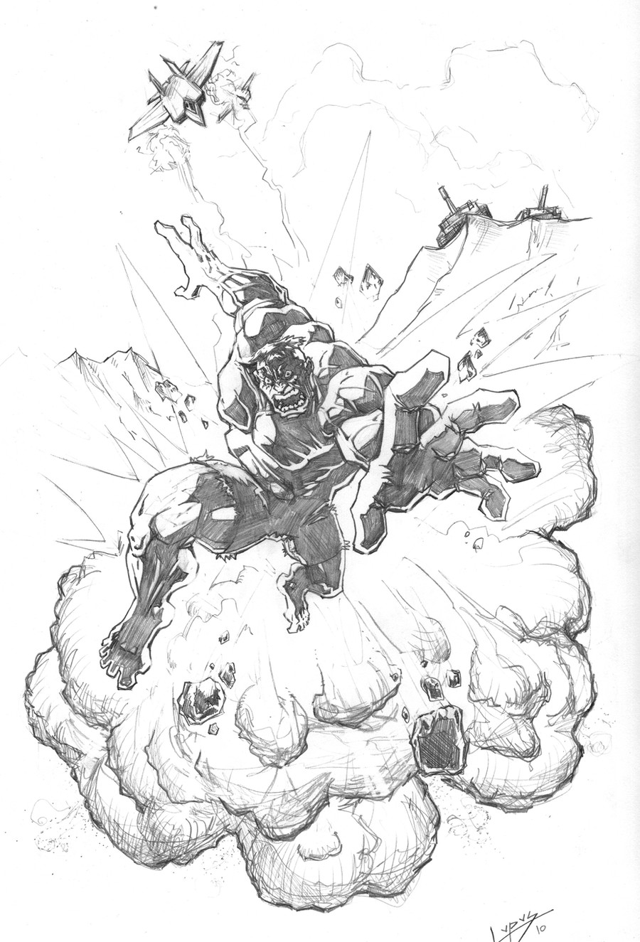
 StudioCombine — Thing by PatC-14 dINKed

Published: 2010-11-29 13:56:19 +0000 UTC; Views: 1092; Favourites: 29; Downloads: 16
Redirect to original
Description
Phew! Where to start? This. Took. Absolutely. Ages! Continuing my practise with inking I naively requested to do Thing ([link] ) drawn by the excellent ~PatC-14 It is an amazing drawing by a truly talented artist. If you haven't seen his work please go and visit his gallery: it's awesome!I really wanted to do his original piece justice, but it was much harder to capture the rendering with inks than I thought. The result is not what I hoped for but more of a compromise with my current level of inking skillz. I have learned a lot though! the most important thing being 'choose what you ink wisely!'.
Any advice on inking and critique is very welcome, as I really want to develop my technique...
Related content


Comments: 29

You need to work on bringing out the key features: the eyes, nose and mouth get lost amongst the inks. By varying the line weights, making the outline of the nose thicker for example, it will stand out and add depth to the image.
You need a lighter touch on the hatching as well. Practice having continuous lines: hatching should never show a break and join, it should be one continuous stroke. Also towards the dark areas the hatch lines (or feathering as it's better called in comics) should be thicker and tail off into a thin line towards the light areas.
I think you've done well in bringing texture in regards to the cracks. Just need to work on those other areas
 (Wink)")
👍: 0 ⏩: 2

thanks for taking the time to give me feedback on this. Especially since I am a HUGE fan of your inking. I did this a while ago digitally, and found it difficult to vary the line weights as naturally as one would with, say a pen or brush. Yes, I agree that I could have emphasised certain features especially when it's a very rough landscape. Hopefully, working with real ink should help to do the things you've suggested. Thanks again.
👍: 0 ⏩: 1
If this is digital you should change the category to digital rather than traditional.
I've not ventured too far into digital so can't really give advice on settings to get a more natural feel and line. The only one I know if setting the pressure sensitivity to the harder side.
👍: 0 ⏩: 1
I wouldn't recommend digital. I didn't enjoy it, it felt as robotic as it sounds. Buuuut, I guess the way things are going with tech nowadays, and so much stuff being done digitally, you may want to try it out.
👍: 0 ⏩: 1
I suppose the more you ink the more natural it will feel.
👍: 0 ⏩: 0
Ps, if you are unable to get continuous lines, you can trick it by cross hatching.
👍: 0 ⏩: 0

IT'S CLOBBERIN' TIME!!! So, uh... You need some colours? *nudge nudge wink wink*
👍: 0 ⏩: 1
I'm always lookin' for collabs for colours or inks, so go ahead. Just be sure to acknowledge the pencil artist, too.

👍: 0 ⏩: 2
Iz gots the colours
[link]
 (Smile)")
👍: 0 ⏩: 0
Thanks man!! I always give credit where it's due
👍: 0 ⏩: 0

Thanks! I'm new to inking so this was very experimental for me: trying to render different shades with different line spacing and weight. I'm glad you appreciate the effort!
👍: 0 ⏩: 1

Thanks for the Llama, you've got some great ideas and it's clear to see you are growing as an artist in both your pencils and your inks. You are on to something with many of your poses because they aren't the standard. Keep pushing dude!
👍: 0 ⏩: 1
That means a hell of a lot, Man. I'm really glad you can see some sort of progression (it's difficult to be objective about your own work). This stuff has become more than a hobby to me now. I'm trying new things almost with each piece, to make sure I'm going in the right direction. I don't know what I'll be able to achieve, but I don't ever want to regret not trying. Thanks so much for the encouragement!
👍: 0 ⏩: 0

")
Thanks a lot! I'm glad you like it!
👍: 0 ⏩: 1

it really was. Part of it was because I restarted so many times. It was a real challenge for beginner.
👍: 0 ⏩: 0


Really nice work man, this looks like one hell of a piece to try and ink so my hat goes off to you.
👍: 0 ⏩: 1
Thank you Sir! It was so difficult. Towards the end I didn't want to carry on, simply because I really love the original drawing and thought I wasn't doing it justice. I ploughed on though until I reached a stage where I'm ok with it.
👍: 0 ⏩: 1
I know what you mean.
Glad you did persist though mate as it looks pretty damn cool
👍: 0 ⏩: 0

Looks nice man. Good depth to the mouth, helps create the 3-D illusion.
👍: 0 ⏩: 1
Thanks, Man! Though I did have very good lines to start with.
👍: 0 ⏩: 0