HOME | DD
 sudoru — help me pick O: - mystline

Published: 2008-11-04 04:56:23 +0000 UTC; Views: 3120; Favourites: 109; Downloads: 223
Redirect to original
Description
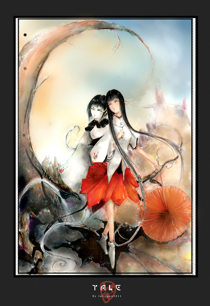
THANKS FOR VOTING! Since votes were pretty even i've decided to keep the two versions separate for your viewing pleasure 8D. See them here:LEFT: [link]
RIGHT: [link]
Hum, i couldn't decide which one i liked more. And i had even votes from friends! (special thanks to *kuroitora , =jadedice , ~xenogenetix , ~a-ndy , and bahn-bahn <: )
Please let me know which you like more, left or right? i think i will then scrap this one and just upload the more popular one? Or the one i like better after sleeping on it? O:
11x17 prints will be available at DotCon convention , please visit! <:
[SAI 1.01 + Photoshop CS2] | Textures from cgtextures.com
Related content


Comments: 160


It took alot of thought! but i choose the one on the left. I prefer the lighting slightly more to the one on the right.
👍: 0 ⏩: 1

Thanks!
I ended up posting both anyway...

👍: 0 ⏩: 0


Wow so pretty, i think the bright one wins me over by just a bit. but if the brightness of the flowers move on to the other picture... WIN xD <3
👍: 0 ⏩: 1
Hmm i tried to brighten up the flowers in the darker one... hope it worked out! haha
👍: 0 ⏩: 0


Keep all the versions on here, but the one on the left looks a little more fitting in my opinion.
👍: 0 ⏩: 0

Im late but oh well :3 My thought is both are lovely but why not make it interesting and make one side an different color robe and hair ")
👍: 0 ⏩: 1
LOL! Hmmm that would've been another path to go!
But alas, i am tired of staring at this drawing and am done with it! >0< thanks for your comment though!
👍: 0 ⏩: 1
haha its fine <3 I do love it tho still watching you like a hawk that i am <3
👍: 0 ⏩: 0

")


I prefer the left one. There she seems to be standing outside, whereas on the right she might be indoors.. which makes me wonder of the tree (snow, petals or such).
The one on the left is even more interesting to watch as I still see all the details even though the shadows fall all over the girl... It makes her seem someone not quite from this world, and what can I say, I like the mystery.
 (Wink)")
👍: 0 ⏩: 1
Thanks for your input! Ended up uploading both ~_~;;;!
(let's not point out that snow and petals don't make much sense either...wheeeeeee! 8D)
👍: 0 ⏩: 0

I thought I w as going to like the right one but after looking at it, I think I prefer the dark shadyness on the left one since it makes it seem almost connected with her emotions, however the right one is good too and I thought the lighting is great, the background lighted that way looks awesome too. :3
👍: 0 ⏩: 1
Thanks! My other friend described the left one as having "longevity" for looking lol!
👍: 0 ⏩: 1

The right one. But if you like the left one better, make the face on the left one look more like the right one and it'll look better.
👍: 0 ⏩: 1
i tried that before, but then the lighting wouldn't make sense since the character should be in shadow in the left one ;-; hmm
👍: 0 ⏩: 0

Beautiful, I just love both
To make it short - the one on the left has special atmosphere, the picture is more realistic and mysterious. The one on the right makes you concentrate on a pretty character and design.
Both are amazing, but I'd vote for the
LEFT 

👍: 0 ⏩: 1

They're both really good~ +___+
But if I had to choose one, I guess the left one, since it seems to have more of a mood or something...

👍: 0 ⏩: 1

They're both really nice, but I think the left one is best. There's more contrast, which suits it. =]
👍: 0 ⏩: 1

I like the one on the left. There's something about the misty unclear aura of the whole thing that fits the title and the darker feeling of the piece.
I also find the white of the window on the left really brings more contrast to the character making the entire picture pop. It really brings focus to looking at the piece which is useful when you want to sell, I think.
👍: 0 ⏩: 1
Yeah i was liking how the contrast pops out at you, but some seem to think it's a little too much contrast. xD
Thanks for your input!
👍: 0 ⏩: 0

Ok, I'm gonna be a pain in your backside for this....
I really love the light/shadow play on the girl on the left side. Nice touch with the window showing slightly through her hair.
But I also like the cherry blossoms (and snow?) on the right side. Kinda like glowing ethereal beauty.
My idea: Splice the two versions to have the best of both worlds.
Tolda ya I was gonna be a pain.
👍: 0 ⏩: 1
Eeeeeek! <3
Hmm yeah i may have to play around with both again. To be honest i'm a little sick of staring at this, been debating over the two forever. xD;;;
That or i'll just upload both versions @-@;;
👍: 0 ⏩: 1
Yay! Glad you uploaded both.
As for which one you like better... you might need to leave it alone for a while til you forget about it a bit, maybe even go fuzzy on what it looks like before going back to it. Then it'll hit ya.
I'm looking forward to seeing more of your stuff.
👍: 0 ⏩: 1
Thank you!
No time to dwell on this drawing though! Must move on for now @-@;;
👍: 0 ⏩: 1
Indeed. Onwards and upwards!
Then dust off that area of your grey matter and it'll hit you then.
")
👍: 0 ⏩: 0

They are both beautiful but I like the one on the right better.
👍: 0 ⏩: 1

Both are very nice but I think I'm gonna lean more towards the left.
👍: 0 ⏩: 1

For me, I prefer the one on the right. With the one on the left, my attention keeps going towards the window because it stands out more than the girl. I also like the brighter colours in the right one ^^
Good luck in making your decision! They can be so tough sometimes!
👍: 0 ⏩: 1
*nod nod* Thanks for your input!
👍: 0 ⏩: 0

i dunno which is better:S i like the ligther too but there is something good in the dark one :33
👍: 0 ⏩: 1

I personally like the one on the right but I think that you should post both because they are both beautiful.
👍: 0 ⏩: 1
Thanks for your vote! ^^
yeah at this rate i think i will post both...
👍: 0 ⏩: 0


| Next =>