HOME | DD
 sudoru — help me pick O: - mystline

Published: 2008-11-04 04:56:23 +0000 UTC; Views: 3119; Favourites: 109; Downloads: 223
Redirect to original
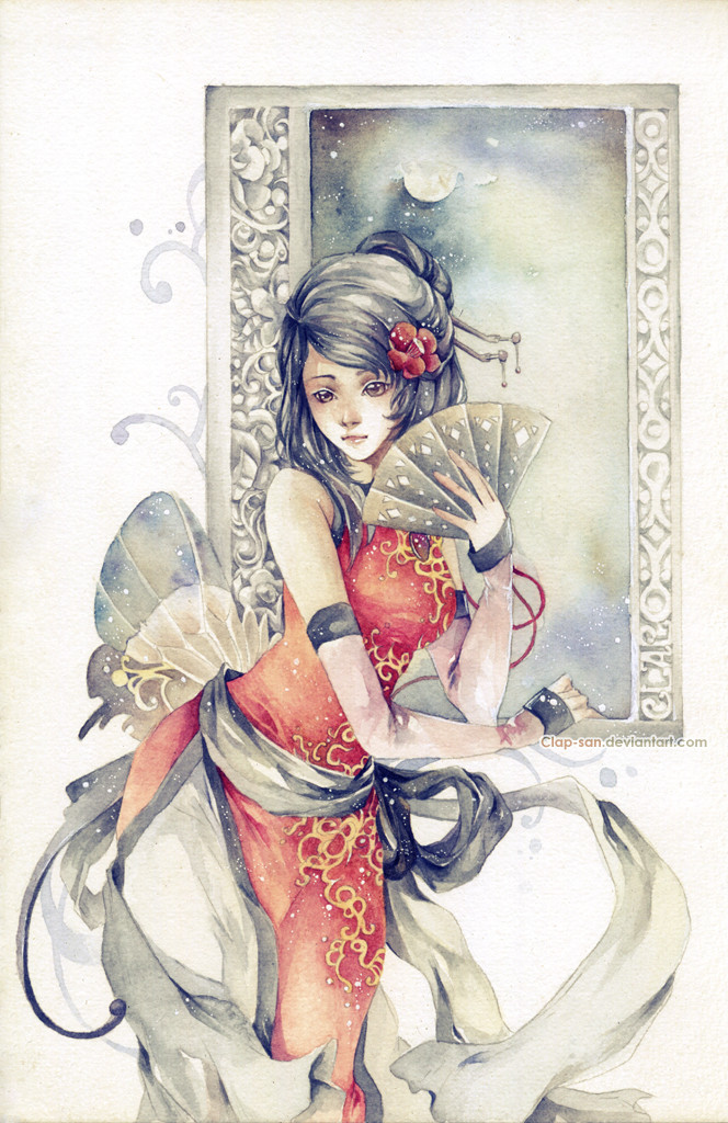
Description
THANKS FOR VOTING! Since votes were pretty even i've decided to keep the two versions separate for your viewing pleasure 8D. See them here:LEFT: [link]
RIGHT: [link]
Hum, i couldn't decide which one i liked more. And i had even votes from friends! (special thanks to *kuroitora , =jadedice , ~xenogenetix , ~a-ndy , and bahn-bahn <: )
Please let me know which you like more, left or right? i think i will then scrap this one and just upload the more popular one? Or the one i like better after sleeping on it? O:
11x17 prints will be available at DotCon convention , please visit! <:
[SAI 1.01 + Photoshop CS2] | Textures from cgtextures.com
Related content


Comments: 160

Both have such beautiful aspects to them that I can't pick! The one to the left looks like she's bathed in moonlight, while the other looks like she's silhouetted by evening city lanterns. Love them both.
👍: 0 ⏩: 1

Thanks! obviously i'm having difficulties picking too! xD
👍: 0 ⏩: 0

the one on the right stands out more, but the one on the left would be nice for a darker personality
👍: 0 ⏩: 1

Both is very amazing~
for some reason i prefer the left one(most likely coz of the atmosphere), but you should follow the majority since they say right lolz
it would sell better ><
anyway the coloring on the right is clearer so just go for it xD
👍: 0 ⏩: 1
Is the majority saying right? i think on comments it's mostly left, but poll is mostly right... aiyaa my head hurts xD
👍: 0 ⏩: 1
lol really? i read the first page comments, most of them were saying right.. xD
haha but in the end.. you're the one who chooses! so good luck ><
hmms how bout sell both?

👍: 0 ⏩: 1
i think a lot of ppl said left too though @-@! i think i will be selling both! Couldn't decide afterall...xD
👍: 0 ⏩: 0

Both are lovely.But I think the one on the left is nicer.
👍: 0 ⏩: 1

I say you should upload the most popular one but don't be scrapin' this one. It's good to see the same picture with a different lighting or brightness level. I ain't goin' give you my fav, I'm just goin' tell ya to keep this one up here.
👍: 0 ⏩: 1
*nod nod* i meant i was going to put it in my scraps, but delete it all together.
")
👍: 0 ⏩: 1
Just checkin' Sudoru. Just checkin'.
👍: 0 ⏩: 0

This is a tough decision... I like the dramatic light on the left one, but the right one has such nice color harmonics.
I think I'd go with the left one.

👍: 0 ⏩: 1

no problem ^^
i saw, finally you couldnt choose ? XD
👍: 0 ⏩: 1

LEFT! The lighting there in much better though the one at the right is still awesome!
👍: 0 ⏩: 1

Left one,
i think thats the prettiest drawing when i look at light sources :]
👍: 0 ⏩: 1

Both are very good!
I love the feeling of the left
and I love the look of the girl in the right.....
I can't choose!
👍: 0 ⏩: 1
It's okay, i can't choose either! ._.;; lol!
👍: 0 ⏩: 0

No matter you could not decide. Mix them. How about a darker kimono and lighter cherry?
👍: 0 ⏩: 1
Yeah i've tried mixing, and they never turned out as well as two separate ones. Mmm i may try again today with different combinations...
👍: 0 ⏩: 0

I cant choose... they both r the same except light and shade... the one on the right is more romanic and opefull like she's waiting for her love to come home, while the one on the left is more depression and grips my heart, it gives the feel she lost her love and now she's alone. I can not choose i'm sorry V_V
👍: 0 ⏩: 1
Hahaha it's okay, i cannot choose either. ;-;
👍: 0 ⏩: 0

I like them both but I think I prefer the left one.
It has more of an impact in my opinion, the lighting in the right one looks more unnatural than in the left.
👍: 0 ⏩: 1
*nodnod* i know what you mean, thanks for your input ! ^^
👍: 0 ⏩: 1

Mhm. It's a great work. But I like the left one more. XD. That light gives it interesting feeling...and the window remind me of moon, teehee. Left one <3
👍: 0 ⏩: 1

Right is more eye catching, but I like left one more
Anyway, you can try and merge them two together I guess D:
👍: 0 ⏩: 1
Believe me, i've tried...it doesn't work, which is why i've come to this lol! ._.;;;
Thanks for your comment!
👍: 0 ⏩: 0

I prefer the one on the left more~ It gives a nice effect that light is shining though the window onto her  (Smile)")
Ahhh, this piece is really pretty. I wish I could attend Dot-con so I can pick this up
")
👍: 0 ⏩: 1
Thanks for your input!
i also mail out prints!....*nudge nudge* 8D
👍: 0 ⏩: 1
Ohh o3o, I shall look into that then 8D~
👍: 0 ⏩: 1
Yes, yes you should! 8D
And omg, i now know to use Air Mail, i sent some prints off to someone by Surface mail and well, still no sign after 3 weeks...T-T;;;
👍: 0 ⏩: 1
Oh noes D: ;;;
It always sucks to lose mail, especially for something important or something someone bought =w=;; I'll keep this in mind when I send stuff~ Thanks for the little tidbit 8D

👍: 0 ⏩: 0

omg, this is so hard to choose >_>lll But I prefer the left one cause of the atmosphere and the girl just totally blend into the atmosphere. Like there's a story behind the pretty girl standing there and staring back.
👍: 0 ⏩: 1

I really like this drawing. Is totally amazing!
👍: 0 ⏩: 1

this looks wonderful!! great work!!
i like the right side
👍: 0 ⏩: 1

I like the right one better by far. The blues and yellows in the background compliment her red outfit nicely.
I also think the contrast levels balance out better on the right one. On the left side, you've got a huge contrast level in the background that doesn't match the lower contrast of her kimono. (Or is it called value in art terms? Sorry, I'm using film terms.)
And finally, the one on the left looks too much like a spotlight to me. The background has a very stark and modern feel to it which again, doesn't match her features or the softer feel and colors of her clothing. Again, the right side feels more balanced in tone and mood.
Beautiful girl, BTW. ^_^
👍: 0 ⏩: 2
Thanks for your input, haku!
It's true that she is supposed to look quite soft..hmmm! @-@
👍: 0 ⏩: 1
| Next =>