HOME | DD
 sumopiggy — Worlds Collide Revision

Published: 2004-08-11 08:29:12 +0000 UTC; Views: 9791; Favourites: 137; Downloads: 1366
Redirect to original
Description
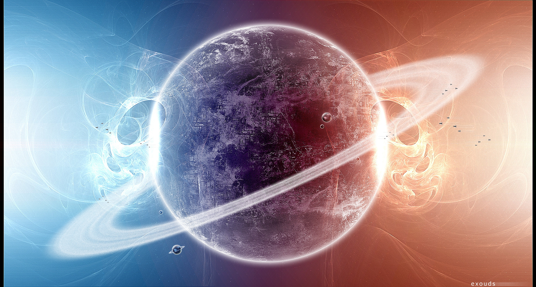
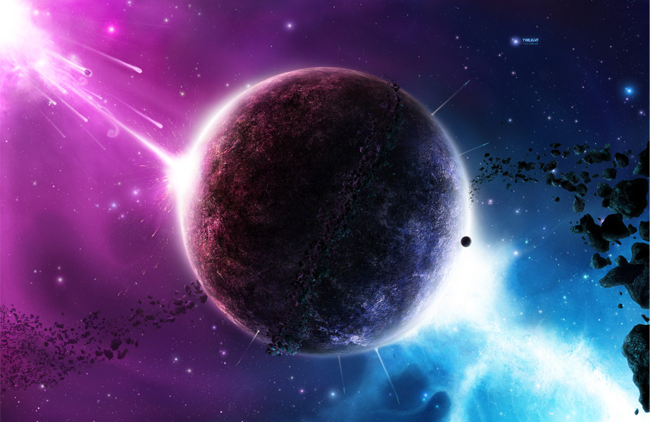
I decided to spruce up an early piece so I could sell it as a print. I really liked it so thought Id do a few things to make it a bit better, tho I kept the same major features.This wasnt meant to be a realistic piece, as you can see, I doubt it would look like this in real life.
Anyway, I cant think of anything else to say atm, except that it was done all in PS7, lol.
I might give it a better description later.
In the mean time, please add comments, suggestions and even favs *hint hint*
")
Hope ya like.
Related content


Comments: 27

Hey, can I have permission to use this image?
👍: 0 ⏩: 0


")


It looks like the souls of the planets are fleeing the scene
Haha, okay--I don't know where that came from. Beautiful work, though.

👍: 0 ⏩: 0

man u are my idol...i love everything u make
👍: 0 ⏩: 0


The only thing it makes me think of, is Final Fantasy IX when Terra (the red planet) and Gaia (the blue planet) Are colliding....Its just that cool. -cuddles the art- I lurve it! ^^ -hands out free cupcakes-
👍: 0 ⏩: 0

Yes, I was right. This is a spiffy piece of work. Well done.
 (Smile)")
👍: 0 ⏩: 0

I like the symetry within the piece and the colours... the collision seems almost magical with the pulsing shockwaves and the gas flowing... very nice
👍: 0 ⏩: 0

That is strange. I have almost exactly the same world texture you used at the top planet only I am not satisfied yet becuase I need some clouds on it though. You have verry light one like mine but I don't like it verry much so I am busy making some clouds. You should to.
👍: 0 ⏩: 0

You've got a lot of good things going on here, and some not-so-good things as well. If I had to pick one thing, it's that your green splotches on the upper planet look just like, well, splotches, rather than landmasses. I find that it helps to define your land (brown) and sea, and then use a layer set to Color mode, and lightly brush on green with a big, fuzzy brush with low flow.
👍: 0 ⏩: 0

Great impact, i love this...the colors are so cool. ^_^
Instant Fav
👍: 0 ⏩: 0

it is nice but you could have made it look a tad more realistic
not as good as most of the work you have done sorry
")
👍: 0 ⏩: 0

*does like* 
Og.
👍: 0 ⏩: 1
")

i love it. i completely love it. i love the spacedust too. +fav for sure
👍: 0 ⏩: 1

Thanks man
normally when people say 
lol, dont worry, I do it all the time
👍: 0 ⏩: 1
wut the? i thought i fav'ed it. anyhow, sorry, i did it again. im pretty sure i fav'ed it though. lol, well its fav'ed now. ur welcome, the piece was awesome
👍: 0 ⏩: 0

Oh no, this is not realistic! you can do better! *justkidding*
planets are nice, but the starfield is great!
The shockwave itself seems a bit too flat, but the two "rays" going up- and downwards are cool, especially the blue one.
 (Wink)")
👍: 0 ⏩: 1

Those planets are just too cool for school! The blue one looks wonderful, full of life and detail and very convincing to an Earth-like planet. I myself have never been able to create that illusion. The background starfield is nice and simple and fits well with the interaction in the foreground. The top right hand corner looks wonderful, it has a nice sense of flow and a great feel of majesty. However, the collision between the two planets looks a little dulled back. I must admit the effect you have right now is an impressivie one, especially the light shockwave bursting away. But the collision lack any action, it seems as though its frozen in time and this is the worst it will get. Other than that it was beautiful piece
👍: 0 ⏩: 1


Wow, now that is an amazing picture. Looks awesome! Great job.
👍: 0 ⏩: 1