HOME | DD
 sundreaming — venetian untitled - IX
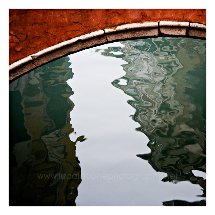
Published: 2006-08-21 18:09:12 +0000 UTC; Views: 1344; Favourites: 46; Downloads: 4
Redirect to original
Description
Venice, Italy. January 2006.Canon EOS 350D
Canon EF-S 17-85 IS USM
Related content


Comments: 69

Thank you... probably I wouldn't make this the same way today.
👍: 0 ⏩: 0

Simple and because of that impressive. Very nicely composed with great colors.

👍: 0 ⏩: 1

the colours are great. i also must add (though i say this alot), the contrast in textures really adds. the rough straight stone against the smooth rippling water.
it looks great.
👍: 0 ⏩: 1


Brilliant shot, the dramatic effect in the water and the red stones are just awsome...
Havent found a Deviation worth +faving in a long time, but this one deserves it!!
👍: 0 ⏩: 1
thanks Bob, much appreciated
👍: 0 ⏩: 0
thank you so much. these two came up after reviewing the venice material from last january -thought the series was over but... always good to review stuff after some time  (Smile)")
by the way I like your website... I guess I am about to redo all mine in black and dark grey. the more I see galleries like yours the more I want to get rid of all that white on mine.
👍: 0 ⏩: 1

Yeah, it's funny how going back to old work can enable you to look at it from a fresh perspective, and perhaps see something in it that you hadn't before.
Thanks for the comments on my site.

👍: 0 ⏩: 1
you're right about the dark color scheme... I've done some thinking though and I decided to leave that to the squares website [link] and to keep the 'white' on the main website [link] -I found a way to edit the settings of the Porta generated gallery here, getting rid of those ugly contour lines and using a lighter gray as 'frame' for the pics... kinda like it also because it reminds me of the color scheme of [link] . I think I'll keep it like this for now
👍: 0 ⏩: 1
Cool.
It's all horses for course, I think. Generally, you can't go wrong with white, grey or black, as they're the most flattering to pictures.
👍: 0 ⏩: 0

bellissimaaaaaaaaaaaaaaaaaaaaaaaaaaaaaaa aaaaaaaaaaaaaaaaaaaaaaaaaaaaaaaaaaaaaaaa aaaaaaaaaaaaaaaaaaaaaaaaaaaaaaaaaaaaaaaa aaaaaaaaaaaaaaaaaaaaaaaaaaaaaaaaaaaaaaaa aaaaaaaaaaaaaa!!!

👍: 0 ⏩: 1


what do i see...what do i see...hmmm
uhh i see nothing...
")
")
👍: 0 ⏩: 1
weird? no... abstract things are supposed to evoke stuff

👍: 0 ⏩: 1
stuffs...indeed it does
👍: 0 ⏩: 0

It's cool to see something fresh and different taken in a place like Venice. There are so many typical shots you see over and over. It's one of those places where you could pretty much point your camera anywhere and get a beautiful shot, but most people don't take the time to look for the less obvious. Cheers!
👍: 0 ⏩: 1
Thank you very much. That’s what I tried to do in my venetian series… moods, details, impressions, away from the crowd –lots of tourists even on that very cold and snowy january. Now a challenge could be going back there only armed with the lensbaby… the idea is really tempting.
👍: 0 ⏩: 0
sputnikpixel [2006-08-22 09:08:30 +0000 UTC]
Simple but effective composition and a lovely red.
👍: 0 ⏩: 1
Venetian red
👍: 0 ⏩: 0


thanks a lot.
👍: 0 ⏩: 1


You were right when you said that you would shoot Venice from a different point of view from tourists'. This one is both conceptual and abstract. It seems so peaceful, I wanted to be there, seeing water during hours...
Moreover, the colors and composition are great.
I love it as much as Venice's stairs I think, even if these two shots are totally different for me :]
Good night
 (Wink)")
👍: 0 ⏩: 1
Thanks a lot Aurelie. This and the other one came up much later than the original venetian series –always good to review your stuff after some time, with a different eye, perhaps different tools and attitude. I admit that recently I’m equally attracted by monochrome and bold color -and yes with an eye to abstraction, details. I’ll see where that will bring me
👍: 0 ⏩: 0


Venis = The water, the romance...city of couples and love !
Here water...and red....
I love...your shot ")
👍: 0 ⏩: 2
merci
👍: 0 ⏩: 1
btw nice different point of view, as you said experimenting is a good way, and here well done
👍: 0 ⏩: 1
Ravie qu'on aime les mêmes photos 
PS : on ira à Venise ensemble hein ?

👍: 0 ⏩: 1
rhooh arrêttes, parce que..................................................................................................................................................
👍: 0 ⏩: 1


350D?! wow un buon motivo in più per comprarla, spero che a breve sarà mia. Complimenti
👍: 0 ⏩: 1
grazie
👍: 0 ⏩: 0

| Next =>