HOME | DD
 SunnyGho — Color:MoonlightHigh-preview2
Published: 2005-01-16 10:43:28 +0000 UTC; Views: 5701; Favourites: 19; Downloads: 1152
Redirect to original
Description
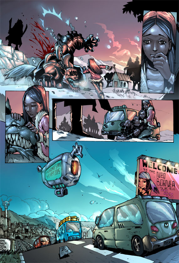
2nd page from MoonlightHighschool!critics and comment welcome!!
All title,concepts and character, copyright GraveyardShift.
@@@@@@@@@@@@@@@@@@@
Writer: Alfi Zachkyelle & Prasajadi
Pencils: Alfi Zachkyelle
Inks: Marcellius Rhoald
Colors : Sunny ( me )
-GraveyardShift 2005-
Related content


Comments: 23


Kayaknya perlu ditancapi gasnya nih biar lebih nendang. Rasanya bisa lebih greget dari ini deh!
👍: 0 ⏩: 1

huehehe, iya nih, kemaren baru aja direvisi visualnya, ntar kita tendang2in deh orang2nya biar nendang juga gambarnya hahaha.
👍: 0 ⏩: 1


I like it! 
👍: 0 ⏩: 0

great job. You could use the color tons to show the emotions displayed on each panels. The first 4 panels could have a darker look with red sky. The last panel could a the sun rising over the moutains... but then again, great coloring. I also draw comics (not professional yet), so I would also welcome your feedback.
👍: 0 ⏩: 0

A couple of things I see with this page, the girl in the second scene, her eyes seem far apart, in fact they make her appear a little silly. In the third scene her hair is very far above her head almost like it was stretched. She seems to change appearance in the face and hair alot, it is not too consistant from scene to scene. Alfi may want to work with her a bit more. Fourth and fifth scene are great! Although the story has me a little lost without any words or text ^_^. Great coloring job, I like the unique shading.
👍: 0 ⏩: 0

the top right panel doesn't convey the emotion needed (color-wise) to capture the moment of intensity.and EVERYTHINGS shiny!
the wolf has the same texture as the girl's jacket!
it has the effect that everythings plastic. maybe tone down the special effects a bit, and pick your targets.
you don't have to empty all of your skills on every panel! the drawings work well enough, and the panel flow is strong.
it looks like an intriguing story- i will be watching!
thats =my two cents..

👍: 0 ⏩: 0


Awesome jobe man! Would love to have someone of your caliber color my stuff. Once again great job!
👍: 0 ⏩: 0

apa aku engga salah liat? itu van mirip ojek di indo>> yg biru2itu lo.. miss indo punya mikrolet #_#
👍: 0 ⏩: 0


the perspective is great! the artwork, the coloring, and shadows. Perfect.... i cannot critique your work. =] hope to see more~
👍: 0 ⏩: 0

wow amazing colors; very professional.
I cannot give advanced critique cos' I think it's really perfect!
👍: 0 ⏩: 0


I agree with the above comments. If the silhouette was smaller, it would appear to be more dynamic, though I can't really say how you'd be able to make it appear as though the van were moving, aside from adding motion lines. It's absolutely beautiful though. I'm going to definitely be keeping track of this. ^_^
👍: 0 ⏩: 0

If anything (and this is just picky now) I think you could push scale a little further. Example:
the figure in black (phoenetics here I come) sil-O-et is a little on the large side. I think by making him a little smaller you could make the perspective more dynamic. I mean, he's the same size as the figure in the foreground, which flattens it a little.
Also, the van doesn't really appear to be moving, but I don't know how to mke it look llike that without disrupting the careful linework you already have. Perhaps some subtle tranparent colors to imply the passage of the object? Like motion blur, only super-subdued.
But on the plus side, I like that you used a lot of the same colors throughout the whole page, and it altogether looks very very professional. which brings me to a question- are you a pro? or in school?
👍: 0 ⏩: 1
whoah..i've been waiting for something like this! thanx for your comment!
about the van, i agree it's doensn't looks like moving, i'll figure a way to fix it out..maybe i'll try your suggestion about adding subtle colors to give an motion-effect ^^
and about the figures, i'll talk to my studiomates about that. Thanx very much man!
and..thanx for the kind words, i'm still an university student, but this is my 3rd year working as comic book colorist ^^
")
👍: 0 ⏩: 0

I like the color styl.
The clouds are not so much my favs but by your styl they are O.K.
👍: 0 ⏩: 0