HOME | DD
 Sunset-Valley — Ready? Set. Run.
Published: 2009-09-10 05:02:18 +0000 UTC; Views: 1792; Favourites: 20; Downloads: 42
Redirect to original
Description
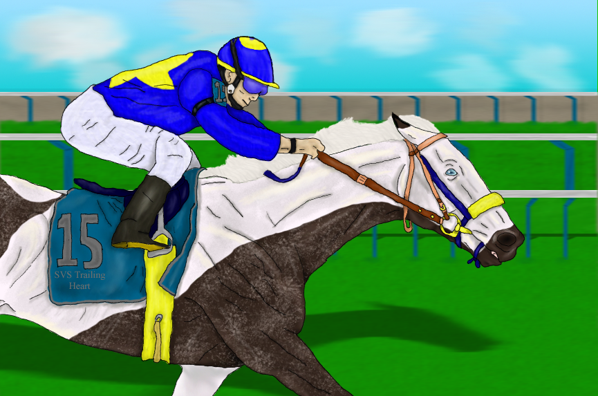
edited 9-10-09: motion blurred the background~~~~~~~~~~~~~~~~~~~~~~~~~~~~~~~~~~~~~~
The gate assistant stared as the painted mare was ridden up to the #15 gate. He froze for a moment, he'd never seen a pinto racer before and was amazed. But he quickly snapped out of it grabbed the mare's bridle and guided her carefully into the starting gate. "Easy Girl. Easy." Amber whispered to the 2 year old as she trembled with anticipation. She was ready to go. This was her maiden race, but racing ran deep in her blood. Her father was a champion as was her mother and her grandparents. Her twin brother wasn't a racer, but it seemed he was a jumper. But that didn't matter to her. All that mattered was winning. Tokio Drift was being loaded, but was having problems, finally he loaded and all the gates were closed. The gate assistants climbed out leaving the jockeys to handle their mounts, but that lasted a split second and the the gun fired and the gates flew open.
"Ladies and gentlemen here we have it The first ever GII Sumerian Stakes is under way. And the crossed mare SVS Trailing Love jumps to the middle of the pack." This continued to be where she stayed until there was a quarter of the race left and then she began to make her move. Her strides had lengthened and she was moving up the pack...
~~~~~~~~~~~~~~~~~~~~~~~~~~~~~~~~~~~~~~
This is my entry for 's Grade II Sumerian Stakes ([link] ). Do you want me to draw my silks?
Horse Name: SVS Trailing Love (sorry told you the wrong name Sage)
Stable Name: Sunset Valley Stables
Owner: Amber Ackman
Rider: Amber Ackman
Running Position: middle until a quarter left then makes her move
~~~~~~~~~~~~~~~~~~~~~~~~~~~~~~~~~~~~~~
Please critique it.
Reffed from a picture found on google. Had 79 layers and took about 15 hours or more.
~~~~~~~~~~~~~~~~~~~~~~~~~~~~~~~~~~~~~~
Terri was home in bed Amber's dad was awake and with her
Related content


Comments: 41

Overall

Vision
Originality
Technique
Impact
I HATE how people say "First off"...Not me!
Everything looks well rounded, I.e. The horse and rider mesh well together. But there are a few things that need to be changed/added...
1. SHADOWS and Dark BASES. NEED MORE! When you are looking at a reference photo make sure to go to Image>Adj.>Curves>Bring the curve button down a tiny bit. Just so you can add more bases, and shadows...
2.The colors on the horse again, are GOOD, but white shouldn't be THAT bright for a white horse. Start with a dark base and work your way light. not the other way around, it's harder to go from white to black digitally than vise versa...
3.The DAMN lines on the white parts...Take your lines layer>DUPLICATE it so if you fudge up you can always have the original...go over the WHITE areas with a low opacity eraser brush and get rid of the damn black lines! grr..I keep telling you! lol
4.DEPTH. There's not a whole lot of it...when you're looking far away at grass, is it all the same color/hue? Probably not..make the distance a tiny bit darker and gradually work your way to a light yellow/greenish brown color for the grass. no blade looks exactly the same as the other.
5. You did good on the light source, but MAKE SURE you have TWO different light sources, usually from the sky, and the ground, where the sun would reflect off of the grass and beam back up to hit the objects from the underside..
other than that, GREAT JOB!
I hate giving you critiques cause I always think you will get mad, but I just wanna help!!!
👍: 0 ⏩: 1

I might color cordinate the lines, but I like her being very white. Thank you for the critique
👍: 0 ⏩: 0

Overall
Vision
Originality
Technique
Impact
Well, first of all, this is a beautiful picture. i do love this boy's color, it looks like a roan paint? that said, the roaning effect is amazing. it looks very life-like.
now, on to the critique! while the ruffles in the jockey's clothes, they aren't shaded very much, so they look just like lines across his clothes. i don't know if you have a tablet/photoshop, but if you do, i would recommend the airbrush pen opacity flow set at 50%. it's the best for smooth, life-like shading.
also, don't be afraid to be bold with your shading! use dark, almost what you think will be too dark, colors for shading, and if they look bad, do them over! more contrast on the muscles will make it look 200% more realistic.
also, for the lines. i don't know if you use a tablet or not, but it always makes for smooth lines if you zoom way in. if you double the image size, then zoom to 300%, you'll get clean, crisp lines every time.
other than that, great job! i fail horribly at humans. keep it up! e.deviantart.net/emoticons/b/b… " width="15" height="15" alt="
")
👍: 0 ⏩: 1
Thank you. I use ps 7 and a wacom tablet. My hands are shakey but I'm getting better compare this to some of my older stuff. I may try the bold shading. Yep she is 3/4 thoroughbred 1/4 paint. She's a dark bay roan
👍: 0 ⏩: 1
you're most welcome! everyone experiences shakey hands (i know i do)
just be patient with the lineart, and it'll be awesome.
i know i loathe doing linework, but it must be done!
she's beautiful.

👍: 0 ⏩: 1
thank you. if you look in my gallery you can see more picture of her as well as her twin brother
👍: 0 ⏩: 1


Vision
Technique
Okay, first off, amazing picture. You have the jockey who is nicely placed on top of the horse's back. The horse is extending and giving it all he's got. Perfect angle shot as well. Both horse and rider look not only determined to win, but very trustworthy of each other. The horse is relying 100% on the jockey to guide him in the right direction.
But, since you asked me for a critique, here is what I think and suggest. (Bear in mind I have never decided to critique anyone's art, because I find it all to be great.)
The first thing I notice is the yellow bit, though you might be trying to match the shadow-roll there, it doesn't look realistic, it's nice but if you want to make it look realistic, you might want to make it silver or a mid rust color. Still awesome looking though.
Secondly, the jockey's toe looks as if he might end up making a wrong move and wind up off his mount. You might want to place his foot just a little more into the stirrup iron to make it look like he's safer.
Lastly, the thing I also noticed was the fact the horse's throat latch was just hanging there. In my opinion it probably needs to fit a little tighter.
Overall this picture is truly amazing. I see great depths and details to everything about it. You really outdid yourself. The thing that I must say I am favoring about this lovely piece, is the fact the devotion gleams from both horse and rider. And that is truly something special if you ask me.
Pain's vote: Epic win!
👍: 0 ⏩: 1
thank you Briana 
👍: 0 ⏩: 1
Ah, okay. And you are most welcome. ^^
👍: 0 ⏩: 0

Cool! I agree with the critiques, that the horse and rider should be shaded a bit more.
But besides that it looks really good
I especially like the horse's face  (Smile)")
👍: 0 ⏩: 1


I'll give a bit of critique.
First off, the horse
The horse's anatomy is quite acurate. I love the pose and the muscle tone you gave it.
The jockey.
The jockey is alright. Not the strong point anatomically, but much better than what I cold do! When adding the wrinkles on the johdpurs, don't use lines, try shading them in, it will look a bit tidier. ")
Overall.
This pice flows nicely. I really really enjoyed looking at it. The lines are a tad shaky, but I know that's hard to do. The background is simple and doesn't take away from the main focus. Though I would add some more color variation in the grass for perspective purposes. I Love how there seems to be motion going on, but you know there isn't...it's a drawing! And I can sence the emotion in the picture. It was really really REALLY well done! Thanks for posting this and letting me see such a nice piece. I see so much randomness on dA now-adays. Keep drawing!
👍: 0 ⏩: 1
thank you I'm updating so that the b/g is blurred slightly
👍: 0 ⏩: 1
👍: 0 ⏩: 1
👍: 0 ⏩: 1
Dude.
👍: 0 ⏩: 1
thank you sometime tomarrow I'm going to update it again with line that aren't black and probably abit more shadowing
👍: 0 ⏩: 0

Thank you. Would you critique it if you get the chance? and thank you for the fav
👍: 0 ⏩: 1

no problem ^^ hrm... I've never done a critique before :S i suppose i'll give it a try - although I don't think i can beat pain's critique XD
👍: 0 ⏩: 1
it's okay any and all critiques help me learn and get better
👍: 0 ⏩: 1
hmm... i don't know! i was going to say about the background being blurred to show movement, but you're one step ahead of me! XD hrr... i love the horse's eye, it shines beautifully... maybe the mane could be a bit more wild? lol wait, that makes no sense... XD im terrible at critiques... the mane, being made up of hundreds of little hairs may be more wild, as the wind is probably rea`lly fierce at the speed they're going, but i don't know, i don't often draw horse. Straight away, I can tell the anatomy is spot on, especially the head.
the writing on the material ' SVS trailing heart' wouldn't be so sraight - being on the material, it would be creased with the material
and that's all i can think of! lol sorry, this is my first critique so it's not very good, kind of all over the place XD hope i helped!
👍: 0 ⏩: 1
No it's good and I thank you for it. The writing is my fault my handwriting sucks so I used the text thing in ps 7. I many redo the mane but I'm lazy, I am adding more shading, etc
👍: 0 ⏩: 1
okay - keep up the good work
👍: 0 ⏩: 1
I like critiques they help me learn if I don't like it then I just ignore it
👍: 0 ⏩: 1
I'm glad there are still some sane people in the wrold! XD
👍: 0 ⏩: 1

^^ Np i really like it and i love horses

👍: 0 ⏩: 1
oh well , i don't know how to do it ")
👍: 0 ⏩: 1
it's okay thank you anyways
👍: 0 ⏩: 1