HOME | DD
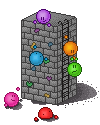
 Synfull — The wall
Published: 2010-02-24 23:13:18 +0000 UTC; Views: 4724; Favourites: 193; Downloads: 70
Redirect to original
Description
update 3:Updated again. This time i'm happier
Thanks to =Mr-Jaunty and `capncraka for the help with shadows
update 2:
Messed with the shadows after some advice. Still not happy with them though. Any tips?
update:
Added a shadow. I like the idea of it but not 100% happy on how it looks right now. Any advice?
Original:
I was on iscribble and decided to test out the fixed paint tool (it now allows you to do 1 pixel dots) so i started off my drawing the left side of the wall. After colouring it and dithering it i added the right side and ended up with a nicely pixelled block.
I then added the ladder and the orange and green emotes. At this point i knew what i wanted to pixel but kept getting frustrated by the fact i would draw the emotes 2 pixels off and not be able to move them without a total re-draw.
So at this point i copied the block into paintshop pro and finished it off. To save time (i'd already spent like 4 hours on just the grey block >.>) i used my pre-made bases for the emotes, including putting them over the orange and green ones i had drawn in.
I then added the extra features. I'm actually quite happy with how it turned out. It may have taken ages but the result is woth it. Some of the lighting dirrections are probs off, but oh well.
Also, check out the collab i did on iscribble
")
Related content


Comments: 86


Hey, how do I upload a GIMP image to deviantART?
👍: 0 ⏩: 1

You save them as a suitable tile type (.jpg .gif .png etc) and upload them normally
👍: 0 ⏩: 1


shadow should be square
maybe a shadow for the climbing ones if youve got the patience...

👍: 0 ⏩: 1
Technically its making a show over the point, so shouldn't have a flat top to my belief
And i already have a shadow for the blue one on the bottom of the wall, though i guess it should be on the wall
👍: 0 ⏩: 1
^^ wtv u think, its ur artwork
i still think the shadow should be pointed however
👍: 0 ⏩: 0


I think in regards to the shadow you should make the top of the wall a lighter gray and the right side of the wall a darker gray. (To make the wall more 3D looking) You might also want to add a shadow (against the wall) to the purple, blue, yellow and green emote. I hope this helped  (Smile) - =)")
👍: 0 ⏩: 1

I love it, but the purple and blue emotes could use shadows?
👍: 0 ⏩: 1
I've added one for the blue one
👍: 0 ⏩: 0

Change the angle of the shadows so that the light matches that of your shading. Also, try using darker shades of dAgreen for the shadows.
I helped.

👍: 0 ⏩: 1


As capncraka said: The shadow is both too dark and too solid right now, a light shade to begin with and some dithering at the end would make it fit in better.
And if the objects casts shadows, so must the characters in the scene
👍: 0 ⏩: 1


Nice pixeling on this wall, i like the 3D effect it looks great 

👍: 0 ⏩: 1


In regards to the shadow:
Please take this constructively
It should not be so round...as the tower is a block the shadow should have more angles to it. Of course it needs to be a bit rounded since it is a shadow and does stretch but it needs to atleast have some sort of indication of corners to it, I feel. Also, the shadow is a bit dark..that's a good shade to start with around the base of the tower but I would also suggest working your way from that dark grey to lighter shades until you have a nice light grey at the end.
One more thing..now that you've decided to add a shadow to the tower I have to agree with =ManiacalMuffin and say that the emotes (atleast the two on the ground) need shadows!

👍: 0 ⏩: 1
Thanks
👍: 0 ⏩: 2
oops wrong file [link] there..had to add the background so i could see the light shade of grey D:
👍: 0 ⏩: 1
Not as keen on the dirrection the tower one is pointing in, but i certainly see what you mean about the emote shadows and different shadow colours
👍: 0 ⏩: 1
Yea, I threw it together very quickly and wasn't concentrating on keeping shadow lines all lined up and perfect 
👍: 0 ⏩: 0
[link] here's a bit of an example of what i'd suggest and what i was trying to describe
note i made that in like 5 min...i'd spend much more time on perfecting the shadow of the tower but that's a good starting point :}
👍: 0 ⏩: 0

Great idea to add the shadow but I think it could use a bit of work
The perspective of it is great but I think it may be a little dark. Perhaps make it a bit lighter? And maybe add some shadows under the emotes too? Just some suggestions :)
Otherwise, great job!
👍: 0 ⏩: 1
Ahh yeah. I agree with that. I'll try and improve it later
👍: 0 ⏩: 0

I like the piece but not really crazy about the shadow, I'd make it lighter if possible.
👍: 0 ⏩: 1
Yeah. I quite like the shadow being there but i think it needs some work
👍: 0 ⏩: 0


| Next =>