HOME | DD

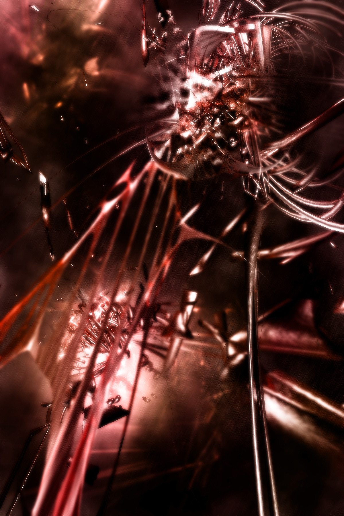
syntax4 — Cupcakes And Missles

Published: 2005-02-06 06:58:28 +0000 UTC; Views: 1035; Favourites: 16; Downloads: 323
Redirect to original
Description 
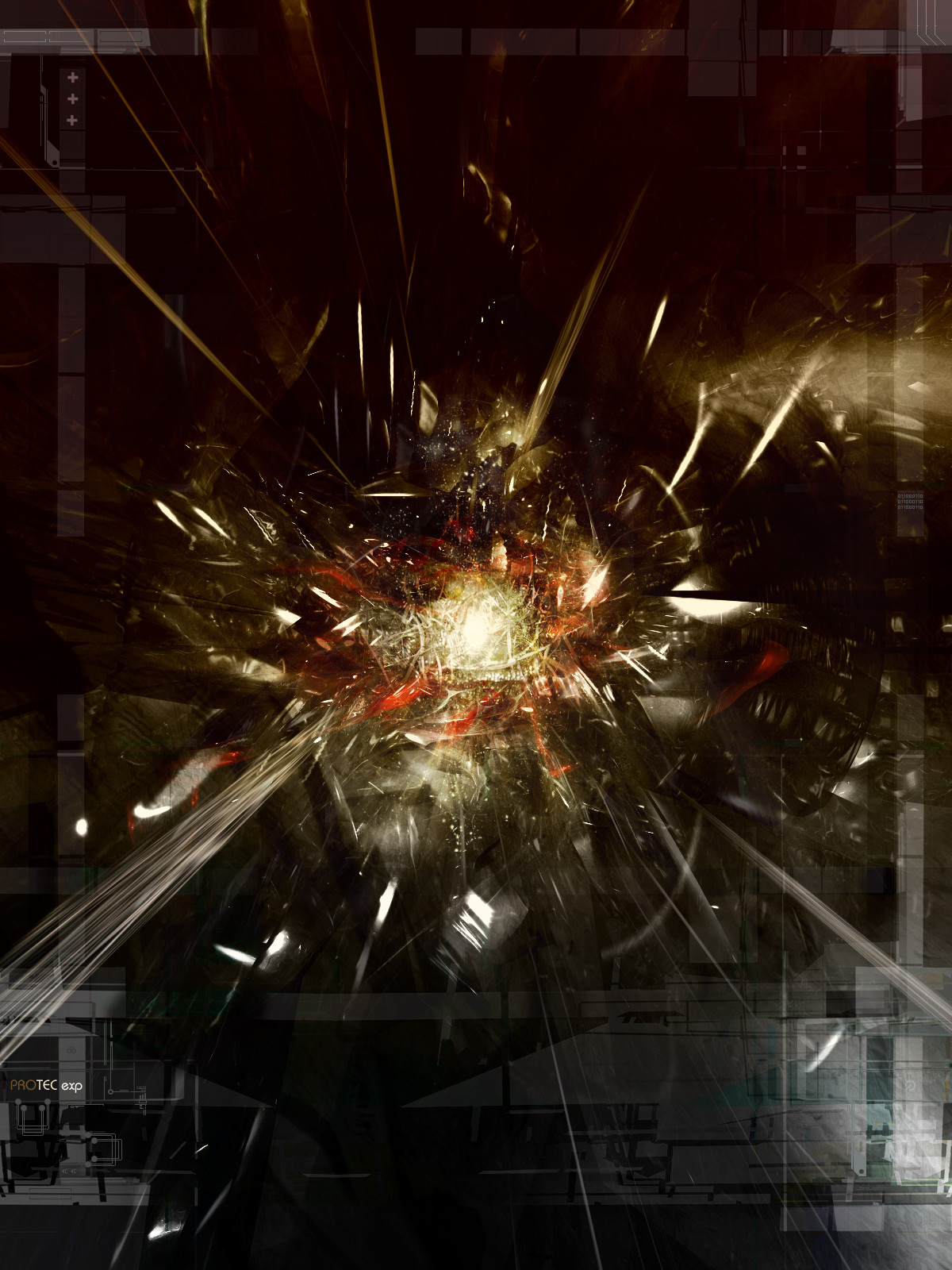
This was originally blue. i remembered i hate blue.
Related content
Comments: 31

Geofftography [2006-10-10 05:33:10 +0000 UTC]

wow

👍: 0 ⏩: 0

TheMaestro- [2005-07-26 14:52:22 +0000 UTC]

your materials are always so good

👍: 0 ⏩: 0

desaa1 [2005-02-09 03:12:27 +0000 UTC]

love the name, lol

....? if you hate blue why is your ava blue?? :blink: :blink:

👍: 0 ⏩: 0

Renox [2005-02-08 17:10:04 +0000 UTC]

awsome render it's cool man

👍: 0 ⏩: 0

channelart [2005-02-08 02:14:32 +0000 UTC]

funkodelic uber ninja

👍: 0 ⏩: 0

aeonart [2005-02-07 07:19:46 +0000 UTC]

love the depth placed in this piece.

👍: 0 ⏩: 0

bassboy811 [2005-02-06 22:49:46 +0000 UTC]

awesome. everything is superb.

👍: 0 ⏩: 0

KFoster [2005-02-06 22:25:04 +0000 UTC]


The

👍: 0 ⏩: 0

SgtTMan [2005-02-06 19:54:28 +0000 UTC]

it's amazing man....idk i think blue might be better....but then again......i'm not that good me lub it.

let's share a baby together.

👍: 0 ⏩: 1

syntax4 In reply to SgtTMan [2005-02-06 22:44:17 +0000 UTC]

pfft, with the way YOU look, i wouldnt want to put a child through so much pain growing up with those terrible genes

👍: 0 ⏩: 0

reks [2005-02-06 19:48:30 +0000 UTC]

lol, odd name

i like it overall though, nice job

👍: 0 ⏩: 0

Jakska [2005-02-06 17:45:36 +0000 UTC]

i agree with Hendi about the blurry thing, but the rest of it is excellent

👍: 0 ⏩: 0

Hendi5689 [2005-02-06 17:06:30 +0000 UTC]

very nice but i dont like the blurry part right in front....detracts from the rest of the image

👍: 0 ⏩: 0

Ponce [2005-02-06 16:46:17 +0000 UTC]

ur avatar is blue lol looks nice

👍: 0 ⏩: 1

syntax4 In reply to Ponce [2005-02-06 18:52:07 +0000 UTC]

👍: 0 ⏩: 0

01041003 [2005-02-06 14:45:04 +0000 UTC]

the blurred/focused foreground vs teh focused/blurred bg is making my eyes do weird things...

i love it.

👍: 0 ⏩: 0

darkarchmage [2005-02-06 14:25:56 +0000 UTC]

pretty nice work ! I liked it

👍: 0 ⏩: 0

xFailureByDesignx [2005-02-06 14:22:08 +0000 UTC]

very fucking brilliant!!!! looks so awesome...
FULL VIEW IS A MUST for this peice!!! , awesome job... wow...so damn awesome

👍: 0 ⏩: 0

Bateri [2005-02-06 14:10:26 +0000 UTC]

fucking brilliant, very original compared to other pieces of this kind. Great job

👍: 0 ⏩: 0

knOwme [2005-02-06 12:09:19 +0000 UTC]

... wOw it lOoks tOo gOod ...

👍: 0 ⏩: 0

Shafik [2005-02-06 11:18:04 +0000 UTC]

Wouldve ben nicer if it was blue ... but overallits brilliant i love the rain effect / render / brushing ^_^

👍: 0 ⏩: 0

Twistedsticky [2005-02-06 09:54:30 +0000 UTC]

Very nice, I like the blurriness and perspective, that's something that you do brilliantly. The render is amazing, and I love the rain effect, it makes it so much better.

👍: 0 ⏩: 0

Rubenski [2005-02-06 08:53:02 +0000 UTC]

Neat render! love the coloring!

goes into my fav's

👍: 0 ⏩: 0

witmer777 [2005-02-06 07:21:21 +0000 UTC]

Very nice. where you been lately?

👍: 0 ⏩: 1

syntax4 In reply to witmer777 [2005-02-06 09:20:02 +0000 UTC]

well my parents got a hold of this piece of paper, it had the words "REPORT CARD" on it............end of story

👍: 0 ⏩: 0

DGGT [2005-02-06 07:15:17 +0000 UTC]

pretty nice brushing blurring is too heavy. and lose the rain effect.

👍: 0 ⏩: 1

syntax4 In reply to DGGT [2005-02-06 07:16:14 +0000 UTC]

NOOOOOOOOOOOO!!!11 not my rain effect

👍: 0 ⏩: 0

Korpus- [2005-02-06 07:12:52 +0000 UTC]

*Drool*

I envy you, but I think the blurring is a little heavy up close.

👍: 0 ⏩: 1

syntax4 In reply to Korpus- [2005-02-06 09:18:54 +0000 UTC]

*eats drool*

👍: 0 ⏩: 1

Korpus- In reply to syntax4 [2005-02-06 09:21:14 +0000 UTC]

👍: 0 ⏩: 0

UrbanBatgirl [2005-02-06 07:04:08 +0000 UTC]

Its very pretty^^ and very abstract^^

👍: 0 ⏩: 0