HOME | DD
 SystemOverload — ec0

Published: 2004-12-21 00:34:14 +0000 UTC; Views: 439; Favourites: 6; Downloads: 144
Redirect to original
Description
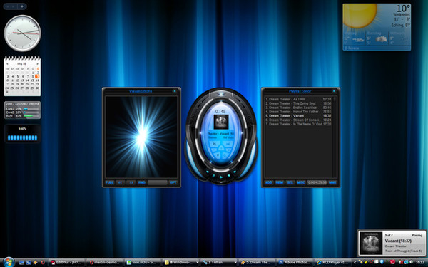
_ec0FULL VIEW IT! OR ILL KILL YOU!
Related content


Comments: 28

looks more like a preview for a template. very cool, great text effect
👍: 0 ⏩: 0

Very nice. I'm not quite sure how to critique graphic design so all I can really say is that I like it. Especially the white waves on the right.
👍: 0 ⏩: 1

thanks buddy.. i appreciate your comment
👍: 0 ⏩: 0


thanks buddy.. long time... havent heard from you in a while.. how are things?
👍: 0 ⏩: 1

Not too bad now bud. Just work bogging me down now. Hope U R okies
👍: 0 ⏩: 1
yeah, i know how that can be. Yep everything is good over here..
👍: 0 ⏩: 0

")
")

 (Wink)")
haha, no your safe buddy! phew.. that was a close one.. ")
👍: 0 ⏩: 0

great blending of colors and the replication on te right side
👍: 0 ⏩: 0


YOur submissons keeps getting better and better mate
THe only thing i don't like about this one is the 'liquid' effect on the 'e' and 'o',but keep it up!

👍: 0 ⏩: 0


totally awesome , i love the concept its so nwe and origial
and my fav part is the text how it looks 3d in a way..

👍: 0 ⏩: 0


Yeah, some fresh ideas here. Good mix of styles... keep developing it.
 (Smile)")
👍: 0 ⏩: 1

Nice picture ! Only one complain: you should remove the orange/yellow thing with a gradient at the bottom, it's a bit weird.
Nice background, keep experimenting with this idea
👍: 0 ⏩: 1
thank you my friend. i appreciate it!
👍: 0 ⏩: 0

hmm.... nice colours..
very nice overall...
the 'o' s ok
👍: 0 ⏩: 1

the details are very nice, and i like the colors as well. The only thing i dont like is the "o" doesnt look right.
Ive liked your submissions lately keep it up
👍: 0 ⏩: 1
thanks a lot buddy.. means a lot to me!
👍: 0 ⏩: 0