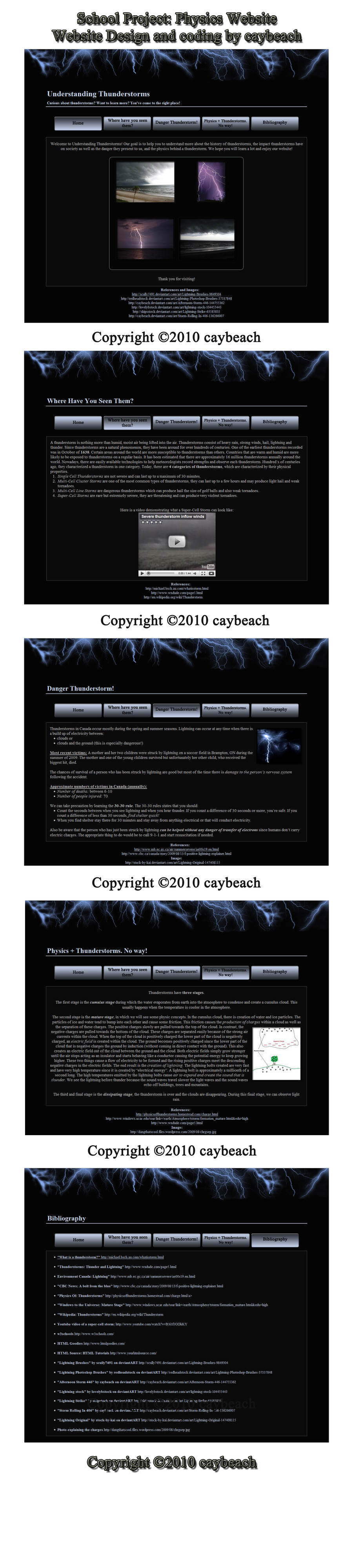
HOME | DD
 T-L — 'A few touchups tut'

Published: 2005-12-10 19:25:46 +0000 UTC; Views: 2343; Favourites: 7; Downloads: 464
Redirect to original
Description
Okay, so as i wrote i'll keep writing it. I thought it's ok if i put some touchups in one tut but that's only my knoweladge and i want to make this tut more like a collection of touchup tuts... and no i don't claim that i came up with any of these touchups original idea however after a while every1 can find out these simple things by him/her -self. So if u know a touchup that i left out please either leave a comment explaining what is this touchup about and i'll get it in the tut ...of course i'll give credit for the idea too.I encourage advenced critique since as i said i want to make it like a collection and that has to look like a good way right? Right. So if the text is hard to read or anything else just tell me and i'll fix it as soon as possible. As you can see there is not only touchups for sigs...since i will put some other in it as well, but now i am just too tired. Any idea or useable critique is greatly appreciated.
What i call 'touchup' others might call an 'extra kick'
Related content


Comments: 28
 (Wink)")

lol nothing u would have to worry about

👍: 0 ⏩: 0

Pretty nice tutourial, although if i would have wrote it it would have been more... uh.. "modern"? dunno what it's called.. anyways im not sure this is where you got one of the touch-ups from buut you probably forgot that i had wrote the "Lighten Up" tutorial on UG... dunno... I think i even called it lightend up too! whatever i don't care if it is where you did get it. soo... yea...
(btw what i mean by modern is like.. a white backround with my arial font [yes i did make my own arial version] and like rounded edges with "flashy" pictures that i manipd a bit.. but yea..... anyways....)
In short, this all (kinda) means...
Good Job

👍: 0 ⏩: 0
Pretty nice tutourial, although if i would have wrote it it would have been more... uh.. "modern"? dunno what it's called.. anyways im not sure this is where you got one of the touch-ups from buut you probably forgot that i had wrote the "Lighten Up" tutorial on UG... dunno... I think i even called it lightend up too! whatever i don't care if it is where you did get it. soo... yea...
(btw what i mean by modern is like.. a white backround with my arial font [yes i did make my own arial version] and like rounded font with "flashy" pictures that i manipd a bit.. but yea..... anyways....)
In short, this all (kinda) means...
Good Job
👍: 0 ⏩: 1
Thanks, but that lighten up stuff that i've done there is based on =blackfuse 's 'an extra kick' tut or something like that... i didn't give credit since that's something every1 can find out by himself if he read one of those 'how to make an imagine anime styleish' but now i am curious...gotta go back to ug n check that tut u made
👍: 0 ⏩: 1
lol.. ok.. it might actually have been the other UG site.. not sure but w.e.. i think i have the like so if you want the link i can give it to you...
👍: 0 ⏩: 1

its great, very nice and noob-friendly  (Smile)")
though i would use a more readable font and a neutral background, for better reading
and always explain when you (for example) zoomed BEFORE you go and zoom.. some people think like "WTF .. whats this? ")
so yeah ")
👍: 0 ⏩: 1
Wow man thanks, now that's rare... i didn't see a useable critique in a year or so
When i'll add more stuff i will use the default times new roman font and i will think about the bg and i'll try to fix those before after stuffs lol thanks again
👍: 0 ⏩: 1
heheh cool, no problem.. glad i could help
please judge my tutorial too, if you didnt already
👍: 0 ⏩: 1
i forgot to comment?
well, it's never too late ^^

👍: 0 ⏩: 1


nice tut T-L I'll add it to gfx-tuts (not online a lot
👍: 0 ⏩: 1

i only know one touch up and BTW great tuts hehe hmm im also experimenting in some of photoshop's effects but still i cant get it right
👍: 0 ⏩: 1
If i missed out that touchup, then could u explain it to me in a note so i can put it in too ^^ btw i am sure u'll get it right really soon...if u get the hang of it photoshop is pretty easy to work with
👍: 0 ⏩: 2
to which i also forgot its only applicable to small sizes
👍: 0 ⏩: 0
just found out that if you do a diagonal fill the radial blur it having zoom effect it will look like a metal
👍: 0 ⏩: 0


Thanks
[got only like the half of that 
👍: 0 ⏩: 1
thanks ^^
still nearly 80 views and no1 who knows a touchup i left out o.O;
👍: 0 ⏩: 1

wow nearly 80? ur more popular then me
👍: 0 ⏩: 1
Yeh...well, to be honest..... tuts are those things what a lot of ppl searching for everyday ... so if it's a tut it doesn't really matter if it's good or bad.... tut is a tut and if it can teach something new ppl will eventually check it out ")
Details:
* Submitted: Dec 10, 2005
* Category: Resources > Tutorials > Photoshop
* File Size: 1.9 MB
* Image Size: 43.4 KB
* Resolution: 100x100
* Comments: 22
* Favourites: 5
Views:
* Total: 154
* Today: 6
and keeps going up
👍: 0 ⏩: 1