HOME | DD
 TakataRikuzen — Practice - proportion
by-nc-nd
TakataRikuzen — Practice - proportion
by-nc-nd
Published: 2013-12-29 17:16:14 +0000 UTC; Views: 538; Favourites: 1; Downloads: 2
Redirect to original
Description
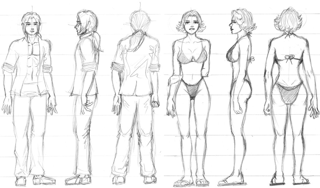
Draw a girl and a boy at preferred head height count (I used 8½ heads) from front side and back. 10-15mins each figure.
Manga class Sensei is 'Dr. Vee' (www.drveemangakaclub.com/) . She was a surgeon before she gave that up and went to Japan to Manga school. She has been an assistant to several known Manga authors, and now she is published with Shonen Sunday. (Her Facebook - www.facebook.com/vivian.drvee)
Related content


Comments: 7

One thing that's easy to overlook are the relative proportions left to right across the body. And it gets a little confusing to do that, even when you want to study it properly, because some artists use the standard head length to do it, whereas others use the head width. When the two systems are confused, you get some pretty "interesting" results! XD.
I know this exercise is about proportions (and parallel projection!). But even so, why not draw the figure with an aim to express balance, rhythm, and volume as well?. . . then add a light source and do the shading . . . add some props . . . some background patterns . . . oh. yeah. forgot. it's just about proportions. 
👍: 0 ⏩: 1

Hahaha, yeah, I hadn't bothered with aesthetics as it's mainly to train to get the height of the person right. (I often draw people too short) You might've notice that in 'Drealms' the proportions of the character 'Ivy/Shyan' changes from one panel to the next. (Others do too, but she's noticeably the worst). I still had problems with this at the time. At least now I have a better guiding principle when sketch-drafting the characters in the panels...
👍: 0 ⏩: 1
Hehe. No prob.
About proportions, then - hehe. . . What is often overlooked is that Michelangelo and other Renaissance artists used 8 - 8 1/2 heads to represent the ideal, which is bigger than life. Advertising illustrators jumped on that, too, to sell clothes. But making the ideal the new normal creates an obvious problem for visual storytelling - i.e., when you don't have normal to compare with ideal, ideal loses it's meaning and impact!
So I draw normal people as they really are (accounting for variation across races), which (for Caucasians) is 7- 7 1/2 heads, and draw the extraordinary figures (super heroes and tall people) 8 - 8 1/2 heads.
It's really not critical, except when drawing people standing straight at eye level. But, while this should be the easiest way to draw the figure, applying ideal proportions to someone who is supposed to look normal can make it difficult to do.
I especially like women at 7 and 1/2 heads. Any more and they look distorted and awkward (to me). But men, you can add or subtract from the legs as you will and it seems not to matter.
Must say - with Drealms, I didn't notice any problems of proportions. (With perspective on the cover page, yes, but not with proportions.  (Wink)")
👍: 0 ⏩: 1
I'm drawing with 8.5 heads as any less and my characters look too short, I'm not sure why. Even drawing at 8.5 heads my characters look like normal height. Only one of the characters, a female, will have 7.5 head proportions. The cutie, not yet featured on the short version of 'Drealms'.
 (Smile)")
👍: 0 ⏩: 1
haha. Have you considered the proportions left to right? If those are off it can affect the look even when the top-to-bottom divisions are spot on. For example, talking in head width units, check to ensure that the male figure is 3 units across the shoulders and the female is 2 - 2 1/2.
Just the way you fit the figure heightwise in a rectangular "box", fit it width-wise in that box, as well - determining the width carefully in relation to the height, using head width (or head length) units. (Just make sure you don't mix the methods of measurement!)
The book by Walt Reed explains the proportions to use for width, www.scribd.com/doc/29731788/Th… Of course, you can find these proportions anywhere. But I recommend Reed's manner of presentation. It's highly visual and for me was easy to lock-in to memory.
👍: 0 ⏩: 1
That is very interesting. I've never come across the left to right proportion in relation to head width before. I will give it a try. I don't know how accurate it is to say that in Japanese manga I don't think it takes this width aspect ratio into account.
👍: 0 ⏩: 1
I would think that good artists, no matter the arena to which they apply themselves, are highly conscious of all aspects of proportioning the figure.
👍: 0 ⏩: 0