HOME | DD
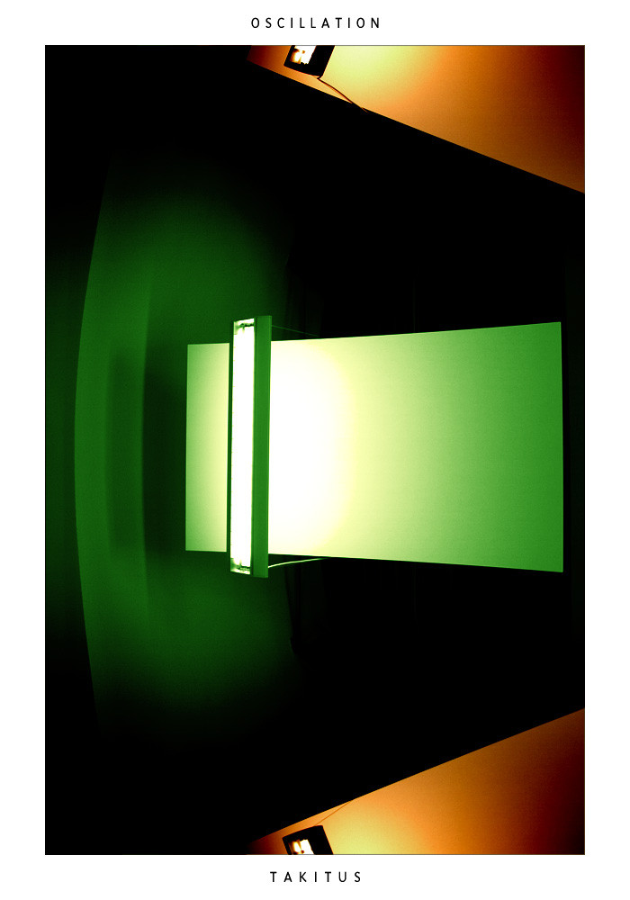
 takitus — Oscillation
Published: 2004-09-06 13:41:37 +0000 UTC; Views: 2720; Favourites: 25; Downloads: 1807
Redirect to original
Description
As objects emitting light move away from the person viewing them, at a high speed, the color of the light that is seen may shift down the spectrum a small bit. This is known as red-shifting. Conversely, objects moving towards the person viewing will shift up the spectrum a bit. I got lucky and caught these yellow lights right at the intersection of their passing.Related content


Comments: 33

amazing colors, the ligthing is perfect, what I love most about this picture is the sharpness of the elements. WOW.
👍: 0 ⏩: 0


this is awesome art bro !!
love the abstract feeling.. the glow.. the colors..
It's a 
👍: 0 ⏩: 0

Looks very coxi-esque. Great piece, nice colours. I'm loving that green colour.
👍: 0 ⏩: 0

I with everyone else...great use of colors and black space. Nice cropping, too. Great job!
👍: 0 ⏩: 0

just WOW. if i had any money i would buy it. definatly.
👍: 0 ⏩: 0


damn. i love this photo so much. the colors, the balance. fucking great. perfect.
👍: 0 ⏩: 0

thats madness!
thanks for the science lesson for the day!
👍: 0 ⏩: 1

yeah science is so fun. learned that from MC Hawking.
👍: 0 ⏩: 0

fantastic vivid luminosity. very clean and slick. nice abstract piece.
👍: 0 ⏩: 0

wow! how did u do it, what were the objects and what light did u use, its fantastic
👍: 0 ⏩: 1
those are actually lights in front of panels to reflect the light...
👍: 0 ⏩: 0


Love the concept, wonderful use of color and composition, perfectly cropped
👍: 0 ⏩: 0

I dont know what it is a picture of whatsoever.... or maybe I do..... im so stupid..... but i love it anways. THe colours work so well with eachother and it's so perfect.... the contrasting and the balancing between brightness and darkness and different ends of the colour spectrum..... this should be a famous picture.... print it!!
")
👍: 0 ⏩: 0


this is wonderful. i love the symmetry. the lighting is great and i love the softness that comes through  (Smile)")
as usual great work! i look forward to the next one
take care,
simon.
👍: 0 ⏩: 0

The fitting feel of the orange/brown and the greens is brilliant- sophiscated, too.
Don't mind my kooky thought, but I thought of Shaggy from Scooby-Doo when I saw this  (Wink)")

👍: 0 ⏩: 1
hehee... me and my roommates were the scooby doo gang one year.. i just happened to be shaggy
👍: 0 ⏩: 1
Ah 
")
Scooby-dooby-doo, where are you? We need some help from you now. Okay now that's starting to ring in my head.

👍: 0 ⏩: 0


Awesome piece as usual. Great vibrant colors, green and orange go really well together!
👍: 0 ⏩: 0

Great use of light and contraste! I like the black surrounding and the colours of these lamps!
👍: 0 ⏩: 0

Very nice! If I might add a slight suggestion - it would be to crop the image so that it is more symetrical. The top yellow light is more visible then the bottom. If there's more data for the bottom, show it - or else cut off more of the top.
👍: 0 ⏩: 1
