HOME | DD
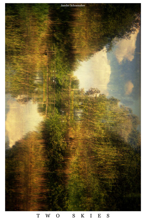
 Talescaper — Composition with two skies
Published: 2010-06-03 21:02:38 +0000 UTC; Views: 649; Favourites: 20; Downloads: 0
Redirect to original
Description
Brownie Six-20 Model EExpired colour film
Related content


Comments: 8

The composition of this is absolutely phenomenal! It's one of those rare images that actually evolves while you're looking at it. At first glance (specifically the thumbnail view) it looked like a unique and fascinating abstract painting to me. On closer inspection, I realized it was actually a wonderfully manipulated landscape photograph. The fact that you've turned it on its side has completely transformed the entire thing...it's such an incredibly clever idea! The balance of the overall image is also glorious. The "sky" sections give it great balance, and also create movement from top to bottom (almost as though those triangles are pushing their way to the center, squeezing the actual landscape up and down). I am curious though, is the white border with the title an intentional part of the final piece (to me, it almost gives it a poster feel), or is it just something you do to include the title with your work?
👍: 0 ⏩: 1

Thanks  (Smile)")
And yeah, I always put a border around my work because I feel like it looks better that way on a screen. Most compositions need to stop somewhere: they're divisions of a plane (or three dimensional space) and you can't make a division of the infinite. If I didn't use a frame I'd be afraid the image would 'bleed' out into the surrounding.
👍: 0 ⏩: 0


I absolutely love it. It has an impressionist look to it. Is there a reason for putting it on it's side?
👍: 0 ⏩: 1
I suppose you could say it seemed like a good idea at the time 
👍: 0 ⏩: 1
It does enhance the fact that there are two skies in the composition. This way it actually looks like two skies instead of a sky and its reflection. Well done anyway!
👍: 0 ⏩: 0

Really cool ")
👍: 0 ⏩: 1
Excuse me, 'creppy'?
If you're trying to make a compliment, perhaps you should rephrase. If you're trying to criticise, at least do so constructively. If you're trying to insult, at least spell correctly.
👍: 0 ⏩: 0