HOME | DD
 tamerofhorses — Original character remix
Published: 2006-03-17 10:34:54 +0000 UTC; Views: 90; Favourites: 0; Downloads: 2
Redirect to original
Description
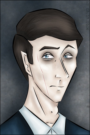
You know how sometimes you're like 'hey, that lineart wasn't as fugly as usual, but the colouring looks much worse than I thought it did when I first coloured it'? That's exactly when I thought about the drawing at [link] and that one was only done a month and a half ago. Lineart-wise though, it's still the only time I think I've actually managed to nail what the character is supposed to look like.I still had the original file with all the layers, so I copied and pasted the pencil sketch into a new file, set it to a blue colour, and drew over it using the pen tool, as per the tutorial at [link] . I like the clean look it gives while making the lines have variety and weight, so I may upload the lineart later under Scraps for reference. Colours-wise, I did the usual slap on some colours with the paintbrush set to medium opacity and flow, then airbrush intermediate colours in-between. This time for the skin, however, I also added very light splotches of blue and yellow, since real skin has many colours to it. The textured part of the background is from Mayang's Free Textures Library .
Since the number of people who appear to be watching my art has somehow increased since before, I'll recap the character briefly -- this guy is an original character I used to play in an old roleplaying game run by ~lunaferalis . His name is Randolph, which is a horribly dorky name that I would not wish on anyone. He is wealthy and loves to study and do homework. He is also a werewolf, even though I think werewolves are boring. More importantly, he is a dick. But I wouldn't love him otherwise.
Related content


Comments: 5

I don't think any of it is crap! I like all of it, it's lovely!
👍: 0 ⏩: 1

 (Smile)")

The lineart is beautiful *loves* And the colouring isnt crap either.
👍: 0 ⏩: 1