HOME | DD
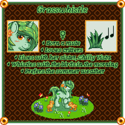
 TaviTurnip — Grasswhistle Pixel Profile [V2 - OPINIONS PLEASE]
Published: 2014-07-29 16:27:13 +0000 UTC; Views: 1135; Favourites: 46; Downloads: 4
Redirect to original
Description
EDIT: Continued it and changed it with the stuff I wanted to include... in theory.OLD SIMPLE VERSION FOR COMPARISON:
I'd really like some more opinions you guys, if that's okay? :c I want to make these look right. Yesterday's version is really cute and somewhat minimalistic, but it doesn't feel like an informative reference to me, just a cutesy small reference with imagery alone. Today I got to doing text to describe the character... ... what do you all think? Does the text take away from the art? Is it placed in weird places? (Should it be all off to one side instead?) Is the text colour annoying? (This is easy to change if it is, and is not really what I'm concerned with.) Is the font too hard to read? Is it... just right? Does it actually look good? D: Please, I'd like any and all critique on the formatting of this profile/reference, if anyone would be gracious enough to let me know.
Did you just prefer the old simple version with no text whatsoever, instead?
~~~
Yesterday:
Been working on this all night, took way longer than I really think it deserved to, portraits suck I am never going to take them on commission ever sorry Komp, other things, anybody who tells me her portrait doesn't look bad is blind and probably a cherry tomato of some kind, this took ten hours I'm extremely sleepy and this isn't even finished (it's not even a profile/reference!) and I'm just zzz no more work zzz probably won't upload anything further today zzzzzzzzzzzzzzzzzzz I'm a bee zzzzzz look zzzzzzzzzzzzzzzzzzzzzzzzzzzz
zzz
There is a very good chance I'm going to replace this with an updated version at about this time tomorrow, but this is where my ideas took me tonight... I don't think it came out very well, but other than the portrait being bad because it's really bad, I'll accept that my judgement and opinions are not good right now because of how exhausted I am.
(Very much open to opinions and ideas as far as pixel profiles/reference go, so gimme your worst, rutabagas.)
*passes out somewhere in the kitchen*
Related content


Comments: 52

Looks neat! The text is a bit hard to read, it might be best to tone down the italics at least for the description. You might find better use of the space you have to work with if you frame the face and cutie mark with something from the main profile, for instance trees or flower bushes. If those objects become the frame itself, you could remove the pattern in the background as well to achieve a much more organic look. Just my two cents, your animation and pixeling is lovely btw.
👍: 0 ⏩: 1

To be totally honest, creative framing has been one of my weak points. I've tried several times over the past years to break out of it and try better frames, but I always end up defaulting back to "gems in the corners, generic texture between" and I've never really gotten past it =_=
Frankly this is all a really good idea, anyways. I don't necessarily mind the general background or the idea of using them, but I certainly do intend to try to spice them up a little bit. Something like leaves or toys or moons or [whatever is relevant to the character in question] rather than just abstract diamonds or such or such. Something beyond just basic shapes.
But yeah, this is all good input, thank you very much D: Everyone's been very helpful to me and I appreciate it so much.
👍: 0 ⏩: 2

Omg two turnips have collided, its the end of the world nuuuuuuuuuuuu.
👍: 0 ⏩: 0

for some reason I thought she was surrounded by bombs and the butterflies were the fuses sparking
👍: 0 ⏩: 1
GRASSWHISTLE
SILENT EQUESTRIAN DEMOLITIONS MARE; YOU'LL NEVER HEAR HER COMING
COMING IN YOUR NEXT TEAM FORTRESS 2 PATCH
👍: 0 ⏩: 1


gyazo.com/07d8202ce3b4a345c4cc…
👍: 0 ⏩: 1
That is... soooooooooooooooooooo unfortunate.
I am feeling mercifully thankful that I am able to unsee this because I would be so mad if I couldn't.
👍: 0 ⏩: 0
Thanks D: I am trying to come up with something appealing and fun, both for myself and others.
👍: 0 ⏩: 1

Well, you're accomplishing your mission
everyday it seems
👍: 0 ⏩: 0
Whelp after looking at them both, id say offer both styles, the minimalistic one and the one with text for those who want a small brief bio of their char. it can include, race, gender n the little things you did. The visual representation is great and with just a few words you can understand the personality the character may have. Like the 1st i did not know the char was mute, knowing so gave me a better impression of the character.
As for the text itself. You did one thing right, its readable and not annoying to the eyes, I guess avoid any combo of colors that may be hard for people to read. However you may want to get feedback of people who are colorblind in a way as into what colors may make it impossible or very difficult for them to make out the text.
I did love that there is an icon of the cutiemark and in great detail!
As for the portrait, i love to see your own style on things. However id say the animation of the blinking may be a bit to fast. Maybe make a pattern of sorts, or the space in between blinking a tad bit slower, other than that its really good.
Hehe it did take me a bit to notice the blinking of the portrait is in sync with the image below which is quite cool.
As for the image, the darn detail is outstanding for pixel art. I like how i can tell she is holding one leg with the other, its detailed enough for such. seeing the dancing flowers may indicate wind in some way. it would be cool to see maybe a bit of animation with the mane n tail being brushed by the wind in some sort of way but then that is asking for to much. as it stands its a beauty.
In all the back round colors and text are appealing to the eye. Ill stand by offering both formats as some may want that minimalistic approach while others would not mind a mini bio included. Keep it customizable for people who may want the words elsewhere and the art placed in different ways. i think being open as such is the best approach.
👍: 0 ⏩: 1
... ???
Despite it being one of my life mottos, I forget about the option of doing both in sooooo many places =_=;;; I am really a simpleminded turnip sometimes... the idea of doing both is fantastic, thank you so much for that.
Also yeah, nobody knows anything about Grasswhistle, or even Chatterbox, Fae, Lapis... I've been meaning to do profiles for so long and I just feel like I finally may have found a way to do it, so I'm ecstatic to finally get these for the girls out there. That's part of why I'm so determined to get this right. It's for my own sake too! (Also I should do a species icon beside genders or something... I'll consider some species symbols.)
The blinking is more for flavour right now. It's not my best blink (this entire thing is not my best anything), but right now I'm more concerned with the formatting and structure of the profile than the actual art quality :P Not that I don't appreciate the input, of course, but you know. That's my focus.
I think though, that the idea of it not being limited strictly to one format is best, and you and at least one other person have basically made me realize "oh right the details can be moved around and stuff" and I'm a total doorknob for not really realizing it. It's really been helpful, so thank you very much D:
When I'm done my next five commissions, you can be one of the test subjects for a profile. There will be much experimenting
👍: 0 ⏩: 1
Im kinda scared of that twilight icon T.T. hehe glad i could help in some way or form!
👍: 0 ⏩: 0

Pixel art will always blow my mind because I cant do it XD your pixels are great~ Love this
👍: 0 ⏩: 1
It's okay. Traditional and digitally-drawn art will always make me jealous and sadface because I can't do it! :'D
Thanks though! <3 I am trying to improve it, as things stand, as I just updated it with another image. I want to get these right because I'd both like to do them as commissions for people and because my girls have been waiting years for reference images already...
👍: 0 ⏩: 0

Dang, thats pretty.
Though the portrait's face seems a tad off somehow.
👍: 0 ⏩: 1
It is because I hate portraits. Hi.
👍: 0 ⏩: 1

That portrait has some ace female tauren anatomy c:
This is a nice thing though, and the background looks real snazzy too!
👍: 0 ⏩: 1
I will never ever draw you a tauren
Also gimme more opinions.
👍: 0 ⏩: 1
Adding the tidbit of information definitely made this look more akin to character card, which is fancy. Something I never mentioned before, however, was I do not like the plain white background on the corner portraits. It feels empty and incomplete in a way, and I can't quite put my finger on how it could be changed to appeal to me.
Besides that, refer to my above (bottom sentence) comment.
👍: 0 ⏩: 1
Yeah, I didn't like the (actually dA-grey) backgrounds either, but they weren't my focus and I didn't really have anything on the mind as to what to put there. I totally believe that the Cutie Mark needs to be displayed in a way that isn't obstructed/distracted/you look at other things instead, and otherwise the portrait takes up so much space that you barely even see the white space... so I'm not totally sure about a solution quite yet either, but I definitely agree with you that they aren't quite right.
👍: 0 ⏩: 0

Before anything else, this artwork as a whole has a lot of cool details, including a very nice color scheme and an extremely well-done pixel pony in the middle, shine and all! I like the pins on each corner, the snazzy borders for the boxes, the stylized text and just how the scene in general works surprisingly well together, you should be proud of all that!
For the close-up, I'll just use my mess of a work-in-progress style as a guide to show you how I'd do it. But I'll warn you, my art skills have over a year of rust...
...Okay, so here's what I did.
I made the far eye thinner, since it feels like it's curving too much around the head and appearing where it shouldn't.
I straightened and sharpened the muzzle a bit, following a rule of thumb that I learned a long time ago; the top of the muzzle should usually cover the lower part of the far eye, so I tipped it up. It felt a bit too soft and round, so I added a sharper, firmer tip with straighter corners. (Note: I may have made the "nose" part a bit too big, so feel free to keep it smaller.)
If you're going for a slightly more realistic style like Harwick's, you have the right idea to make the mouth and the "nose" semi-separate, but if you're going for something more like the show's style, you just make one big curve and add a line for the mouth. However, both of these methods (especially the latter) can lead you into a problem that I see here, where the "lower lip" of the mouth has more outward presence than it should. In other words, pony mouths tend to look like this Yoshi , not this one . I just made the bottom ridge curve for the nose and then a flatter, lower line cutting into it at the bottom to show a mouth, but one that's not too thick. (As another general rule, if the tip of a smile doesn't almost touch the bottom of the near eye, the mouth is too low.)
This is probably just a stylistic choice, but I noticed the eyes are rather small for ponies and it doesn't really match with the smaller pixel version where the eyes are big. So I just made them WhiteDiamonds-style, or as huge as a pony's eyes are.
There's nothing wrong with forging your own path, and if you don't like my kind of ponies, there's nothing wrong with that. I'm just trying to give you a basis so you know where exactly you're deviating, you know
👍: 0 ⏩: 2
Also I updated the profile in general. Gimme opinions.
👍: 0 ⏩: 1
Well, alright. I'm not sure what's wrong with show-style pony eyes (it's kind of a major part of their facial proportions and design), but if you like the profile's style more the way it is then I'll focus on the other things instead.
Hmm... The text color may be the only one you could have picked, since the only other major colors here are black and orange, which obviously would mix with the background. I have no trouble reading it obviously, but I'm not sure that would still be true if the font was much smaller.
The most out-of-place thing I'm seeing is how you've given such a special place for the Venus symbol, which is okay, but you can tell her gender from the pronouns so it seems like an odd thing to put in a focal point. Though I'll admit it does look nice with the text (it has that classical "downward-display-sword-over-important-thing effect) and too many classification symbols would get as cluttered as the stamps on a dA profile. Maybe it could be replaced with something more symbolic of her, almost like a less-emphasized cutie mark?
Now I'm realizing how much this spotlight looks like a character select screen... Or maybe like...
This would be a ton of work, but I could see some people wanting to cover up the borders with something backgroundish, like the old "this character is in an underground tunnel so here's some rocks around the edges " thing they do in comics, or "we're in a forest so have some trees on the sides ". I could see some people wanting vines, Christmas garlands and all sorts of decorations. Maybe that's something Registered could help with...
I like the minimalist touch of the leaves next to the lines of text. Just make sure they don't get too complex, that wouldn't look good. (Edit: I don't suppose they'd look goof either.)
Also I just realized why I thought the image borders looked snazzy; they look like poker chips .
👍: 0 ⏩: 1
Nobody ever said there was anything wrong with show style eyes, where do you get these ideas in your head and why can't you read anything I say at face value.
I said I wasn't able to work gigantic eyes on a normal basis and that my attempts to work around them end up more human. I also said I was freestyling this and attempting to work more loosely, so... be definition that means not attempting to follow a set of rules.
Also, um, seriously, why would a gender mark or designation not go on a profile/reference? It's an integral part of a person. Of almost any person. Also, what if the text doesn't have any pronouns? Or what about the ten million non-binary gender Ponies in the fandom? Spoilers: there are a ton of them. To make your paragraph even more confusing, there's already a "symbolic" and "less-emphasized" symbol for her all over the profile; leaf bullet points. This is a thing that's already happened. There's no need to take away something important about a character for something that ultimately represents her less than imagery already on the picture. That's just silly.
I don't know, I don't have the energy to keep having these weird conversations that I barely even understand the origins of. I can't even come up with words with any meaning behind them. It's just kind of exhausting that this keeps happening for reasons that don't make any sense to me =w=
👍: 0 ⏩: 1
Me neither, as you know... This doesn't happen with anyone else, so I don't think it's squarely anyone's fault. That first line was actually meant to avoid having a discussion about it. It didn't matter enough to me to ask how or why they wouldn't fit (obviously there's space, and obviously it would fit the style). It's explained now, but I wanted to just let it go and talk about something else.
Now I'm not sure if you want me to answer your questions or not... I'll keep it in small text. If there are no pronouns, then that would be a change in the layout which would also change my choices on it. And non-binary characters are part of my reasoning, since the only symbols they have are very broad and don't really express their identity any better than "they/them" or pronouns. Maybe it's because I have no concept or understanding of gender identity. I don't even know what it means to have a gender. (I just go by "he/him" because it doesn't matter to me. It's not a part of who I am.) If it's not just restating something that's already known, it's hard for me to relate to that.
I don't know how to avoid it... Sometimes we understand each other better than anyone else in the room, and sometimes we don't understand each other at all. I don't want to suggest that I should just stop coming by here (which would not be good for my emotional state), but I don't know what else there is
👍: 0 ⏩: 1
Ehh, I just... feel like some things should be easier to comprehend without either being misinterpreted as ambiguous or like, leading into paragraphs analyzing its story or purpose when it doesn't have either of those things. I guess. I'm not saying paragraphs are bad. I just feel like... I think like, you think that some of the things I do (in art or words!) are on a blue (arbitrary example colour) wavelength, and I'm actually working on a smaller and less complex yellow one, and then you answer me on the blue one and I answer you on the yellow one while trying to explain that we should be on the yellow one and not really understanding how to convey it even though I try to be as literal as possible at times. I'm not sure. That thing about red curtains being red curtains, instead of being a literary sign of the author's moods that he/she is secretly trying to express and force the reader to understand. They're just red curtains.
Like I said, something about it is just kinda tiring. It also doesn't help that 2PM is my "awake for twelve hours" point in the day and also unfortunately the time I seem to choose to reply to some things. I'm easily irritable when I'm tired. Like super mega easily. It's definitely not localized to just you or conversations with only you.
Someone somewhere who really likes me is gonna come read this conversation and be all like "wow, why is Rena being such a bitch?" and then hate me and I'll prolly never know about it.
👍: 0 ⏩: 2
I swear, I just checked my messages on my favorites account and one of them was this. chromatinker.deviantart.com/jo…
👍: 0 ⏩: 0
OH HEY I DID IT AGAIN
I went on to explain my line of thought, and I only just realized now, many hours later, that doing so was turning it into a story. So yeah, you're free to read all that if you feel like it, but the gist is that I'll do whatever I can to make sure it doesn't happen again. I shall find a way
I will find my way
I can go the distance
I'll be there some day
If I can be strong
I know every mile will be worth my while
I would go most anywhere to feel like I belong
👍: 0 ⏩: 0
Just wanna say, I appreciate it, but the issue here was two things:
A) I was freestyling her 100% rather than attempting to follow the show style like in old portraits.
B) I was trying to shade her closer to someone else's (non-Pony) icons and it did not turn out well.
I attempted a more loose/free style with both shading and shaping in an attempt to "find myself" again with portraits, but... it didn't pan out too well, because she does look awkward as hay. And that nose was already pushed in by four pixels from the original version. I am pretty sure that in my heart I knew I had to push it in a few more, but you know. Artists.
(I appreciate that you noticed her shine. It was meant to be very subtle and not draw much attention, but to be a slight step up from my usual icons.) And I have a thing with not making gigantic eyes because they just don't fit the size correctly to me. I just seem not to be able to do the ginormous Pony eyes on a normal basis... and I end up with ones a bit more human. It's not really a bad or good thing, but it does seem to stand out to people pretty bluntly. Her neck, though, accidentally ended up thick manhuge. I'm sorry, Grassy >_>
👍: 0 ⏩: 0

I think this is pretty awesome 
right when I saw this submission I was like ")
")

👍: 0 ⏩: 1
YOU SASSIN' ME BOI?
Wanna give me a second opinion? I updated it to show the old and new versions. Do you like one or the other better? :o
👍: 0 ⏩: 0
Oh my effigndhgwjhejfgjw this is so damn amazing... i...neeed one of these T.T
👍: 0 ⏩: 1
You can have one if I get them right D:
I updated it with a comparison image between old and new. Could I get a second opinion between them, if you don't mind? ;c
👍: 0 ⏩: 1
I gave my opinion on it hehe. but ya expect me to commission one!!
👍: 0 ⏩: 0


Oh wow! That's so pretty!!
I would love one of my oc, it would be cool if you could do smaller ones and then put them all together. Each having a different costume or color, like Wonderbolts uniform or Crystal :3
👍: 0 ⏩: 1
I am strongly considering these as commissions, but I want to get the formatting and general idea right first ;_; I'm really glad you like it, though. I appreciate it, and I kinda like your idea too xD
I've updated it with a second version and a comparison image. Could I bother you for a second opinion on this versus the first?

👍: 0 ⏩: 1
Ooo, I like the bit of information about her. It's not a lot but it's just enough.
as far as layout goes, does she have a pet that you could put next to her? The bottom part, where she is standing, now looks a bit too small with the text above. That's just my opion though :3
👍: 0 ⏩: 1
For other characters, a pet would definitely be a great way to help fill the extra space. At current, Grasswhistle doesn't have any pets, but she spends a lot of time with outdoor critters (as already seen here xD) so that sorta counts. What you're suggesting is that I make the general area below wider, it seems, since the text is dwarfing it now? I kind of think I agree with you, looking at it. I hadn't considered that when I made the area larger...
👍: 0 ⏩: 1
Okay that would solve the space problem for ponies with pets, so if she doesn't have a pet what could we do with that space.....??
The two things that pop into my head are, you put her in another outfit or form she might have (Crystal, gala dress...) or you put different facial pictures around her down there.
👍: 0 ⏩: 1
Actually this is a really really really good idea. If people would prefer an alternative beside the first, like an outfit or Crystal or other things, that would be a great way to fill in the space below. You're kind of a genius.
After talking with another friend, we think that the additional space/stuff should be left up to the commissioner or whoever the profile's for (or if it's for me just whatever I feel like) in case that person wants to emphasize something like other forms, a pet, their job, activities, another Pony... really anything you could want could go there. This is a really good idea.
👍: 0 ⏩: 1
| Next =>