HOME | DD
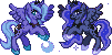
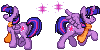
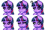
 TaviTurnip — The many faces of Lapis Lazuli
Published: 2013-02-24 03:22:23 +0000 UTC; Views: 1420; Favourites: 56; Downloads: 22
Redirect to original
Description
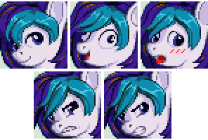
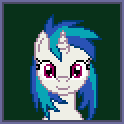
from the other upload.Tentatively decided to upload these at 2x zoom so you can see all the cheating and horrible pixel choice decisions a little easier. This is one of the things I've been working on this month, for no reasons other than practice, ultimately. They're displayed in almost opposite chronological order. Angry Lapis was actually the first one done, and the only two expressions that were done on the same face were the two on the bottom. Every other one was rescratched no matter how similar they look to one another, bringing the total amount of scratched shapes/lines to four.
Why is the hair so inconsistent? Because I really really hate hair more than pegasus wings. The hair here, specifically the teal part... it was so annoying and so hard to even begin to understand that it literally brought my mood down three days in a row. I don't... I don't get how hair works -_- I'm over it now, but I'm still not happy, and I'm very upset because I can't comprehend the workings of hair at all. The most I can do is fake it, and it's blatantly clear where it fell apart. I don't know. The actual style of the hair isn't even really what I wanted when I first designed Lapis as a character (see the old icon of him), but I guess this is where it got me for these mugs.
... Yeah. This was a rough journey :c Even so, here you go, everyone. I hope you find it interesting. If anybody wants to bug me about commissions for these, chances are I will not take them because these are extremely difficult for me... so I'm sorry in advance for that. Still, though, I hope you guys find these neat in some way.
Lapis Lazuli
Also, that angry face? That's extremely, extremely sexy >~>
Also I'm really sorry for how naughty the top right face looks, but, well... at least it's a good face, right? xD
Related content


Comments: 39

Overall
Vision
Originality
Technique
Impact
While I'm wondering what you're seeing in the hair that feels off, I could see where you're coming from. I think what looks off is that if you think about where the hair grows, and where each stand goes, it probably doesn't make all that much sense. That lock of hair to our right doesn't appear to be placed to be quite attached to the head.
If you're talking about this particular style of hair not being what you intended, the only thing that looks funny to me is how a couple of bunches of hair have a layer of hair right under. I have a hunch that we could just simplify them into one bunch. Otherwise, it still reads as hair and IMO that's all that matters.
You also wanna be careful about chopping up your lines into pieces when you AA. I tried making an edit to show what I think is more optimal AA, but I end up having to create a new color because I couldn't easily find another color that can do the job, but here it is: [link]
Instead of having to create new colors just for AA though, you could just tweak your palette. Heck, look at what I did for this piece: [link]
Value is apparently more important than color for AA, so I was able to AA between colors using colors that doesn't appear to belong... using oranges to AA with the pinks. Most of the colors can fit on a ramp that goes from light to dark in a straightforward manner, while containing multiple color ramps inside at the same time.
Putting aside rendering skills, there aren't that many other things I feel are 'huge'. Maybe the eyelashes can be more consistently thick, and there's the possibility of using a composition that is less of a close up and zooms out farther. I recently realized that there is more potential for interesting poses and other elements if you use less room for the face A current WIP of mine is using a couple of abstract backgrounds, just a fun thought e.deviantart.net/emoticons/s/s… " width="15" height="15" alt="
 (Smile)")
👍: 0 ⏩: 1

My problem with the hair is... I suppose it's hard to explain. I forget who I said this to (or where), but my biggest thing with the hair is that I'm trying not to fall into "big anime spikes" (which really, I can hardly even claim to have avoided) and to detail it to look at least passingly similar to actual hair, but I suppose without the lines lines lines lines that come with realistic hair styles. I just feel that the teal parts are mostly terribly flat and my usual habit of shaping things via shadows doesn't really work on them. Maybe I'm expecting way too much out of either myself or the style, but it leaves me unsatisfied.
What I find most interesting in what you've said is the idea of zooming further out, which I'm not especially sure how it would go in my case. I have problems enough with consistency (see the very different sizes of his ear and eyes), and I suspect that it would become an even more inconsistent and open-ended deal if I zoomed out, but it wouldn't hurt to try. It's also worth noting that these are only 48x48 and not 50x50 (a habit I picked up from RPG Maker, I guess? xD) and so there's already two pixels' worth of room for expansion if I wanted to include background flavouring and not, perhaps, a border of some sort. Both would be applicable at this current stage, but pushing it up to 50x50 alone could make a pretty big difference for pose dynamic.
If I get back to mugs (I expect I will), I will see what I can come up with. I really appreciate the critique and thoughts, so thank you.
👍: 0 ⏩: 1
I meant zooming out like this WIP sketch thing: [link]
👍: 0 ⏩: 0


Originality
Technique
Impact
I think you're being a bit hard on yourself here Rena e.deviantart.net/emoticons/s/s… " width="15" height="15" alt="
Even the detail I believe is excellent for an icon sized art, the highlights in the teal portion of the hair at the very least gives it a different texture feel and doesn't look like Lapis's skin. The shadows on his skin helps give the hair some pop, which it needed.
Now, I'm no expert in pixel art but perhaps what I would suggest is adding the TINIEST one pixel wide shadow to the center of some of his locks of hair, there are some locks that look 5 pixels wide where you might be able to squeeze a shadow in, perhaps giving it some hair-like texutre.
But again I don't know because I am no where near an expert on the subject, and I rarely find pixel artists who do ponies. Just perhaps something to try.
Really I think the hair looks great! You know, I've heard artists are always harder on themselves because they can see their own "blatant" mistakes. But for me I can't see them as clearly or at all. I don't think it's because I don't see detail or mistakes, it's just when I look at this I see this as "this is the way this piece of art is suppose to be" His hair doesn't appear to connect his head in a funny way, it doesn't look like it's coming out of his skin, or flastered to his forehead.
I won't commission you to make one of these because it sounds like quite an ordeal, but really I think you did a wonderful and lovely job creating them for what it's worth.
Also! DAT BLUSH FACE a.deviantart.net/avatars/m/o/m… " alt=" " title="moeblushplz" />
👍: 0 ⏩: 2
Thank you for the detailed reply as well! ^_^ I'm glad I was able to learn something, this is a field of art where I have very little if no experience at all, usually when I critique I simply think very logically finding very discreet mistakes or somewhere that can be improved.
When I did this critique I was a bit nervous because I had never had any experience with icon art ")
Also, one last question I'd like to pose, you don't need to answer if you don't want ")
👍: 0 ⏩: 1
Both, for separate reasons, but ultimately every art I make is for myself, even if it's for someone else. I... I want to make people happy, and making people smile or giving them something they enjoy is the best thing for me, but I ultimately do it all for myself too. I write, draw, and talk to people, for everyone's sakes, but also my own. It's both and I would never undervalue either side of the matter.
I'm apparently doing something right, though, since people like to talk to me so much :<
👍: 0 ⏩: 1
I just asked, because this situation reminds me of speech classes I have taken. They always tell us cater to your audience. If you screw up in your speech like you forget a line, my professors say to just keep calm and confident. They often told me just pretend it was a verbal pause, and people give you the benefit of the doubt that that verbal pause was planned even though it wasn't. You as the speaker KNOW that you screwed up and it wasn't the best speech you could have given, but the audience doesn't know that, to them you gave a great speech with awesome dramatic pauses!
Such is the case I believe here. Now you KNOW you've made some mistakes on these icons.But your audience doesn't, I know this just by scrolling through the comments, everyone, myself included, adores the little icons of Lapis
Is it "lying to myself" if you don't point out the mistakes? Not really, because it is clear you put in extreme effort, and it is also clear you worked very hard trying to perfect these icons. The only time you can really lie to yourself is if you say you tried as hard as possible and really you didn't even care. I don't think this is a matter of "I could have done better" I think its a matter of "I could use more experience with this" because you did try, I can see it in your writing! If you don't have the experience to get these icons to look the way you want, that's fine! None of us are perfect and art as you already know takes time and practice (probably why I'm so bad at it xD).
Now if it bothers you so much you can always find an artist that you respect, another icon artist, an expert if you will (dunno where but hey!) and ask them for help. See if they can help you with the mane, etc. That's just my two cents on the whole thing, but really you are an amazing artist, and I was honor to critique your work
👍: 0 ⏩: 1
... Yeah, his name is *Pix3M and he's even gone so far as to make a visual guide all about my icon style :P I do ask him for his thoughts on things here and there, as I look up to him and his ability to analyze things so well.
Anyhow, though... you're right, in a way, and I've never looked at it that way before. But just remember, that I do art for myself. I do it because it's my desire to create, and to bring things, concepts, my characters, to life. Even if I'm trying to make the rest of you happy, I owe it to my characters to present them in the best ways I can. I'm the one who holds the power to show them to the world, right? So I want to do my best. I know it sounds like I'm trying to hold this big grand personal responsibility, and in way, that is exactly what I'm trying to do... but that's what it is.
... I know. I'm weird :c
👍: 0 ⏩: 1
Not weird, its probably the sign of an outstanding artist ^_^ I understand

👍: 0 ⏩: 0
Adding shadows to hair ends up changing its shape a lot, which can be really tricky at times or can completely betray the way the hair is meant to look. What you say is true, though, as well as giving it "hair-like texture", and the reason why I had so much trouble with the hair in the first place is because with portraits/mugshots I do my best not to just give it giant anime spikes, which is something that is still somewhat present, but they're a lot more thin and slender than the wide ones I'd otherwise have. That's where my troubles really are, with the texturing like that. It's where I really want to improve.
The thing with not seeing mistakes, that is also something that makes it hard for other people to judge. You think this is what pixel art is supposed to look like stylistically, and that's why you and most people often overlook things that are easy errors D: The style is correct, of course, but many technical aspects are wrong and it's hard to spot them when what you see is "pixel art that looks like pixel art". I apologize if I'm sounding a little offensive when I put it this way, but it means that for someone like me who knows more intricately what makes it "look like pixel art", the errors stand out like crazy. I have my nose buried in this stuff every day. I'm hardly an expert, but I can see many things :c
Anyhow, not to end this on a rough note at all, but I appreciate the critique :< You and everyone else are being very supportive and I know I just need to be patient with myself in order to get this. I'm really thankful that you took the time to write up a detailed critique, though, so thank you a lot for that!
Also, yes, blush face c:
👍: 0 ⏩: 0

I only think you shouldn't be so close perhaps add room to see the full head?
👍: 0 ⏩: 0
I was trying to go for a bit of a variety :P My friends have often told me I only draw smiley faces, so I wanted to mix it up here xD
👍: 0 ⏩: 1

It's fun to change it up every once in a while
👍: 0 ⏩: 0

Okay, I'm no Pony fan, But I am lovin' this thing.
👍: 0 ⏩: 1
You don't have to like Ponies xP I really appreciate it nonetheless. It always makes me happy when someone outside the fandom can appreciate something I do just on its own individual merits, so thank you o:
👍: 0 ⏩: 0

Oh dear lord. The insane face.
ALSO THE BLUSHY FACE. JHSDJHSKDHFjkdssdgf. /faves a million times
👍: 0 ⏩: 1


Very solid work here, I don't see much wrong with the hair. It flows outward from the head, and you couldn't fit it into the frame. Maybe because the dark blue section looks like it follows the head, almost like it's stuck to him(?)
Also (though this is purely personal preference), maybe think about replacing the black with a real dark purple, it would soften out the image a little bit, I think
👍: 0 ⏩: 1
Maybe a bit, but the darker parts of the hair are already pretty dark and if I lightened the outlines, I'd have to lighten the others too. Contrast between shades, and all that. I'll consider it for next time, but I couldn't say for sure how much of a difference it would end up as D:
👍: 0 ⏩: 1
Probably not a massive change overall, I would agree with you. You could just use the "Contiguous" option on Photoshop's Paint Bucket to adjust all of the same colour, that's how most people play with colour palettes on a pixel level (unless you don't have Photoshop -_-).
👍: 0 ⏩: 1
I use MS Paint. What the hay do I need something like Photoshop for? >:P
I can adjust colours on my own. It's not that I can't change them all, so much as that the dark purple/blue of his hair already looks good as-is and properly reflects the way his hair is. Making it brighter wouldn't be an accurate reflection of the way the character looks, or at least not the way I want to present him.
Of course, now that I say this, I realize that the only black pixels here are on his eyes, and if that's what you meant then I feel silly and those would be worth changing <_< But his hair's outline isn't black. It's a dark blue, if you get in close and peek.
👍: 0 ⏩: 1
I'm not saying that you need Photoshop per se, and a lot of pixellers use MS Paint, but I personally like the tools that it can provide, which overall help to accelerate my own pixel process.
I did not notice that everything but the eyes were dark-blue, so that's my mistake. You could play around with changing the eye colour to the same dark blue if you want, but it probably won't make a massive difference to the overall look of the piece.
👍: 0 ⏩: 0

These turned out really awesome. Did not know manes were a pain in to make *Hides his mane under a hat in fear Rena will shave it off* Derp face is just commical but my fave is the bottom left.
👍: 0 ⏩: 1
The bottom left was slightly an accident. I was going for a face like the bottom right, but I started with a different mouth (the bottom left's) and I realized that I could turn it into a different, more pained expression, so I went with that too.
👍: 0 ⏩: 0

Really great job at capturing these expressions.
dat derp face...
👍: 0 ⏩: 1
Probably blatantly the most referenced face out of all of these xD I just couldn't resist.
👍: 0 ⏩: 1
There are other references? MUST FIND THEM-
👍: 0 ⏩: 1
Only a teensy bit. The barest of references for expression, truly. You'd probably have a really hard time identifying any of them if you ever found any xD
👍: 0 ⏩: 0

Well thank you very much o: I'm glad you think so.
👍: 0 ⏩: 1

These are awesome! And the hair actually looks REALLY good. Don't be so hard on yourself!
👍: 0 ⏩: 1
It was hard I'm glad you and everyone likes them so much, but I really wish I could have done a better job, I'm afraid.
👍: 0 ⏩: 0

They look good Rena, I don't know what the buck you're talking about. At least you highlight and shade your hair, I don't even get that far on the matter. XD
👍: 0 ⏩: 1
The shaping... xD The flow. The natural curves. The way it falls upon a head. It's... hard. With the floating Cutie Mark icons, it's easy to convey a simple and basic shape. But an upclose detail style where lines really matter to convey a shape? It's just... tricky. It requires real understanding. I know people will probably say it's just the artist being rough on herself, but I just don't feel like I really get it... if you must know, the hair on most of these took hours alone to sit and figure out, each. Even if the result is good, the work was really really stressful, and it really drained me ._.
Still, I appreciate your words, so thank you very much :c A few of my friends already sat through the process with me before I posted these and I appreciate everyone's support even if I sound so down about it.
👍: 0 ⏩: 1
