HOME | DD
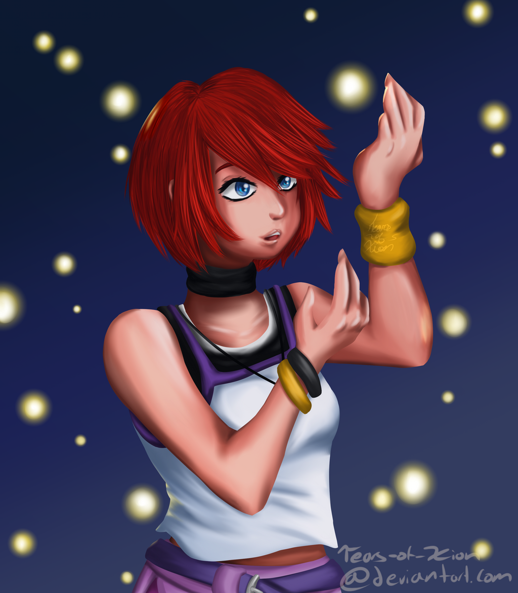
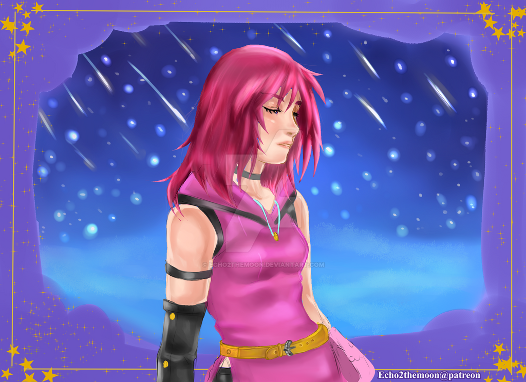
 Tears-of-Xion — Lights of the Returning World
#csp #destinyislands #glow #kairi #kingdomhearts #redhairedgirl #mangastudio #clipstudiopaint #tearsofxion #kairikingdomhearts
Published: 2017-02-03 03:40:24 +0000 UTC; Views: 850; Favourites: 77; Downloads: 4
Redirect to original
Description
A remake of one of my pieces from August. It's amazing how much one can improve in a few short months.After making that realistic picture of Juleka, I wanted to try to draw in the realistic style again, AND I wanted to re-make that picture. And thus this was created.
I'm crazy happy with the shirt. Crazy happy with it. ^^
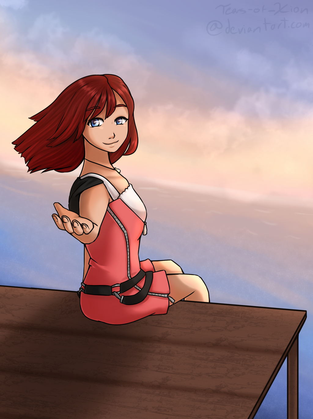
Original piece~
EDIT: Watermark has been updated
Any comments/constructive criticism would be most appreciated!
Kingdom Hearts is owned by Square Enix and Disney. I do not own their concepts, nor their characters.
The artwork, however, IS mine, and you are not allowed to do anything with it, or post it on another website, without my permission.
Related content


Comments: 31

I've never played these games, but I've always kind of wanted to. Do you think it's worth the time/effort?
Either way, I like the vibrant color of her hair. It contrasts nicely with the cooler purple and blue tones around it. I'm not familiar with the character...is the shirt dark on top, or is it a layered series of camisoles?
👍: 0 ⏩: 1

I may be a teeny bit biased, but yes. I do think that they are worth it. The first game may seem a little underwhelming at first, but the storyline quickly becomes quite intricate throughout the series. The characters are interesting and unique, and they do a good job of drawing you into the storyline without too much effort. Each game is at least twenty to thirty hours of game play, and I personally find the game-play itself to be super fun. Plus, the graphics get better and better with each game.
I would say to at least try the first game and then go from there.
^^ Thanks! Her hair was fun to draw. And she is wearing two shirts; a dark black one beneath a white/purple one. xD I could have probably used to make that a little more obvious.
👍: 0 ⏩: 1
Ok, thanks for the recommendation!
👍: 0 ⏩: 1

Hello from ProjectComment
First of all, I'd like to state that I'm very impressed by how this piece looks, seeing how you've only been active on dA for a rather short time. The piece has a certain clarity and your work with light and colors is really something to be commended. I'm gonna be a bit negative in the rest of this critique, but please keep in mind that I'm really just trying to help you improve, because I think this piece shows off a lot of your potential!
The biggest flaw I can see in this piece is the lack of structure and anatomy underlying your drawing. Like I said above, this piece is really well done with the lighting and coloring and is really quite appealing to look at. However, when you examine the image more closely, you can quickly note that the image isn't really founded solidly. For example, her two arms are varying wildly in thickness, her neck looks very stiff and unnatural and her face looks quite unfocused. Looking at the other works in your gallery, generally I can really say that your current focus should be on improving on your proportions and anatomy. I'd even advice you to just do a lot of sketching to get those area's improved. You can do this through gesture drawing or figure drawing practice.
Looking at the original piece you've based this image on, I'll definitely say that you've obviously improved a lot in terms of values and colors, especially the way the little lights reflect off of her skin and clothes makes the lights really integrated into the drawing as a whole and works great. However, especially when you're doing realistic painting like this it's extremely important to have a solid line-drawing to base your image on. Perhaps look for some recorded work processes of other artists that draw in this style and you'll see that generally they first sketch out a line-drawing to get all the anatomical details in place and only when they're happy with that base they'll go to the coloring and shading. Your shading is very nice, but it won't really fix a shaky structure.
Again, please keep in mind that I'm just trying to help you improve here; you've only been posting art for a short while and if you keep up at this pace you'll be improving a lot in a short amount of time. I really hope you'll keep this up and I'll be looking forward to your future works!
👍: 0 ⏩: 1
Hey! Thanks for the comment! I don't mind the blunt honesty - I actually prefer it, as it'll help me improve.
I had noticed a good amount of these problems, but I had not noticed that her neck looked stiff. Thanks for pointing that out! Thanks for all the tips! I'll be sure to take your advice for future pieces.
👍: 0 ⏩: 0

I personally like both pieces, but it is true that you've improved! This is lovely and Kairi looks so cute in this!
👍: 0 ⏩: 1
^^ Thanks! I'm glad you like it!
👍: 0 ⏩: 1
You're very welcome! Keep it up!
👍: 0 ⏩: 0

It's a nice improvement from your last original piece  (Smile)")
👍: 0 ⏩: 1
^^ Thanks! I was so happy to complete this picture and see how much I'd improved.
👍: 0 ⏩: 0


Hi! I'm from !
Ok, first of all, I FREAKING LOVE THIS PIECE! You've definitely done a lot right with this drawing! The anatomy is much better from your last drawing, and the little details such as light on the back of the shirt and hair really make you feel like she's really surrounded by little lights~
Before I jump into the critique, I just want to say that I hope you are okay with what I've done! I tend to be a bit bad with words without visuals, so I went ahead and modified your picture to illustrate my point. If you don't like that, then I'm sorry in advance! However, if it's helped you, then great! I hope it helps you in future drawings!
Okay, so here's my modified version of your drawing: sta.sh/0za4h0gqxo6
To really see the difference, I recommend flipping between that and this (your original piece) to see each difference best: sta.sh/02b99l3pgbfo
So, I'm going to run down each change and why I did it:
- I blended out the hair a bit and added some loose strands. Realistic hair is never drawn as the individual strands, it's often much more blended. If you use Clip Studios/Manga Studios, it's the finger tip blend tool. Best. Hair tool. Ever. Otherwise, just work on finding a blending technique that you find pleasing~ For someone who does this VERY well, look at Rali-95 . Very blended and smooth!
- I added some more highlights to the hair! Again, with my precious finger tip tool >w< I made the highlights pinkish, then turned down the opacity until I thought it looked good. I made the highlight by the edges yellow though, since they were close to the light ball things(idk what to call them)
- I adjusted the hand to make it a bit smaller (try measuring your hand against your face for a sense of scale, your hand goes to about your eyebrows). I also made the pinky a bit longer, since it seemed to small. If you ever are struggling with proportions, I'm dead serious, take an actual picture of yourself in the pose you want and look at it while you're drawing. While there are a few differences in body type, gender, etc. between people and what they're drawing usually, most proportions will translate over well. And worse case scenario, just go to Google and find an image. Even if it takes 45 minutes to find the right picture, it will totally be worth it!
- I've added small highlights around the edge of your drawing. In lineless art, it's really important to define your lines, unless you want your picture to look blurry and unfinished. Especially in a picture line this where there are many small light sources, it's very imposrtant to define your lines through small highlights right on the edges like this. I kind of rushed through it, but I hope it gives you the right idea! For someone who does this well, check out Kiwi Byrd on YouTube (she has no dA)! Pay attention to how she separates parts of her drawings from the rest by adding highlights, such as when an arm is overlapping the torso, etc.
- I made her shoulder a bit smaller. Reference pictures are always nice for proportions!
- I messed around with her eye a bit. I added some more highlights to give her a staring-in-wonder kind of look. This is kind of stylistic choice since I'm an anime/manga-styled artist mainly, but it's based on when your eyes are more open (in wonder~), there's more light to reflect off if it and give it highlights.
- I also blended out the top of her eye and redefinted her eye lashes. In realism and semi-realism, there are rarely such defined lines to mark the eyes. Try making the eye start dark then fade to the skin tone, then adding eye lashes after that. It should go up to the crease line over the eye.
- I moved her mouth up and gave her a bit more smiling to match what I thought her expression would be. The mouth was too low, but the more smiling thing was just my opinion.
- For effects, I added a few more faint and small light balls to make it seem like there's some far away, some close, some dim, some bright, etc. since it makes it look more... real? Idk, Unless all of the light is in one flat plain, there's gonna be some variation.
- And last but DEFINITELY not least (actually one thing I find very important in drawings) is color! Your colors are a bit muddy (especially on the skin tone), so I added some more red into her skin to make it a bit more...glowy? Pinkish? Uhh... whatever you want to call it. Lol Then I added some overlay layers to work more on the colors. I made the base layer dark blue then added a bit of yellow around the lights, some red for her hair, some white for her skin, and turned the layer opacity down to... 15% I think? I don't remember ^^ If you don't know how overlay layers work, I can link you a tutorial on what they do and how to use them!
...So if you can't tell already, I tend to over-explain stuff. If you like this monster of a comment, yay, if not, sorry about that ^^
If you have any questions, don't be afraid to let me know!
But seriously, even if I made a lot of small changes, the concept and execution of this piece was really well done! You have a ton of potential, and I have no doubt your art will be senpai-worthy if you keep at it!
👍: 0 ⏩: 1
Oh my goodness, I don't think I can fully express how grateful I am with this! Thanks so much for taking the time to take my drawing, edit it a little, and then tell me exactly what you edited! I'm perfectly fine with this level of explanation; it was incredibly helpful! Especially when it comes to the eyes and the hair - those were the two parts that I was having the most trouble with! Also with the background - I was trying to go for that look, and you showed me how to do it properly!
What's funny about the last bit, though, is I had added a layer above the others to make the colors darker in order to make it appear like it was at night; but somehow you managed to pull that off with the bright colors! And yes, a link to a tutorial about the overlay layers would be very helpful.
Again, thanks so much for this! Any advice I receive will be utilized in later drawings, and this comment and the links you provided to other artists will be very helpful when I attempt realism/semi-realism again! <3 Again, thanks so much for taking the time!
👍: 0 ⏩: 1
Aah, I'm glad you liked it! When I critique something, I really like to be able to go and actually show the person what should be done, but it isn't always easy with linearted drawings. Paintings are much easier to edit~
Haha, as someone who draws very pastel and bright usually, I'd like to think working with bright colors is one of my strong suits! I'm much better at that than darker or more realistic colors. But in reality, colors appear the way they do because of the colors around it. My favorite example of this is this picture: brainden.com/images/identical-…
They look like different colors, right? But cover up the middle, and voila! They're the same! Crazy, right? But what this shows is that colors are all relative. If you add more contrast to your drawing, then it can look like there's a close light source in a dark room, or less contrast could mean something more evenly lit.
As for the overlay tutorial, it's best to experiment on your own, but this tutorial was from Yamio for coloring eyes and she added a bit about overlay at the end: youtu.be/tqa6P4T7avc?t=1374
Overlay, to explain simply, will switch the color of your picture. When it's all the way up at 100% opacity, it can be used to change the color of something, but when you use it like Yamio with 10-30-ish% opacity, it gives some subtle but pretty adjustments to pictures.
...ugh, that probably wasn't the best explanation either... do you use a program what supports .psd files? I could give you the file for a sketch that I used overlay on quite a bit: dragonintheshadow.deviantart.c…
(Which is, lol, the piece I critiqued your art to put into Project Comment ^^)
Or you can just play around with overlay, it's not too complicated to just mess around and see what happens ^^
And I'm glad I could help! I love seeing how I can help other artists improve <3 Good luck, I look forward to seeing how you improve in the future!
👍: 0 ⏩: 1
^^ Thanks again.
Lol, I tend to be the same way with colors and struggle with drawing with darker shades. Glad to know that there's a way to get the feel I'm looking for with that, 'cause I've been finding it really hard to do. ^^ Time to do some experimenting!
I use Clip Studio Paint, so I'm not sure if that supports .psd files, but I think that Yamio's video explains it well enough. Funnily, I was already sort of doing that, but instead of using overlay layers, I was just using the brushes with different settings to change colors. xD
<3
👍: 0 ⏩: 1
Ahh I use CSP too ^^
I like it way better than SAI, but almost all tutorials are for SAI, so frustrating >w<
Have fun experimenting!
👍: 0 ⏩: 1
Yeah, I got CSP when I bought my tablet, so I decided to use it. ")
^^
👍: 0 ⏩: 0

This piece is absolutely beautiful! Looking back on the original, your art has improves very much!
I love all the detail and texture, it really makes it more distinctive. The shading and lighting is brilliantly done.
This deviation is truly spectacular, great job! I hope you keep making art like this in the future! 0w0
👍: 0 ⏩: 1
^^ I know, right? I was surprised I was able to improve so much in only a few months.
Thank you! I hoping to eventually make more pieces like this, as it always ends up teaching me a lot about the character's I'm drawing.
👍: 0 ⏩: 1
>w< your welcome!
👍: 0 ⏩: 0

The atmosphere in this is so much better than the original version! The skin coloring is great too
👍: 0 ⏩: 1
Aw, thank you! I'm really happy with how it turned out. :3
👍: 0 ⏩: 0

Your shading is great. It looks like you put a whole lot of work into it.
👍: 0 ⏩: 1
^^ Thank you! And yes, I spent a lot of time working on this one. Especially on the face.
👍: 0 ⏩: 1
It really shows. This stands out as a huge improvement in such a short time.
👍: 0 ⏩: 1
Dabbling at 3D modeling helped. xD
👍: 0 ⏩: 1

She looks great. I love how you've coloured her hair.
👍: 0 ⏩: 1
^^ Thanks! It's funny, usually I really dislike doing the hair in these more realistic pages, but here I am actually pretty happy with the results!
Of course, red hair is easier to do than dark/nearly black hair. xD
👍: 0 ⏩: 0