HOME | DD
 The-Chronothaur — Forerunner sketchdump 1

#343 #bungie #faber #fanart #fanon #fanwork #forerunner #paper #pen #robot #rough #sentinel #sketch #sketchdump #traditional #forerunners #didact #masterbuilder #halouniverse #343i #bornstellar #isodidact #chronothaur #forerunnerhalo #forerunnersaga
Published: 2017-09-16 12:50:19 +0000 UTC; Views: 7108; Favourites: 164; Downloads: 55
Redirect to original
Description
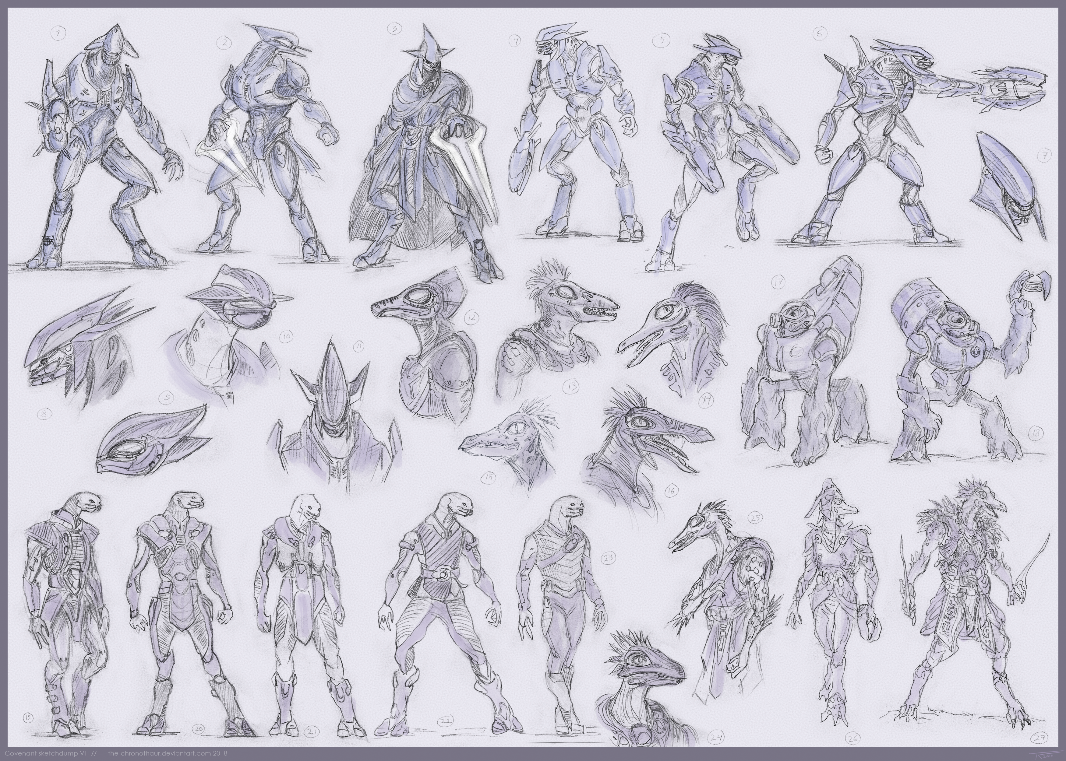
Yay, more sketches. At least I gave some color to some of these.I guess some of these warrant an explanation. The character portraits top the top are meant to be (left to right) Chant-to-Green, Bornstellar as the IsoDidact, either another version of Chant or a random character (not quite sure myself TBH), Glory-of-a-Far-Dawn, and Master Builder Faber. I always thought Faber's official design looked too ascetic. If there's one Forerunner who should look showy to the point of garishness, it's him.
Some of these are actually really old sketches that I just dug up from my files, like the ships on the bottom right (I never figured out how I'd present them). The colored one is supposed to be the Council ship that appears toward the end of Halo: Cryptum, the ovoid one is the Didact's planet-breaker, while the Fortress class ones are probably self-explanatory. The rest are just random ships.
The robots are a more recent project of mine. I've had this idea of creating a Forerunner-based enemy class based more on the Halo 3-era aesthetic than the whole "flaming skulls and chrome" thing 343i's got going on. So they might actually appear in more developed works of mine later on. I've always preferred Halo 2 and 3's more ornamented and 'archaic' Forerunner style to the sterile, Tron-esque hyper-futuristic direction they've been taken of late. I miss the warm brown, bronze and gold hues of the Halo 2-Halo 3 era; 343i seems to have forgotten that the Forerunners did build stuff colored something other than different varieties of chrome. I didn't want to give them overt faces while also adding some extra character over a single eye, so I came up with this idea of them having these various glyph-like ornaments for "faces" (it also avoids making them look too much like Mass Effect's Geth). The relative lack of Tron Lines on their bodies is also a conscious design choice, as I think the lines (like everything else) are most effective when used with moderation, in this case drawing the focus of the designs to their "faces" and weapons.
More sketches:
Related content


Comments: 6

👍: 0 ⏩: 0

I really like your designs... especially of those flying things, they remind me of Sentinels from Halo 1-3. The look of the Forerunners themselves is more to how I envisaged them to be, rather than the enormous Hulk with tusks, devil-eyes and super-giant mega-armour in Halo 4...
👍: 0 ⏩: 1

Thanks; I was partly inspired by the classic Sentinels.
And yeah, I really have no idea what 343i was thinking with the Didact's design. I think many of the Forerunner armors in the Halo 4 terminals are fine but the Didact's in-game design is just hilariously over the top.
👍: 0 ⏩: 1
I prefer the look of the sentinels from the original games. This new look in h4 doesn't do them any justice. And that Promethean stuff is just bad... Not halo at all in my opinion. Especially forerunner lol haha
👍: 0 ⏩: 0

I'll have more done at some point
 (Smile)")
👍: 0 ⏩: 0