HOME | DD
 TheABones — a hiding place to keep it safe
Published: 2009-01-29 05:11:13 +0000 UTC; Views: 1447; Favourites: 59; Downloads: 50
Redirect to original
Description
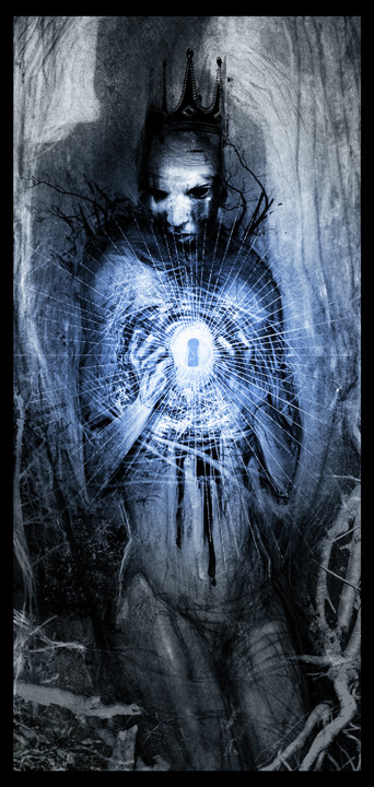
more personal work.having trouble being sure this one's finished. any help would be greatly appreciated.
Related content


Comments: 62

thank you! that's a kind of tricky question to answer. it's about 80% digital painting, with some collaged pieces and scanned ink and paint texture.
👍: 0 ⏩: 1

Ahh nice! Thanks for the reply
 (Smile)")
👍: 0 ⏩: 0

haha! you have an astounding way with words. i may have said that before...
👍: 0 ⏩: 1

People keep telling me I oughtta write....
👍: 0 ⏩: 0

hey man its looking great...maybe in the far coners make it a bit darker so your ryr goes more into the image. other than that i not really sure maybe some darker blues as the get away from the source just to show a tad be more powerful bright ness.
Anyway still looks awesome...kudos man
👍: 0 ⏩: 1
word. noted and noted. thanks for the help man! sorry it took me forever to respond!
👍: 0 ⏩: 1
lol its ok man great to see you putting up more things
👍: 0 ⏩: 0

It's hard for me to really say anything to help you because, I think this is a very beautiful, very spooky piece...
He looks like an evil faerie. Not Tinkerbell fairy. But the Celtic sort, the ones that kidnapped babies and could eat you up and whatnot.
Moving on, I see there's a crown atop his head, maybe empasize it a wee bit more because at first I thought that was just part of his head.
👍: 0 ⏩: 1
thanks both for the kind words and feedback. i will work into the crown a bit more, but i was actually thinking it was sort of growing out of his head. a kind of guillermo del toro nod? or rip off, maybe.
👍: 0 ⏩: 1
That's actually a really good idea. Go for it.
👍: 0 ⏩: 0

you could add a touch of warmth that contrasts and empowers the cold. like yellow. just a little sharp touch.
otherwise its a really nice piece dude. could have it on the wall. totally.
👍: 0 ⏩: 1
yeah, i tried to add some yellows and tans a few times and couldn't make it work, but i think this is a really good idea. i'm going to try some things out and see if i cant get some warmth in there. good call
👍: 0 ⏩: 0

looks awesome. I would say the bottom half looks unfinished. The legs and bottom torso is a little softer while the top is more graphic looking. Also the "roots" or whatever that is at the bottom add the photographic/soft look. I think just making it have a uniform "graphic" look would complete it.
👍: 0 ⏩: 1
i hear you. the thinking behind this was that i wanted the keyhole and face to be the focus, but if it's uneven, that's no good. i'll see what i can do!
👍: 0 ⏩: 1
Its great, just giving a critical analysis. Keep up the good work
👍: 0 ⏩: 1
oh i know, and i appreciate it.
👍: 0 ⏩: 0

Damn, took my breath away. Real nice. I love the colors of the blue. I really think you don't need to change one bit of it.
👍: 0 ⏩: 1
thank you very much! i'll be sure to save one version as is, don't worry.
👍: 0 ⏩: 1
awesome can't wait to see the other
👍: 0 ⏩: 0


First of all, the face is amazing, and I think the contrast between the face and the bright, harsh keyhole really keeps the eye moving. I love it to pieces.
the light isn't too harsh, I think the variety is good
I think the bottom could be darker. I agree that there could be more texture and more of those wonderful scribblies in the branches.
👍: 0 ⏩: 1
there seems to be some consensus that the bottom is the trouble area. i'll see what i can do. thanks for all the kind words
👍: 0 ⏩: 1
No problem...sorry you caught me right after my drawing and design class!
👍: 0 ⏩: 0
thanks, boss! i'm totally tempted to leave it as is after hearing from a few of you who's opinions i really respect. but now i've gotten all kinds of suggestions i feel like i should explore...
👍: 0 ⏩: 1

Follow your gut. That'll steer you right.
👍: 0 ⏩: 1

Keep it my friend. don't work on it anymore and continue on. this is great.
👍: 0 ⏩: 1
i like how you think. i'm gonna try just a couple things, i promise i wont ruin it
👍: 0 ⏩: 0


WWWOOWOOAH! THat Giuys gotta LOCK IN HIS CHECK And he's PULLING BaCk HIS SKIN
WHAT Those ROOTS COMIGN in WHAT IS THAT
👍: 0 ⏩: 1

If it was me, I'd make the light around the keyhole a little softer, less harsh. But it looks good already.
KAB
👍: 0 ⏩: 1
i can't help myself! i want more contrast, MORE LIGHT! I'd burn out all your retinas if i could...
👍: 0 ⏩: 1
")

I think the head is kinda weird......it should face to the right side but it just my opinion......btw nice work man........
👍: 0 ⏩: 0

Personally, the chestnest is what does it for me.
I'm with that guy above me, just a liiiiiiittle more texture to the tree trunk innards...
👍: 0 ⏩: 0

I dig it man, the only ting I can even think you could add is maybe a bit more texture or shading to the background to pop out the dude and his keyhole a bit more
👍: 0 ⏩: 1
word, thanks buddy. i'll get back in there!
👍: 0 ⏩: 1

You wanna know what I THINK?!
Course you do. Cause I'm awesome haha.
Some definition on the torso and legs perhaps
rib cage, muscle definition on the legs
some random details behind the figure perhaps
but otherwise I think it's in top shape man.
👍: 0 ⏩: 1
gotcha gotcha gotcha, i'm on it
👍: 0 ⏩: 0

Dunno, looks good to me... The bottom might need work, I guess...like if you wanted to add more branches that would lead you into the picture? It looks a bit off on the left side...
👍: 0 ⏩: 1
yeah, i hear you on that. i was toying with the idea of trying to cram more branches in there. i'm worried about overdoing it, or bogging the piece down with a heavy bottom end, but i think i can get a few more in there without too much risk. thanks!
👍: 0 ⏩: 1
yeah just skinny ones, so it doesn't get too uh. bottom heavy. <3
👍: 0 ⏩: 0
| Next =>