HOME | DD
 TheABones — s13:when the lights go down...
Published: 2006-01-12 17:42:59 +0000 UTC; Views: 2990; Favourites: 91; Downloads: 311
Redirect to original
Description
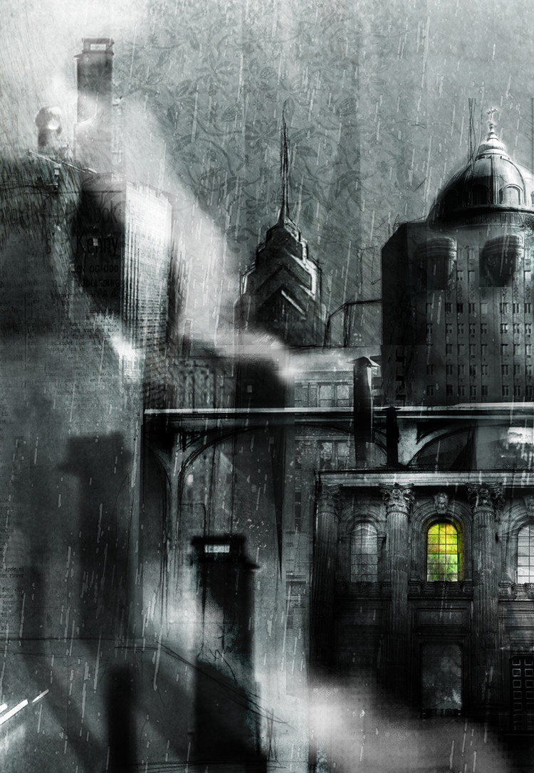
--------------------EDIT-------------------------okay, darkened the railway, toned down the newspaper. hope it's better
---------------------------------
in the citaaayy!
pencil, photoshop, photo. more work for S13. what do you guys think, is the rain too much? does it read?
Related content


Comments: 102

this is absolutely among your best works yet. the rain blends perfectly, and the buildings are very clean and it all fits so nicely. The yellow contrast to the color is lovely, beyond words. the newspaper makes for the same abstractedness I'm used to seeing in your work. It's wonderful man. Keep it up.
i seriously thought it was a photo at first >_>
👍: 0 ⏩: 2

well, thank you. always happy to make someone wonder what the hell they're looking at. i'll most certainly try to keep it up
👍: 0 ⏩: 0
i mean like, a regular photo with no altering >_>
👍: 0 ⏩: 0

Very cool. The "pleasantville" effect is always really cool and it's nice to see it used in different ways.
I love rain, so I think the rain is a nice touch for personal reasons. Where I live, it's quite so clear when it rains, but I'm not sure how it's like in other parts of the world.
👍: 0 ⏩: 1
yeah, i'm trying to hold back on the color a bit every now and then. as apposed to throwing every color i can think of into a piece. anyway, i'm glad you like it. rain over here is often pretty unpleasent and overcast. i actually really like it sometimes, but not when i have holes in my shoes...
👍: 0 ⏩: 0

I like how the little window lights up the whole picture and adds lots of contrast. only critique I have is the railroad thing that the fat kid told you about. it looks as if it goes right into the building. everything else is purrfect.
I'm still wondering if I'll fave this or not. I'm almost faving every new pic you come up with, almost like I'm making you a fanclub
")
👍: 0 ⏩: 0
I like how the little window lights up the whole picture and adds lots of contrast. only critique I have is the railroad thing that the fat kid told you about. it looks as if it goes right into the building. everything else is purrfect.
I'm still wondering if I'll fave this or not. I'm almost faving every new pic you come up with, almost like I'm making you a fanclub
👍: 0 ⏩: 1
haha! i've got no problem with a fanclub. so any of you out there who want to get together and celebrate me, feel free. i won't be offended
👍: 0 ⏩: 1

I agree about the newspaper, but the shadows and the window are killing me. A beautiful piece with the urban mood I talked about to it.
👍: 0 ⏩: 1
why thank you. i'm working on the newspaper as we speak
👍: 0 ⏩: 1
I like this version even more.
👍: 0 ⏩: 1

once again cheers to you!
👍: 0 ⏩: 0

this is awesome. i love it.
i didn't notice the newspaper at first, but now that i know it's there, it's kind of bugging me. it's just random and now i keep looking at it instead of being drawn to the window.
👍: 0 ⏩: 1
damnit. okay, since everyone seems to agree about this newspaper, i'll see if i can do something about it. and thank you as well, of course
👍: 0 ⏩: 0

Great indeed! It's amazing how you can capture/create a mood with almost any color, and now also without...
👍: 0 ⏩: 1
aww, thanks a lot, frriend. that actually kind of means a lot to me
👍: 0 ⏩: 0


 (Smile)")
And one another thing I've noticed.... The piece of sky in the right corner looks like "pasted" and it doesn't fit there...That is suppose to be like that?
And those tracks should be more darker (or live them, it doesn't mess up anything, at least to me ")
Well! One way or another, I love it

👍: 0 ⏩: 1
thank you thank you! for the kind words and critique! i'm actually not really sure what you're talking about in the right corner. i didn't paste any sky in there...maybe it's where one of my textures ends? hmm.
as for the pattern in the sky, I kind of like it a lot. i realize it takes away from the realism, but i don't want to lose that. not in this one anyway. maybe for the next, i'll keep the pattern to a minimum.
i just darkened the tracks a bit, so hopefully it's better. but again, thank you very much
👍: 0 ⏩: 1
No problem
Yeah now the tracks looks better
👍: 0 ⏩: 1
awesome, glad that helped! i'll take a closer look at the sky before i turn this in for the final print. thanks for looking it over so carefully! it actually really helps me out
👍: 0 ⏩: 1

Nice. Personally, I think the bridge is fine...it looks like part of it, and it's not attacking my eyes or anything.
Have you watched film noir? Yeah...good. What I'm saying is it has mood, which is a good thing.
Wait though...is that newspaper on the left? That's kind of confusing me, now that I look again. Doesn't fit or it's flat, something like that.
👍: 0 ⏩: 1
there is newspaper over there, maybe it doesn't work so hot. without it, things look a little barren though. maybe i can lay something over it to calm it down a bit. thanks for the comment though!
👍: 0 ⏩: 1

in the citttaaaay and teh sun shines ooooon the bay
👍: 0 ⏩: 1
hahaha! YES! i'm so glad someone got it
👍: 0 ⏩: 0

vury sweet. probably one of the smoothest ones of these yet. you might have trouble with that railroad bridge thing; right now it doesn't contrast enough with the bulidings in the back and it looks like it goes right into the building on the far left. other than than, spiffy.
👍: 0 ⏩: 1
hmm. you may be right about those tracks. i'm not sure what to do though. don't want them stealing all the focus. should i go lighter or darker, do you think?
👍: 0 ⏩: 1
whichever, it's just that right now it's almost the exact same value as the stuff behind it. go nuts, experiment. lighter may be more contrasty, but darker may be tougher.
👍: 0 ⏩: 1
tried darker. if it doesn't work, maybe i'll try something else later, but this is probably the last version DA will see
👍: 0 ⏩: 1
mooooooch better. definitely contrasting my face. what?
👍: 0 ⏩: 1
i'll contrast your face with my lips. my big pouty lips. how's THAT for confusing?
👍: 0 ⏩: 1
confusing enough to get me HAWT
👍: 0 ⏩: 1
fuck me. how's that for subtle.
you should check out "sweet cobra." they're kind of like cursed with a bit less death
👍: 0 ⏩: 1

Damn! That's fantastic. Even better than that last one. I especially like the newspaper on the walls and the wallpaper sky. I think my favorite bit is the shadow cast on the wall by that -- smokestack? in the foreground. And no, I think the rain's just right for this. The steam is perfect, and the color window is great, of course.
Damn you for being so talented!
")
👍: 0 ⏩: 1
haha! shucks! i'm pleased with it myself. took a lot of inspiration from benjamin carre and king kong. you should totally check him out
👍: 0 ⏩: 1
Damn, that's some good work from Carre. Is he a French comic artist?
KAB
👍: 0 ⏩: 1
indeed he is. one of my favorites right now.
👍: 0 ⏩: 1
Damn, I hadn't even heard of him before you mentioned him. That's some amazing work.
KAB
👍: 0 ⏩: 1
yeah, he seems to be really underapriciated. i don't know if he's done anything too noteworthy over here in the states. i'd bet people start knowing his name pretty soon. and then we'll seem so cutting edge
👍: 0 ⏩: 0

Wow, now that is cool. It looks like the kind of thing I would make if I was good at PS. ^^ I like the one lighted window, gives the picture a focal point. The rain is not too much, I like it. But I'm not quite sure about the floating words...
This is amazingly cool, I congratulate you!
👍: 0 ⏩: 1
thank you very much. i thought the words were subtle enough so as not to draw attention, but maybe i was wrong. they are only in that one spot afterall...hmm. i'll take a look at it
👍: 0 ⏩: 0

I think it works very well. The rain is fine. It's a nice touch, really. I like the background. The lit window adds a great focal point, and there's enough of interest elsewhere to create a visual pathway. Excelent work.
👍: 0 ⏩: 1
thanks very much! i'm glad the composition works for you, cause i spent a fare amount of time on it
👍: 0 ⏩: 0


| Next =>