HOME | DD
 TheArtFlower — The Elements

Published: 2013-01-31 16:54:57 +0000 UTC; Views: 581; Favourites: 18; Downloads: 20
Redirect to original
Description
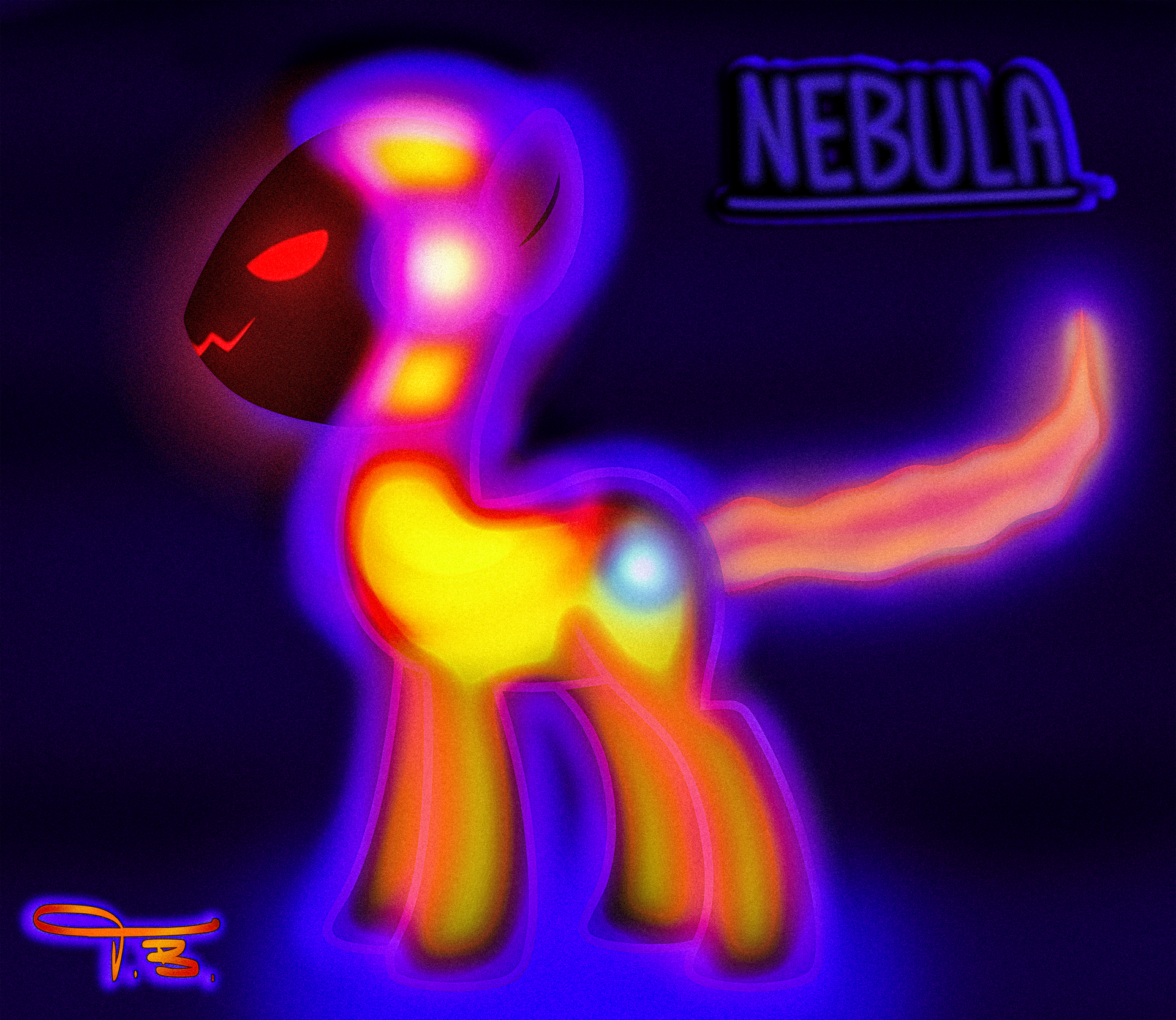
the Elements of natureart(C)meee
Fire, Wind, Earth and Water(C)meee
Related content


Comments: 8

Ho-k. Gosh it's taken a long time to give you that critique that I wanted to give.
Eh-hem. Ok. Before I start just remember that I don't mean any offence by anything I say, I only want to help. Sometimes critiques sound rough.
The first major thing that I noticed that I wanted to critique on is the use of black in your piece. We've mentioned it quite a few times on the show but using black will create a void in your art and it leaves for a lack of detail or space. So the black areas on your ponies I can't see any detail and it's rather confusing to the eye. I can see that it's because the fire pony on the bottom right is supposed to be bright, but there's more ways to show that the character is very bright or emitting light.
The character I mentioned is also very saturated. Which isn't necessarily a bad thing, it just attracts a lot of attention, as well as from the other characters, which is just something to keep in mind. The black in the piece also does something similar, where it will draw the eye, but then there's nothing to see.
I like that you showed light from the bright character emitting on to the others, which is a very good way to show she is bright other than saturation. Now something to keep in mind is another thing we mentioned in our Color Ep. Warm light will cast Cool shadows, and Cool light will cast Warm shadows. So since your bright character is a warm light, try shading the other characters with a cool color rather than black. And it will give everything a very harmonious feel, as well as make the light source feel way more warm. Right now everything feels warm with some big back spots. If you make the shadows cool colors, (it doesn't have to be the same colors, as in replacing the black all together. It should be cooler colors of the characters that the shadows are on.) the characters will really pop from the warm background, which is a good thing.
Each of your characters are also in a bit of an odd pose. Which is good, but it's sort of hard to make sense of ost of them. I can't see character on the top's back hooves. And I'm not sure how the blue characters front legs are attached or what they're standing on.
All the characters are looking away from the viewer, accept for the bright one (Sort of), I like that. Even if you didn't intend it, it's a nice touch. When a character makes eye contact with the viewer we engage that character more and give it meaning.
Also some critiques on the characters, the sporadic-ness of the outlines of your Water element's hair make it look more like an element of lightning. it looks like you were trying to go for a water fall type look, which is a good idea, but you might want to play around with how you show those lines. Since your Water element is really bright from all the light coming off your Fire element it also makes it feel less like water. And your Wind element seems more like an earth element with the yellow-y hair and green body. You might consider adding some transparency to something like the wings or hair to give it a more "Air" like feel, which is what most people think when they think wind.
Over all the two main points to take out of my critique are:
- You should avoid using black in your art, especially digital, unless you want to show some kind of void or hole.
- Make sure your characters poses make sense and are clear.
I hope that helped. Sorry again to took so damn long. CAC keeps me busy.
-*Bernd01
👍: 0 ⏩: 1

I just got to say that I didn't use black at all in this painting! I never (almost) use black in any thing when I paint it, though I usually use a very dark palette that can be perceived as black after my final overlay layers. and I didn't even notice winds leg before you pointed it out, it was supposed to be a tornado thing but it kind of got to close to the BG in value and color but if you look super hard you can see the out line of the leg, but the one who is looking at the painting shouldn't have to search for so significant parts like the leg! yes it was supposed to be a waterfall hair! winds color was from the beginning a deep blue fur and a gray mane but with my awkward shading it kind of got to a green and yellow instead.
and OH MY LUNA the element of lightning how awesome is that!!!!
thanks for the critique!
👍: 0 ⏩: 1
No black? Shenanigans! Photoshop doesn't lie!: [link] You may have started by not using black, but that value is too damn dark! You got to make sure to watch your values!
You can always gray scale your piece by "De-Saturating" it to see how your lights and darks are looking: [link]
👍: 0 ⏩: 0
Hey there ArtFlower! I really like this OC design for your submission, and I was wondering if I could offer you a critique on your piece. Would you be alright with that?
👍: 0 ⏩: 1
shure!
I'd love to have any corespondens on my work.
👍: 0 ⏩: 0

well I don't!
please explain!
👍: 0 ⏩: 1

You know how the ponies you drew were "elements"? And the Mane 6 are also "elements"? I'm leaving the rest for you to figure out.....
👍: 0 ⏩: 0