HOME | DD
 TheAwesomeAki-kun — AKI's Digital Coloring Styles Analysis
#coloring #compilation #digital #lineart #style #digitalcoloring
Published: 2019-01-18 08:10:59 +0000 UTC; Views: 2136; Favourites: 19; Downloads: 0
Redirect to original
Description
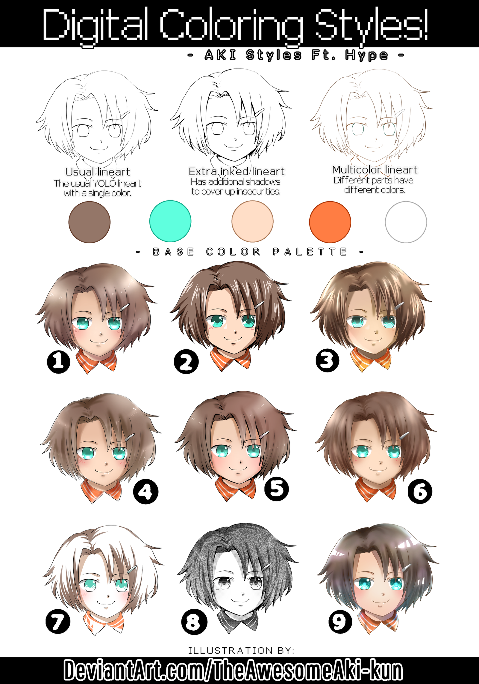
Featuring my cheerleader boi OC, Hype as the model 'v')9I've been studying on different techniques and styles from other artists to improve mine. But I thought it would be better for me to be aware of my own current styles at the moment first before learning any new ones. So, here they are. .v.)7
I looked around my gallery and observed the coloring styles I frequently use. But before getting into them, I also realized that my coloring style could differ depending on what kind of lineart style I use for that particular drawing.
I found three of my most common lineart styles; [1] the YOLO, [2] the one with additional inking to cover up my mistakes and insecurities, and [3] YOLO but with different colors. And from there, I discovered the following 9 types of coloring styles:
No. 1 : "Simple Pen Blur" (w/ Plain lineart)
[ An example of my art that shows this style ]
I think this could be the 'default' coloring style I go with for most of my art, especially the older ones. I'd use the pen tool for shading, abuse the blur tool on it afterwards to soften the end of the edges, and add more depth with the airbrush tool. And of course, there's the final touches of bright light for highlights with a little sparkle. It's the easiest for me to do, but I've always felt like it's a bit lacking, mostly because my choice of colors aren't the best and I've always been too wuss to try out other palettes that is different or far from the base colors.
No. 2 : "Pure Cel Shade"(w/ Inked lineart)
[ An example of my art that shows this style ]
is it 'cel' or 'cell'?? I don't even know anymore-
This style is commonly found in anime and cartoons. It's done purely with the pen tool, as an experimental style for me to not abuse the blur tool for once. The shading, as well as the highlights, are completely solid. It looks cleaner to me, but a little too sharp for my taste. It does however remind me of 80's-90's anime style though, so I still have a soft spot for this style.
No. 3 : "Kinda Cel Shade" (w/ Colored lineart)
[ An example of my art that shows this style ]
I figured this one out while looking at old MMORPG art as reference. It's kind of a mix of the first and second style; you can still see some rough chunks of shading and highlights even if some parts of it has been smudged. One thing I observed about old anime-style art (especially ones found in old video games) was that they had an interesting brightness to them. Maybe it was the typical color choices of that time? Maybe it was because most of the CG art came with a scenery for a background and the character has to blend in with the atmosphere? Either way, it's not like they were an eyesore to look at or anything, but I don't know, I see it looking brighter in some way. So for this style, I usually put on some heavy overlay layers of bright colors like orange or yellow.
No. 4 : "Glowy Soft Shade" (w/ Plain lineart)
[ An example of my art that shows this style ]
This has to be one of my favorite to do, mostly because there's a certain level of 'laziness' to it. I usually have to manually fill-in the base colors by pen (can't paint bucket because my lineart is full of holes orz) and make sure that I don't miss a single spot. But with this style, I'll instead use the waterbrush tool to fill-in base colors, and I don't have to worry if I miss a spot or if the color exceeds outside the lineart. In addition, I usually add more 'light' to it, making it look like it's glowing in a way. I feel like this is more soothing to the eyes if I want to make a peaceful scenery for a background along with the character to interact with. The downside to it is that my lineart somehow appears to be even sketchier with it, and I can't leave it with a transparent background.
No. 5 : "Clean Soft Shade" (w/ Inked lineart)
[ An example of my art that shows this style ]
It's very alike to the previous Glowy Soft Shade style, but only cleaner. The base color is now properly filled in the boundaries of the lineart, plus with the additional inked shadows, it's a soft shade style that I can now put in a transparent background. What I don't like about this however, is that it lessens the glowing effect that the previous style has because of the additional shadows, plus now with the lineart more visible and the black lines + shadows more emphasized, the colors look a little dull. Then again, that's just me with my poor color choices. xD
No. 6 : "Detailed Soft Shade" (w/ Colored lineart)
[ An example of my art that shows this style ]
It's a soft shade with shadows and lighting made with the waterbrush tool, but has more detail to it, especially with the hair and clothes. I usually have two layers of shading for each part instead of just one as usual. I've also noticed that with drawings I use with this style, I tend to not do my usual over-the-top sparkle highlights with the hair and instead just put subtle lighting on it.
No. 7 : "Marker Imitation" (w/ Plain lineart)
[ An example of my art that shows this style ]
I like this style a lot! It's simple, quick, and easy to do. It reminds me of how I would color with markers in a traditional medium, since the markers I have are the cheap ones with hella bright colors and I wouldn't dare use it for a base color. So instead of filling in a drawing with an eyesore of a color with my cheap markers, I'd just partially shade its shadows with it. And as someone who NEEDS to work with at least 10 layers for coloring, this is a refreshing style for me (and for my MediBang who won't be crashing this time from too many layers. :'D)
No. 8 : "Aki Doesn't Know How To Tone" (w/ Inked lineart)
[ An example of my art that shows this style ]
This isn't really 'coloring', but I have done multiple drawings that are manga toned so I figured it'd feel right to put it here as well. I...I don't really know how it works. I like screentones a little bit too much and I always overdo it. I know most manga don't even have this much tone to them :'D I'm still working on improving this one, but I like this style very much as well.
MANGA SCREENTONES USED PROVIDED BY:
- AmethystArmor.deviantart.com
- panamanga.deviantart.com
No. 9 : "Experimental Style" (w/ Colored lineart)
[ ??? ]
I ran out of existing common styles to put and I didn't want to leave an empty space, so have an experimental coloring style .v.)9 Maybe I'll actually try this out next time haha it's not so bad.
The coloring styles made in the usual plain lineart (#1, 4, and 7) are the easiest to do for me. The ones made with an extra inked lineart (#2, 5, and 8) are styles that I struggle with as they're not really styles I'm used to or practiced enough. Lastly, the coloring styles with a colored lineart (#3, 6, and 9) are styles that usually make my MediBang hang from too many layers and interestingly, I found out that most contest entries I make have these styles.
Which one is your favorite, and how are my styles different or similar to yours? ovo)/
Drawing Commissions OPEN! Art Trades OPEN! Adoptables OPEN!
Related content


Comments: 2

👍: 1 ⏩: 1

👍: 1 ⏩: 0